Brückenfestival
client
Brückenfestival e.V.
CATEGORY
Festival Design, Branding Concept, TypeDesign, ColorFont, Poster design
BRANCH
Music Festival
Collaboration
festivalteam with Jürgen Held & Toni Reinhardt
stage & crowd photos ©️ Frank Schuh
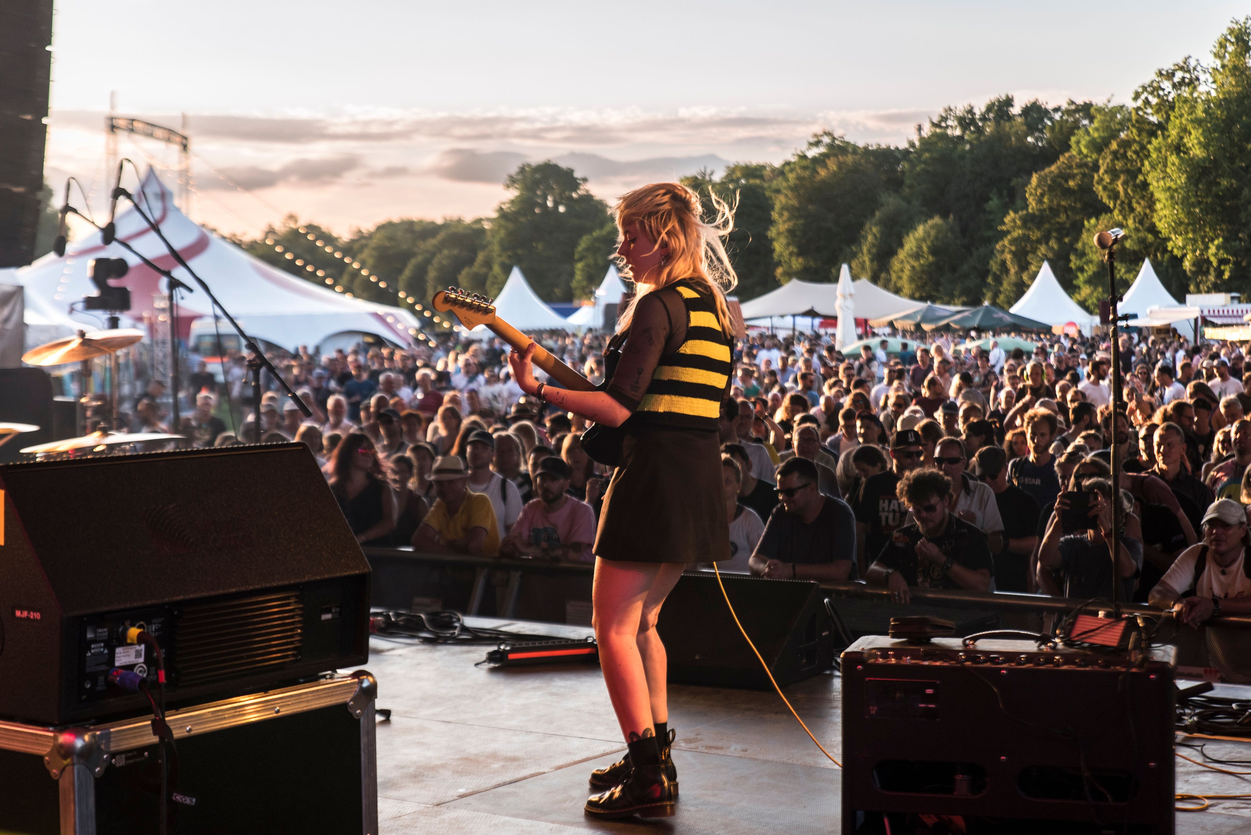
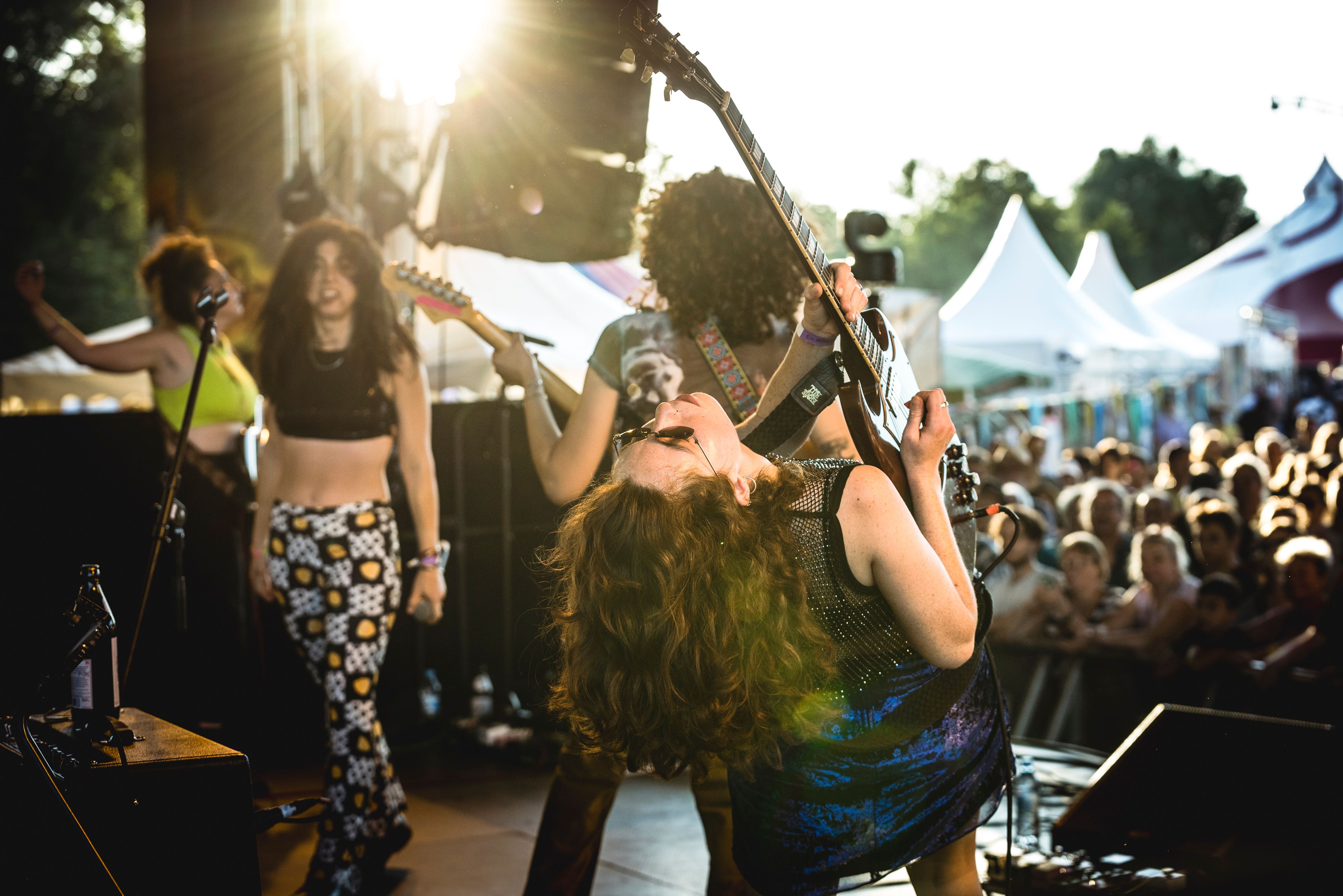
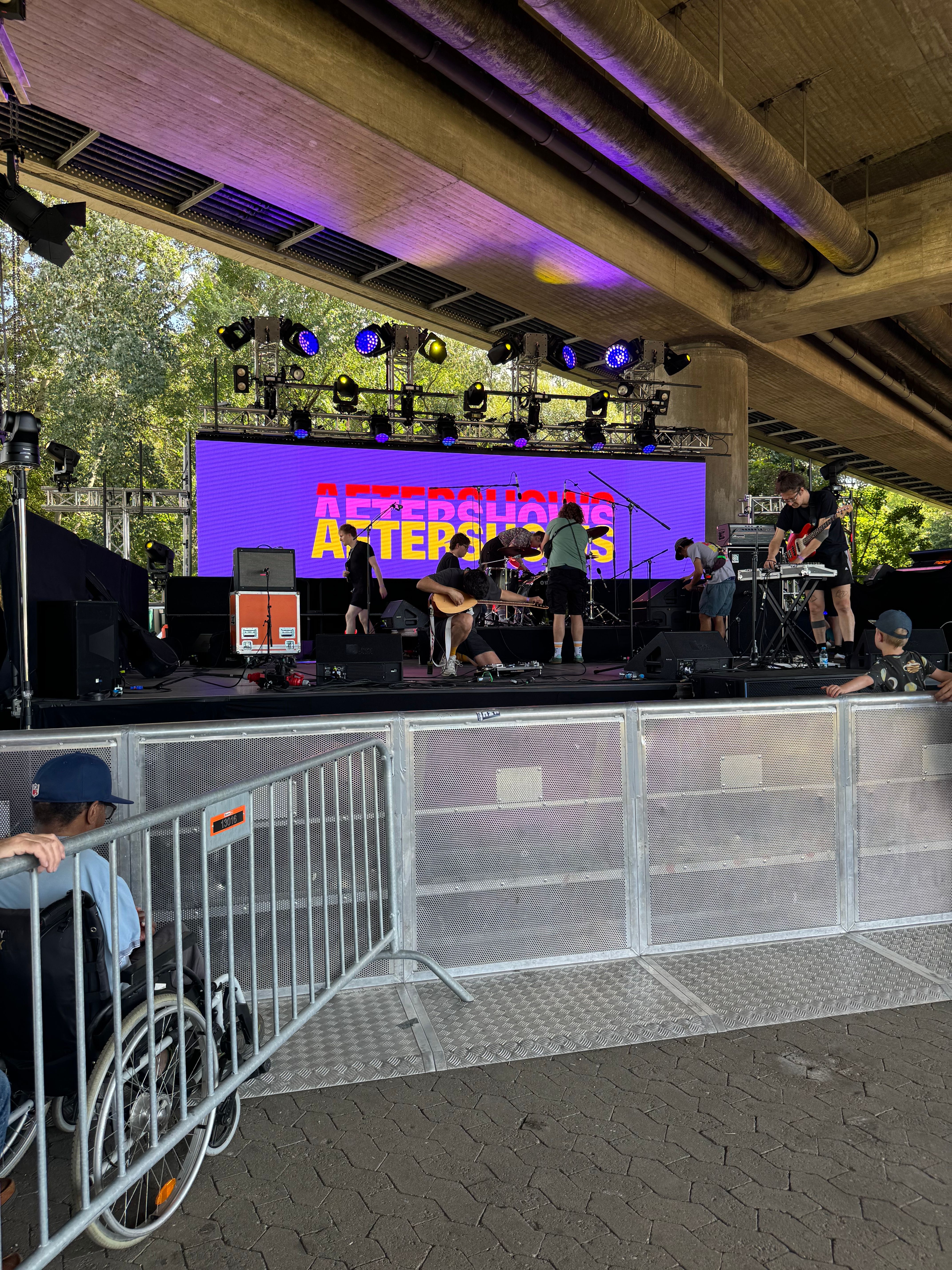
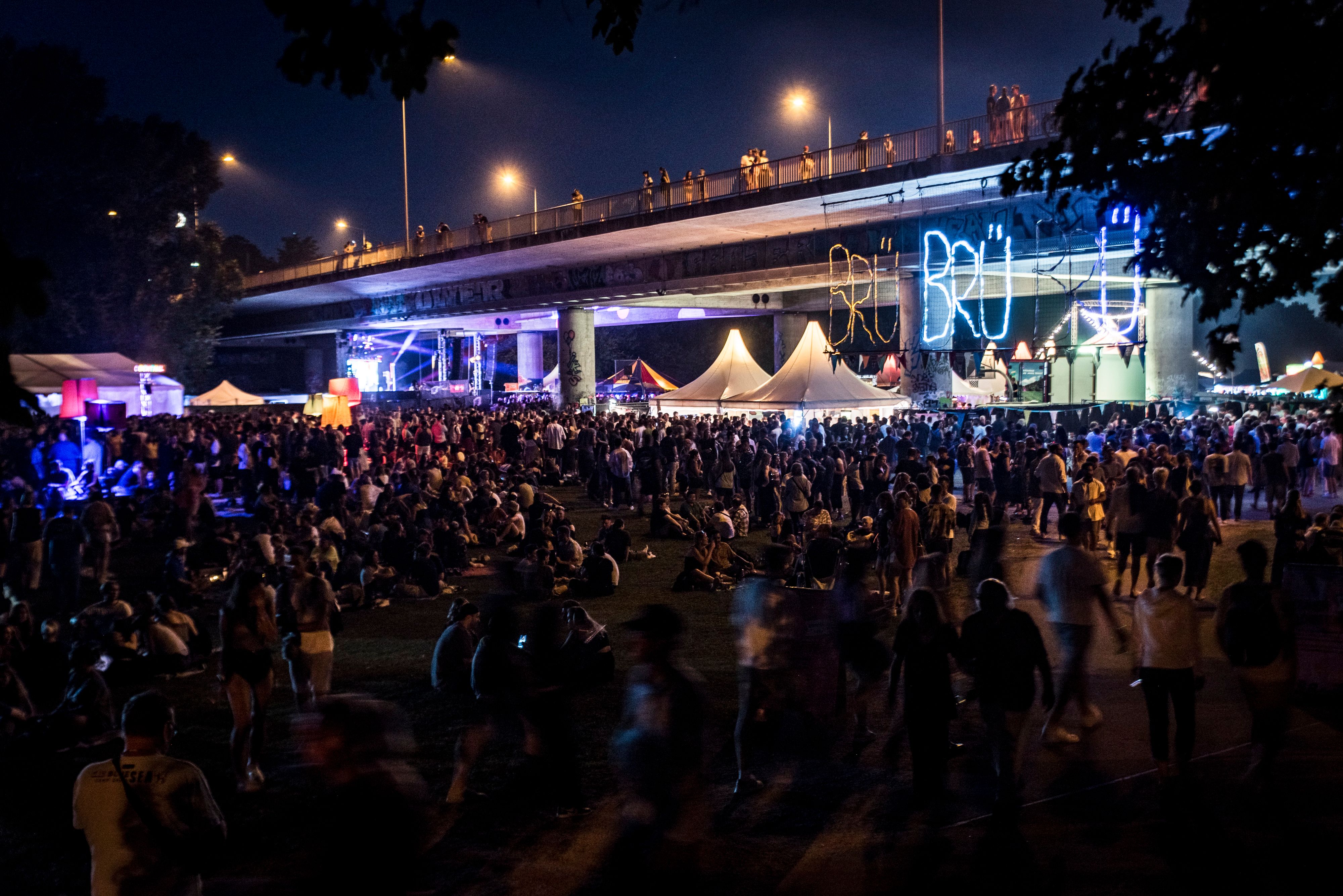
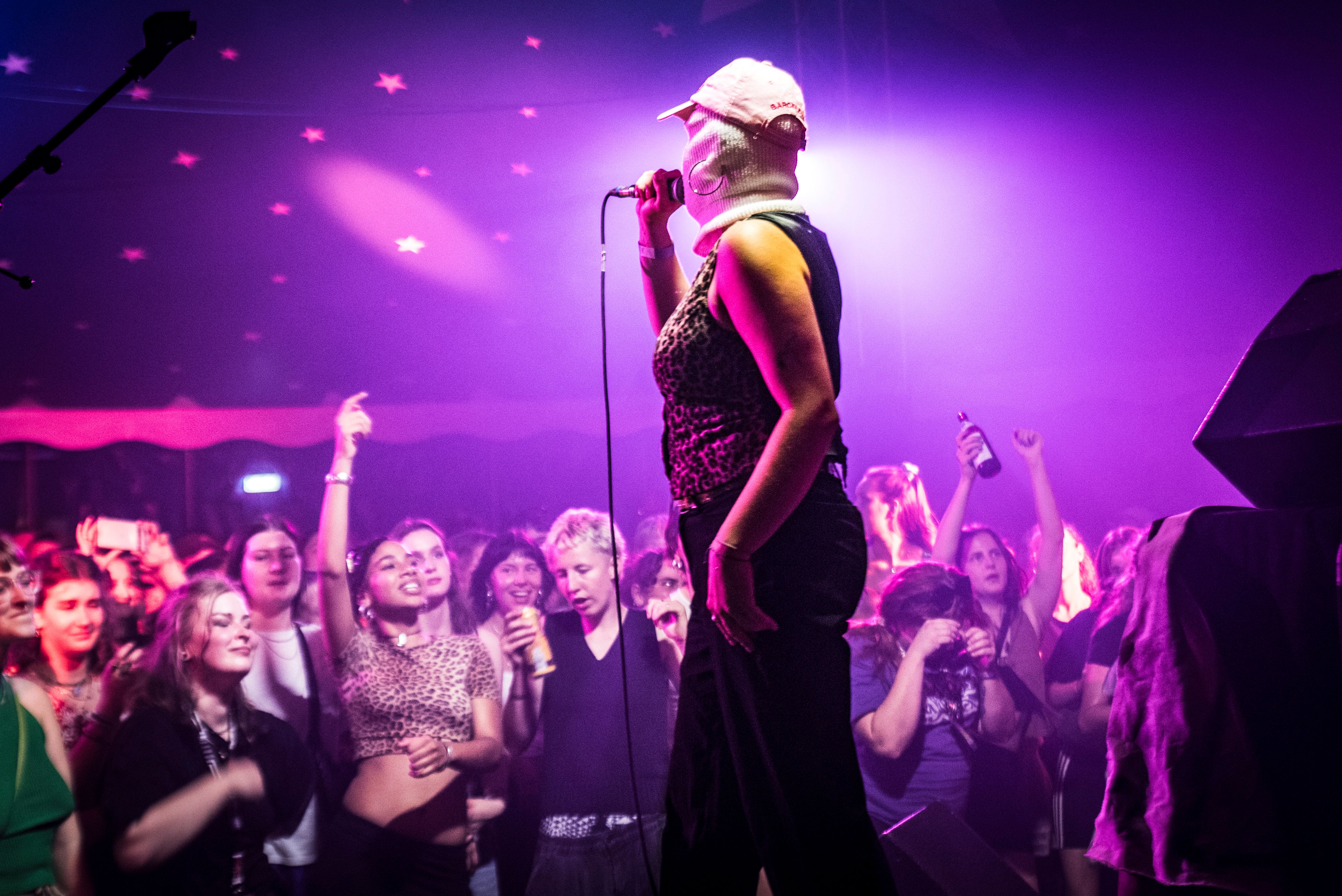
Once a year thousands of people are dancing under the Theodor-Heuß-Brücke in Nuernberg at Brückenfestival. In two days they have counted up to 30000 visitors, that come together to enjoy music on three stages.
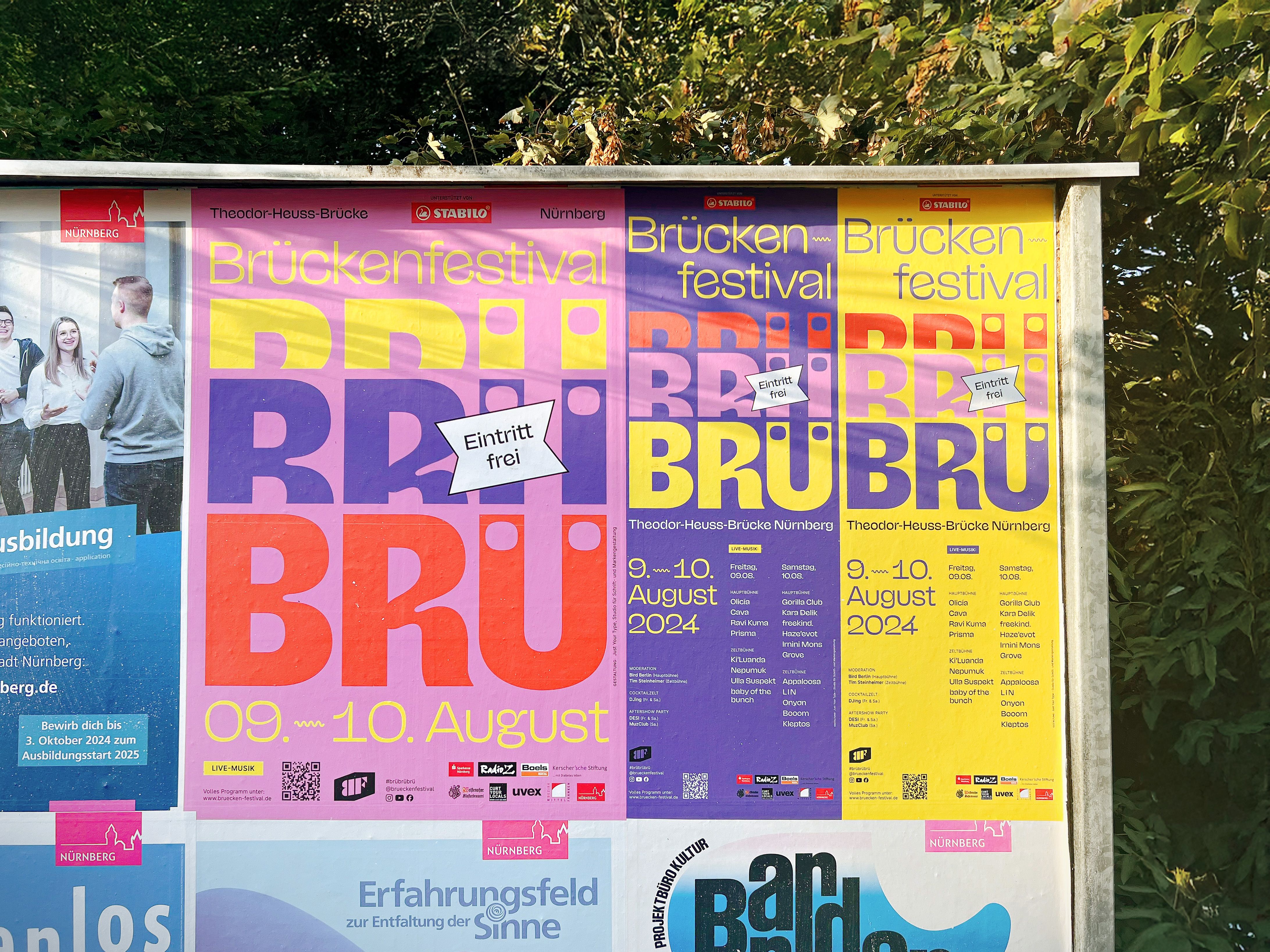
2024 we were asked to design the festival poster. Obviously, we couldn’t resist and created a custom typeface.
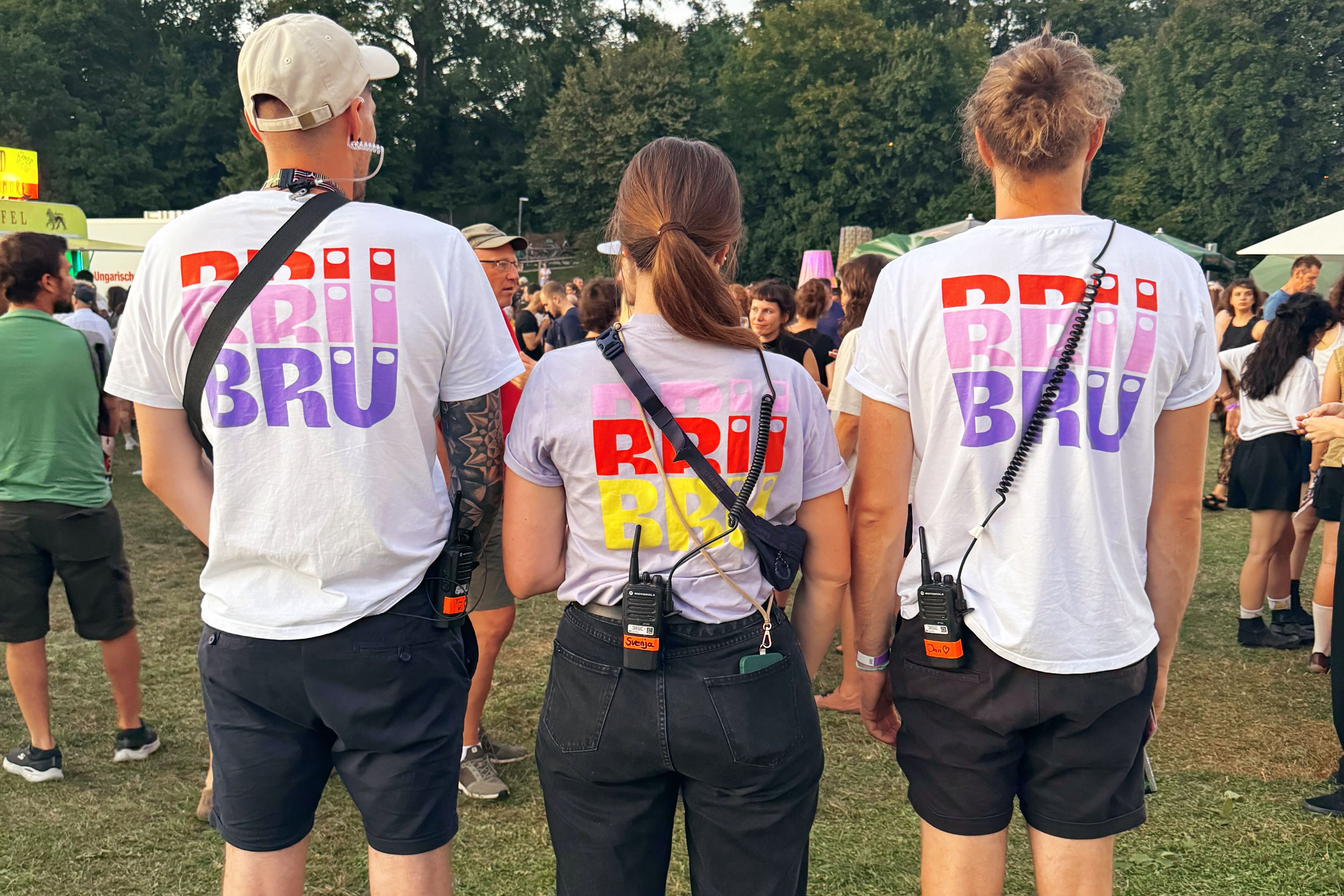
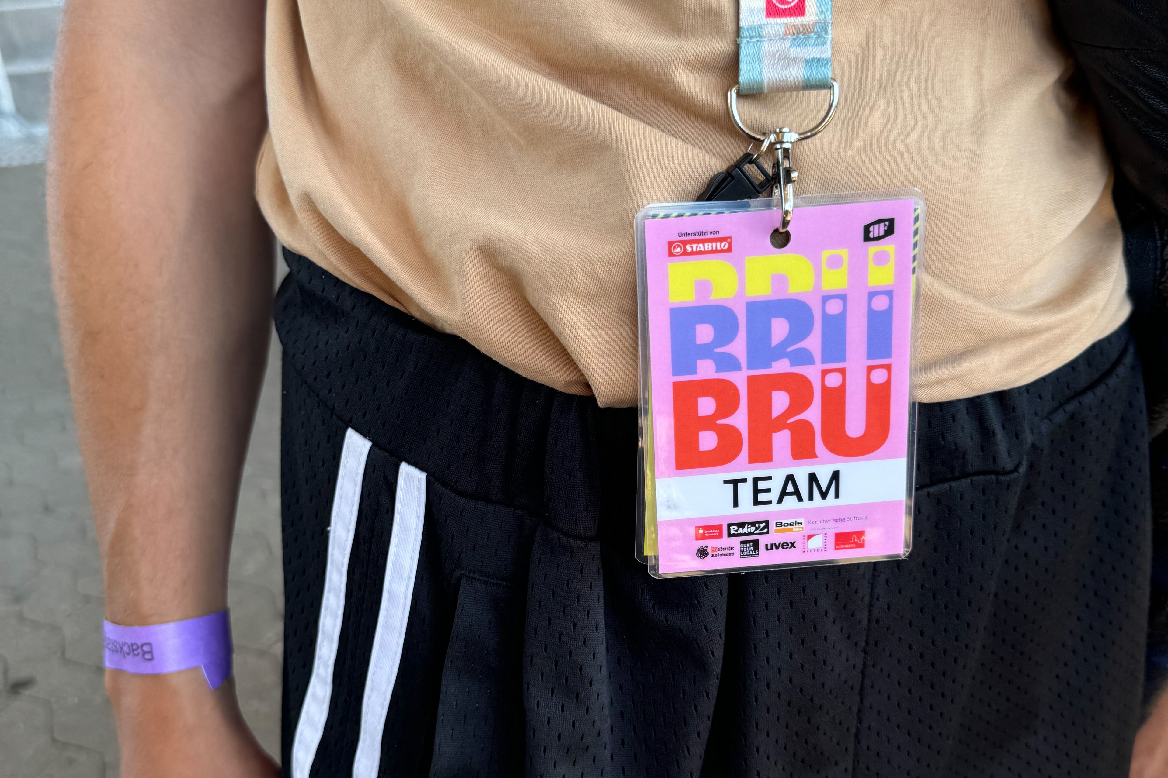
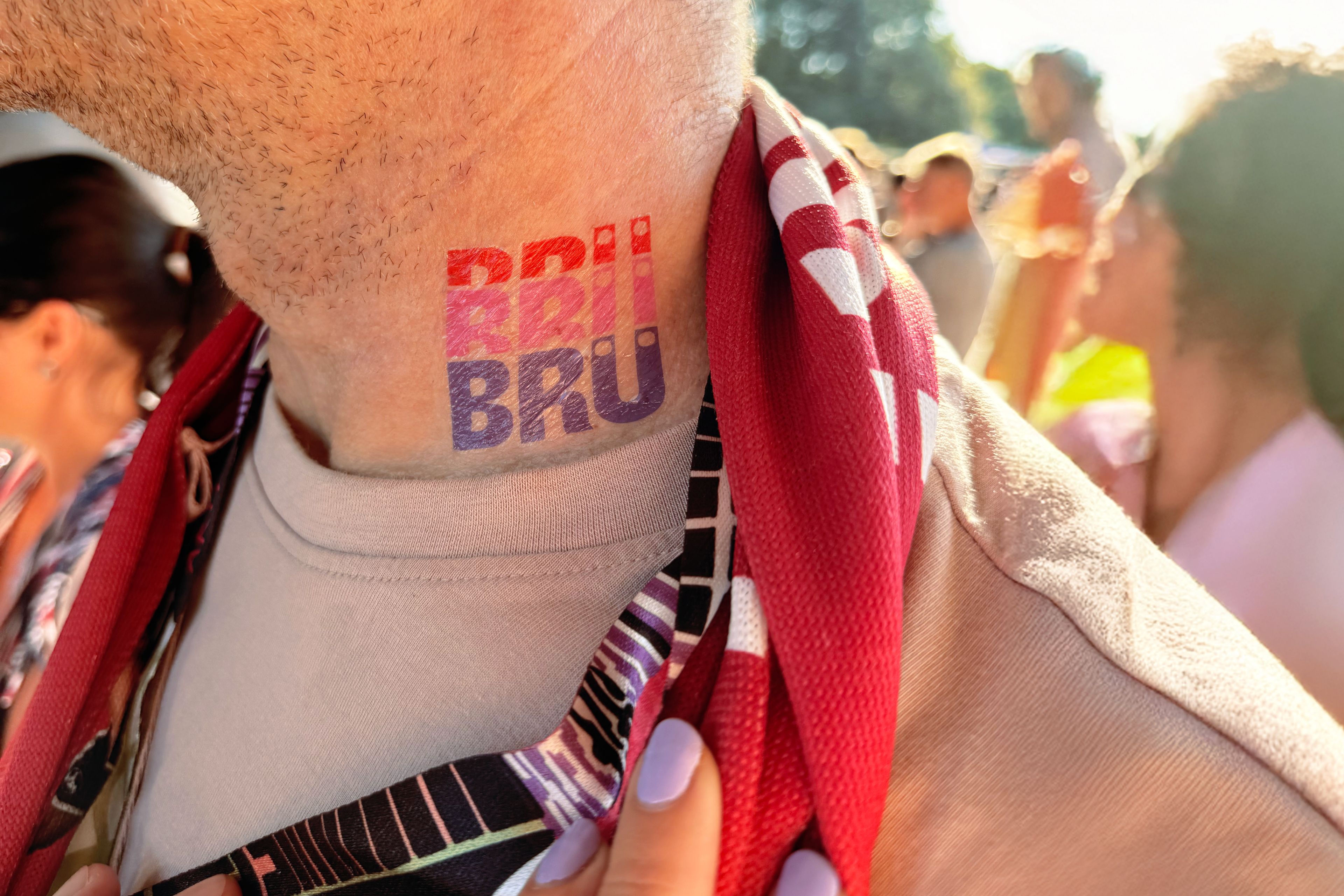
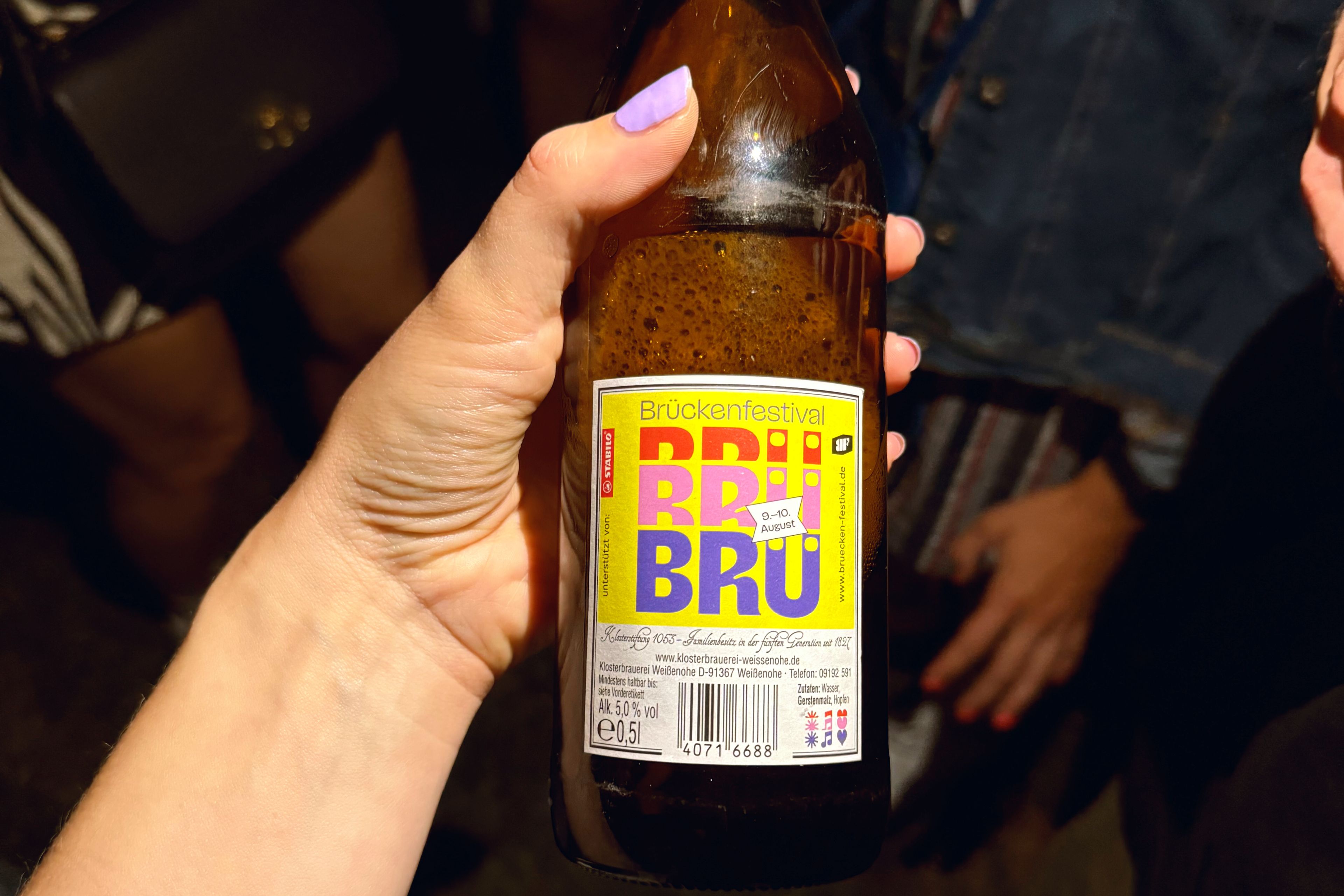
Brü—Brü—Brü—Brückenfestival! sings Bird Berlin, the beloved host, as the crowd joyfully joins in. For a long time now, loyal fans have affectionately referred to their festival simply as BRÜ. The hashtag #BRÜBRÜBRÜ continues to gather more and more photos, capturing the spirit of the event. This year, we elevated the iconic BRÜ, transforming it into a versatile key visual. It works seamlessly in different colors and scales down perfectly as a logo for social media.
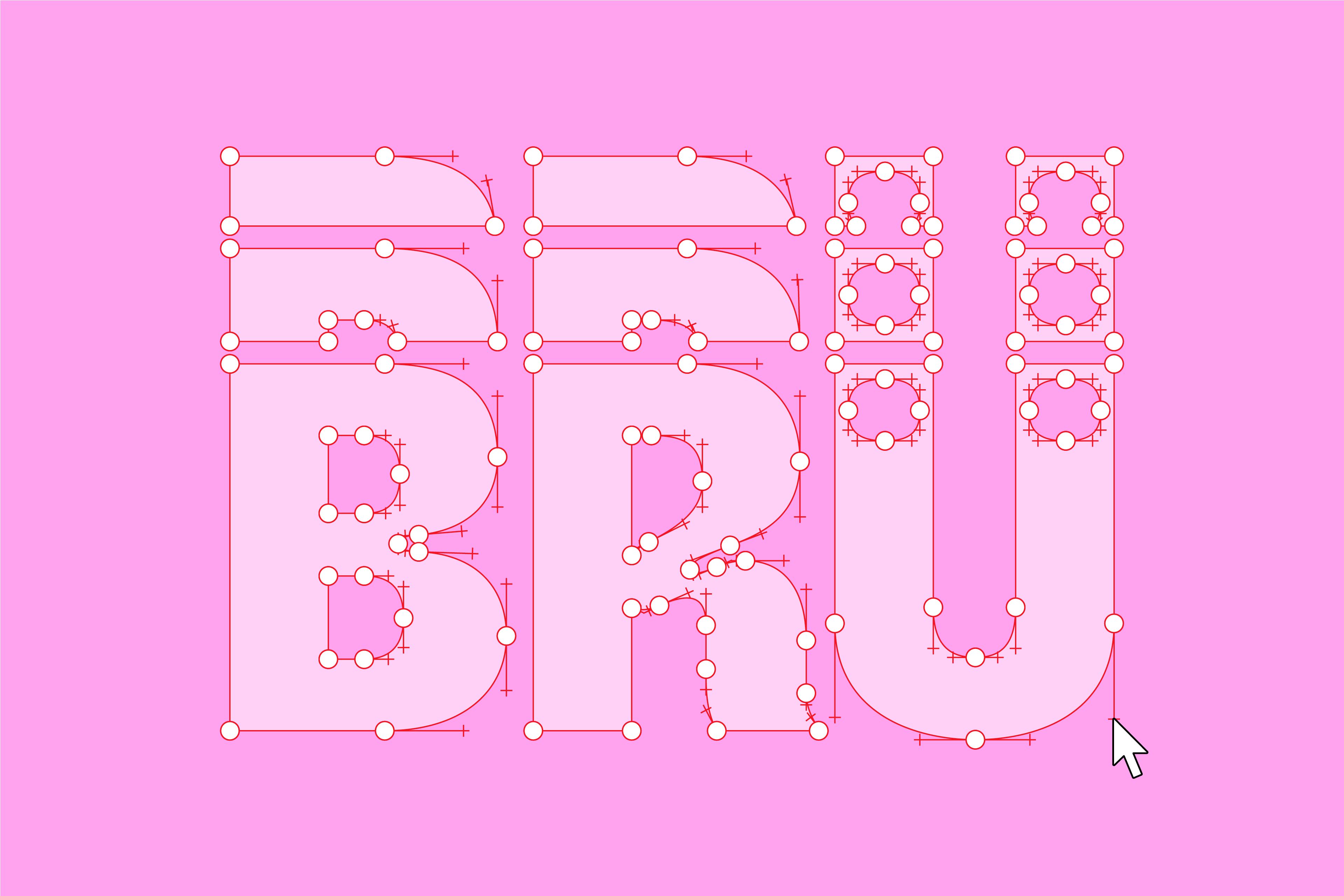
Inspired by the three-note chords, we divided the letters into three segments. You might think this would work with any typeface, but of course it doesn’t. We refined the letterforms to ensure that the shapes repeat seamlessly and beautifully.
While designing the poster, we thought about cutting and rebuilding the letters in different heights. Which made it even harder to find the right moments to divide the letters. Like the umlaut Ü in the version of the compact height. We for e.g. cut the dots.
bright & colorful
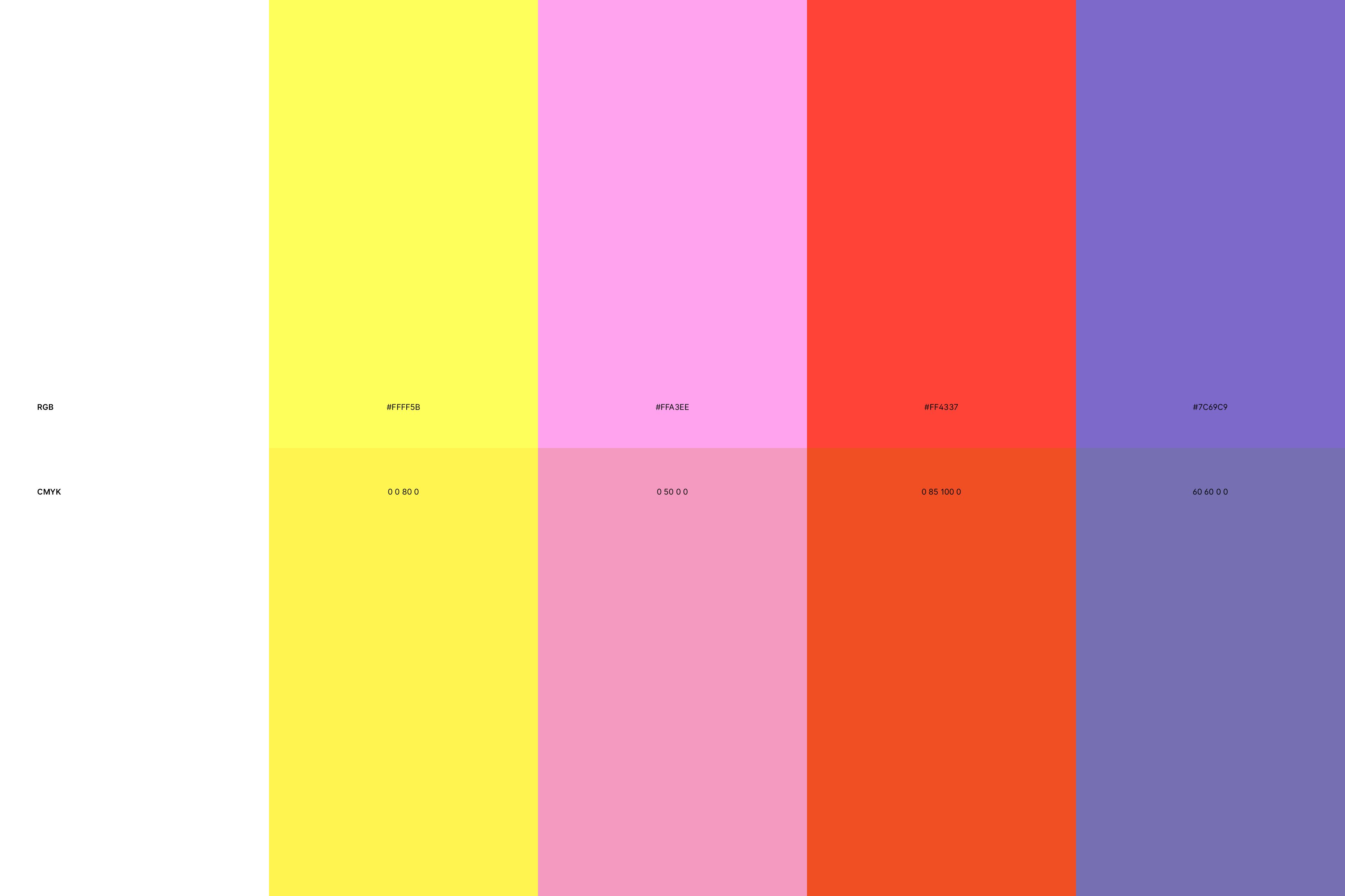
Right from the start, we knew the design had to be fun, bright, and colorful. We wanted to bring something new to the festival designs, and a ColorFont was the perfect solution. We came up with a color code to match our vision for the festival day in August: warm and sunny.
Picking colors that would still pop in CMYK print was a challenge. – But I guess we made it!
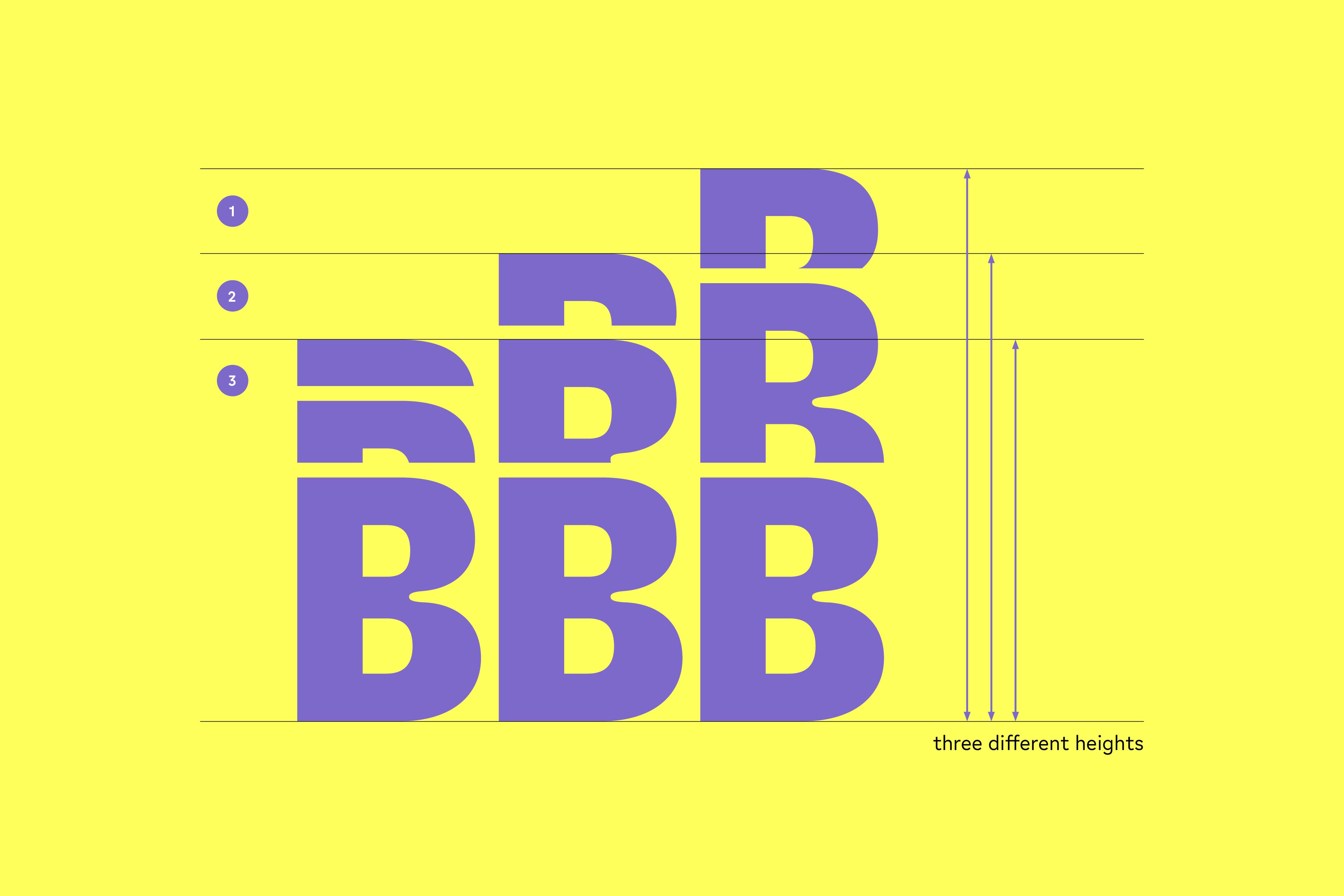
We came up with three different heights for the stacked typeface design, so users of the font have more flexibility to adapt it to various formats or mix and match the heights for creative combinations, as in type animations.
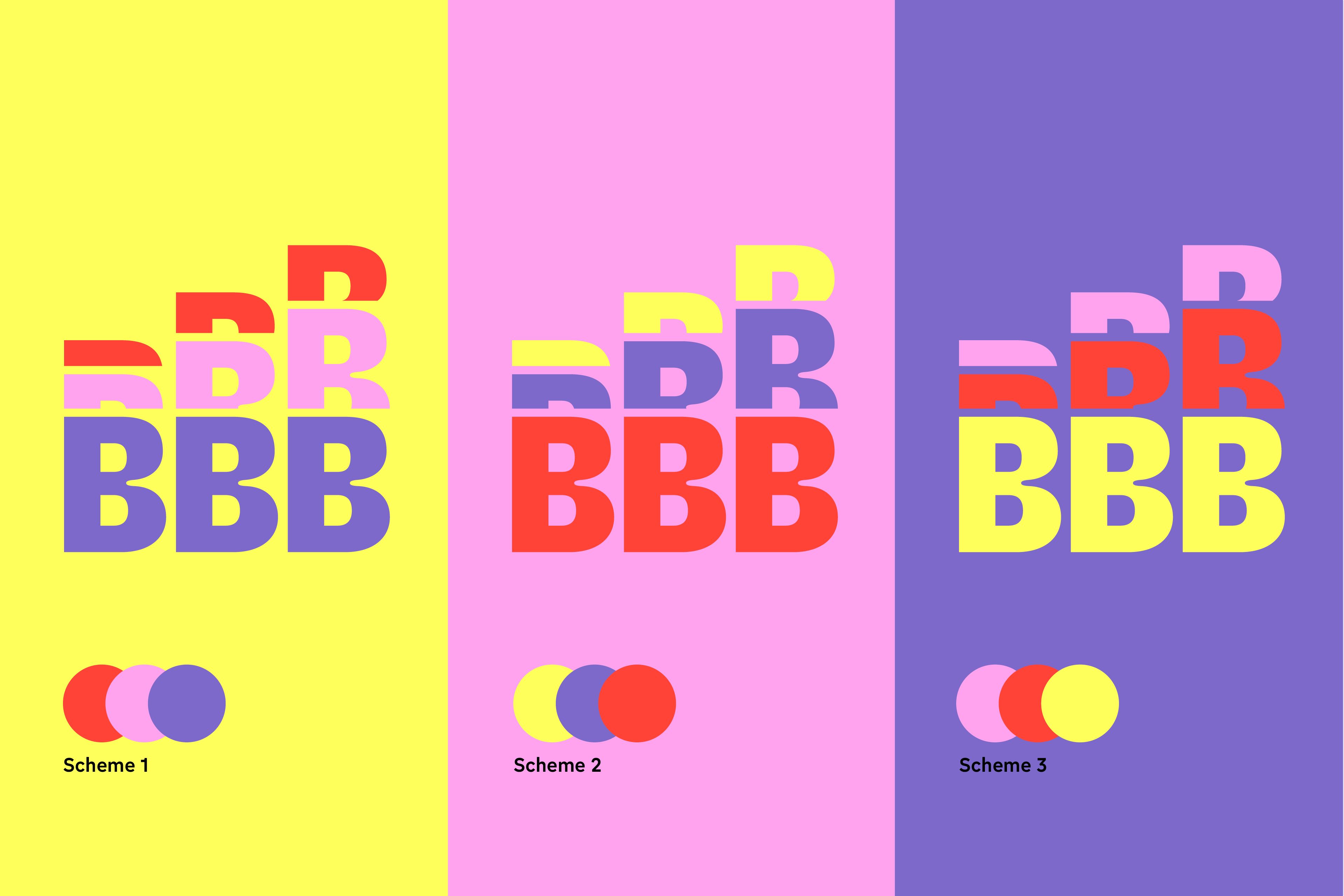
The ColorFont offers three distinct color schemes for each height, designed to complement various backgrounds and provide a creative playground for designs across different media. It’s ideal for use in video, stage design, festival signage, motion graphics, and more.
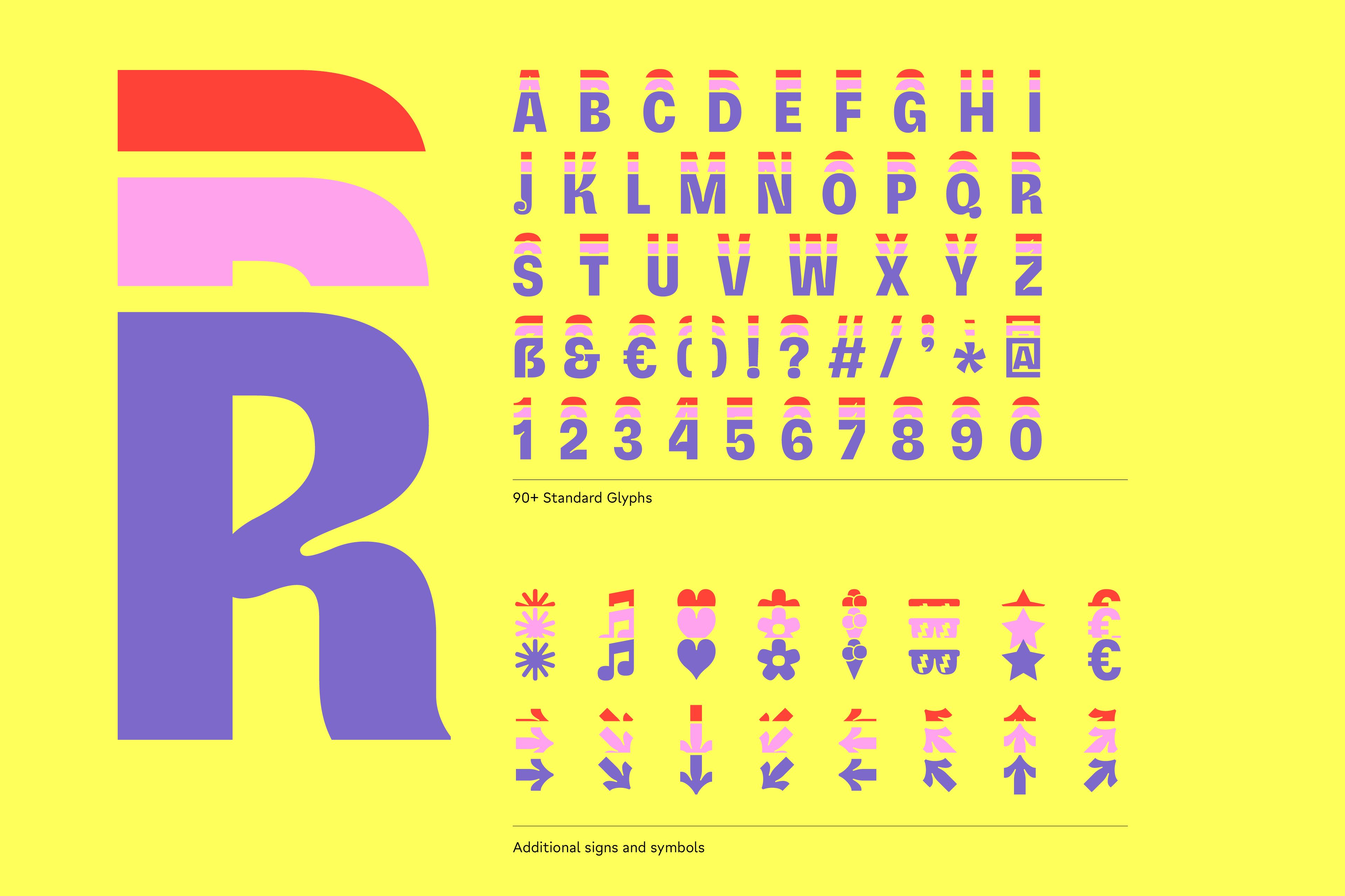
The basic glyph set works great for short headlines. We added some basic punctuation and figures, and obviously started with some arrows, of course. We ended up designing some fun tricolored icons. We had to stop at some point, though (sometimes deadlines save your life).
Dancing Color Font
We gave three height options, so users could move the headlines around easily. Let the typeface move, grow, dance, or even simulate an equalizer with just a GIF animation.
“Thanks to the ColorFont, I had an incredibly easy system to design with.”
— Jürgen Held
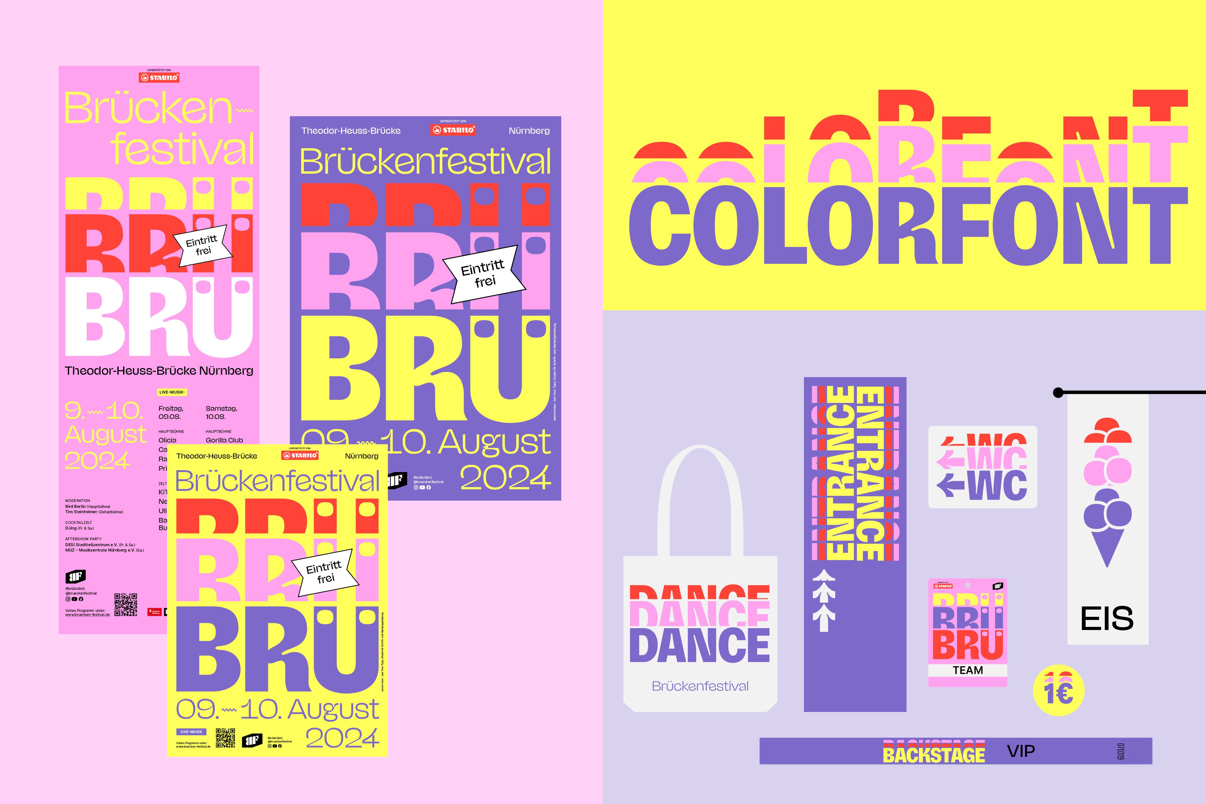
BRÜ BRÜ BRÜ all over the festival!
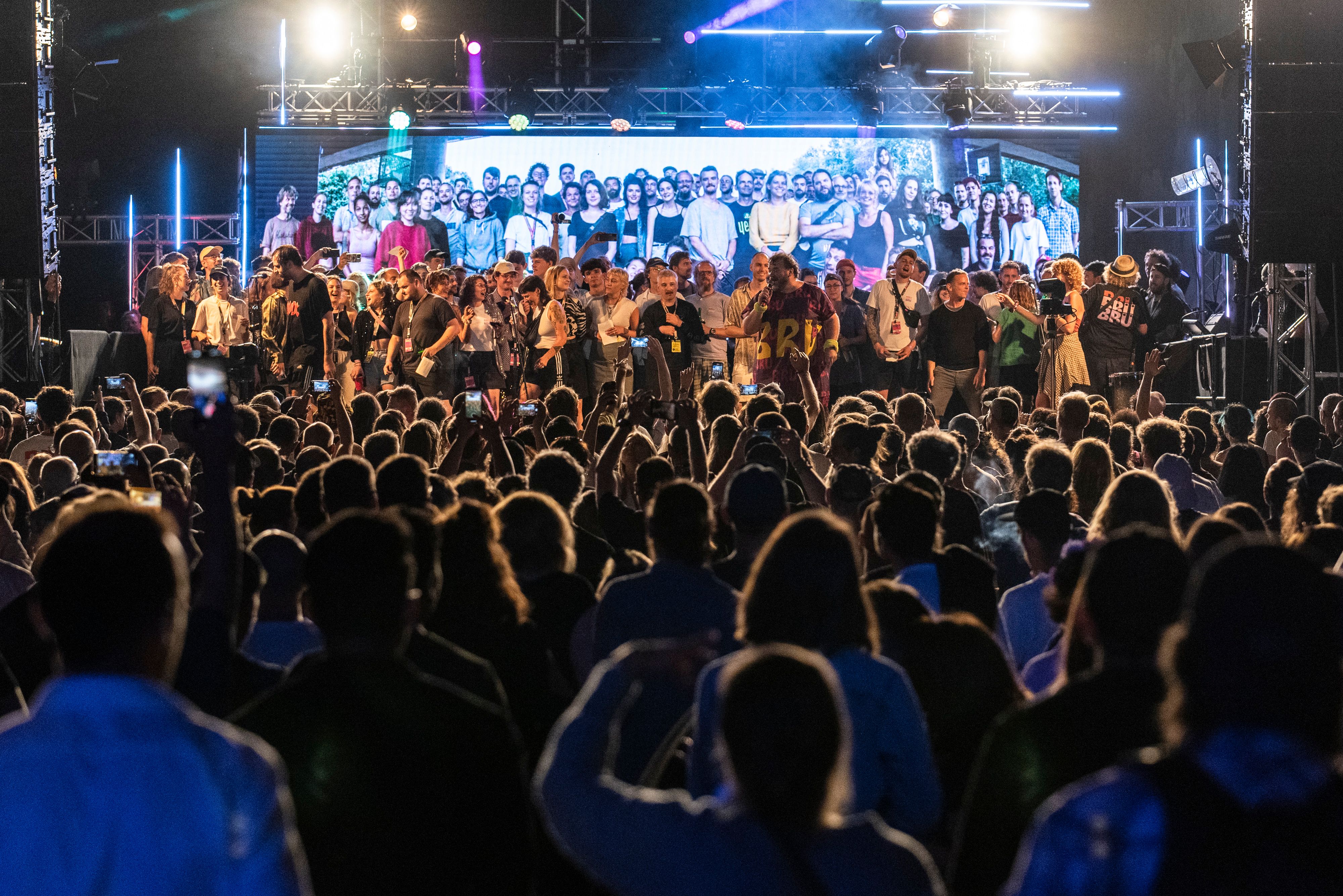
Thanks to the 150 volunteers of Brückenfestival e.V. and everyone who has passionately helped make it happen since year 2000. This year, they went all out with merchandise. Jürgen Held, who worked on the design adaptations, shared that our ColorFont made the design process incredibly easy for him.
We’re lucky that volunteer work is contagious. Thanks to NaN.xyz for sponsoring the additional, more legible but still funky typeface, Jaune.
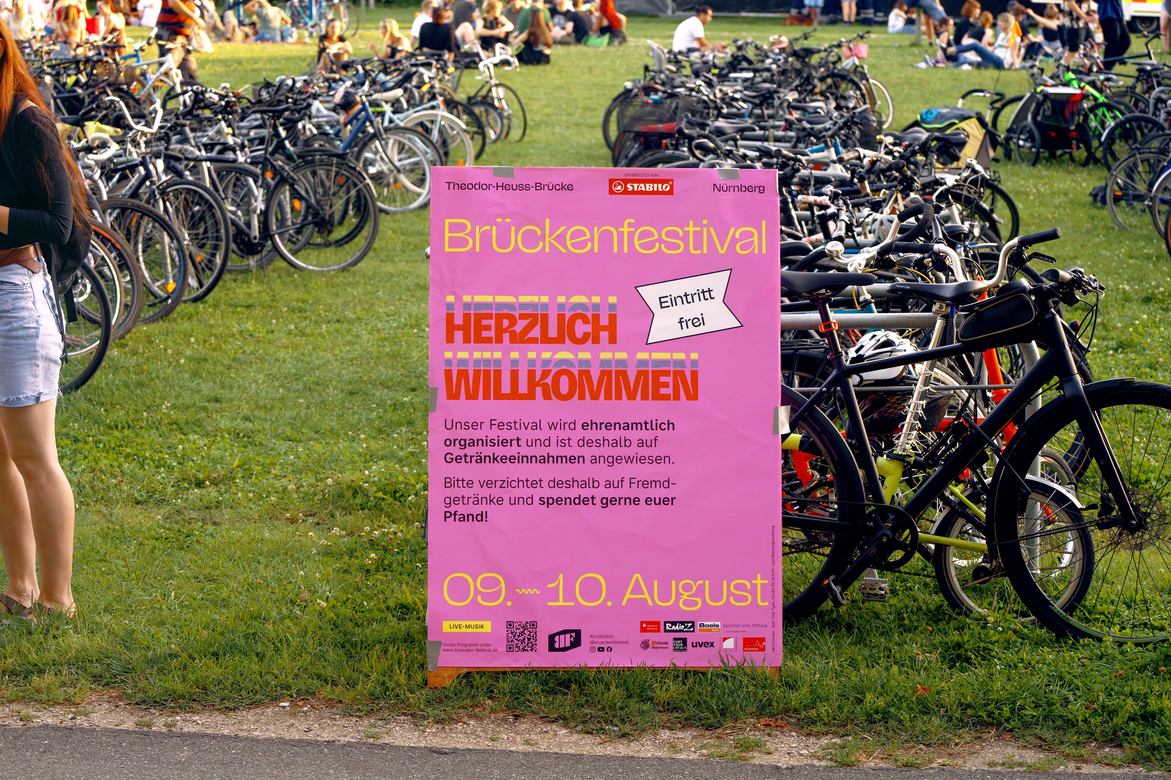
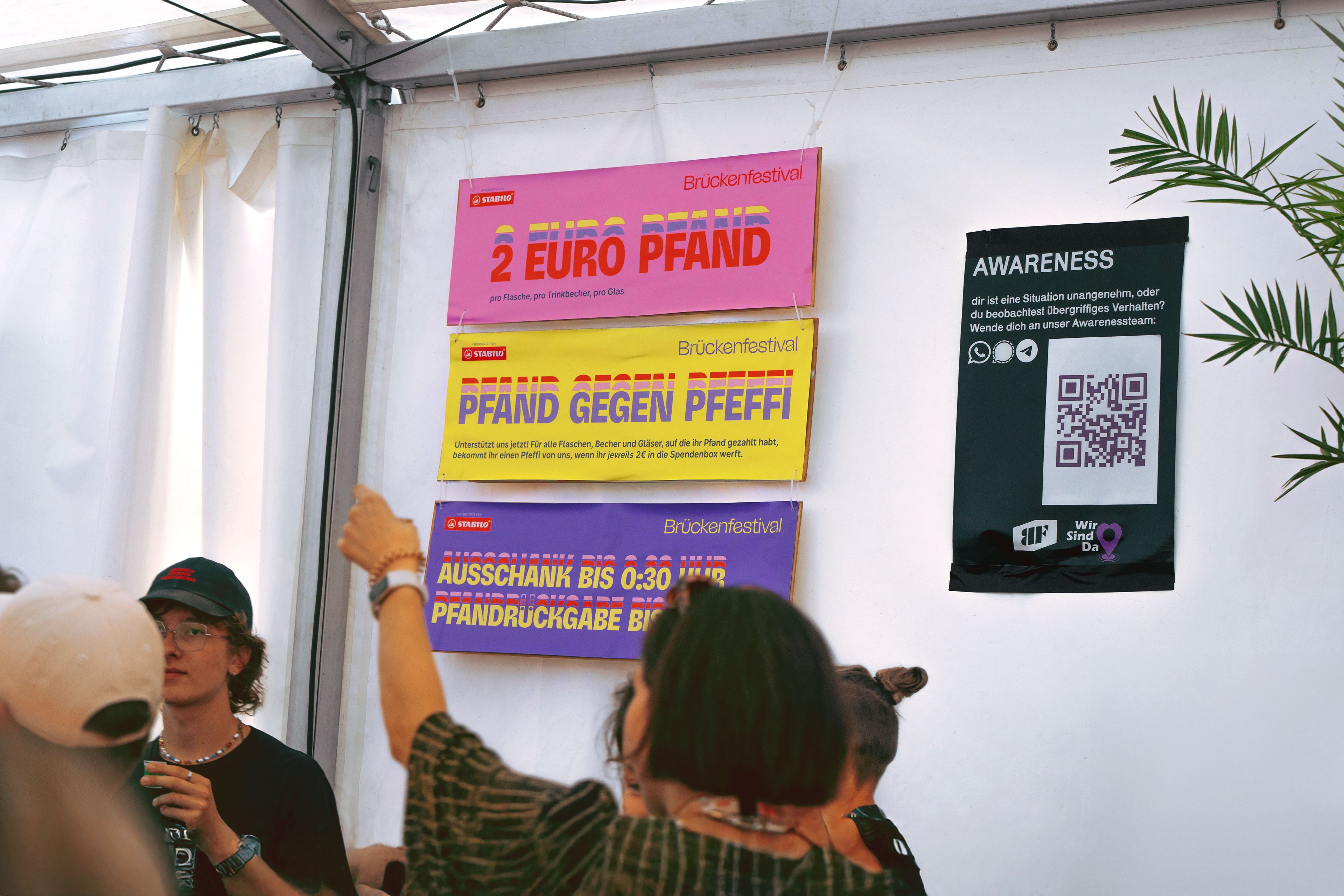
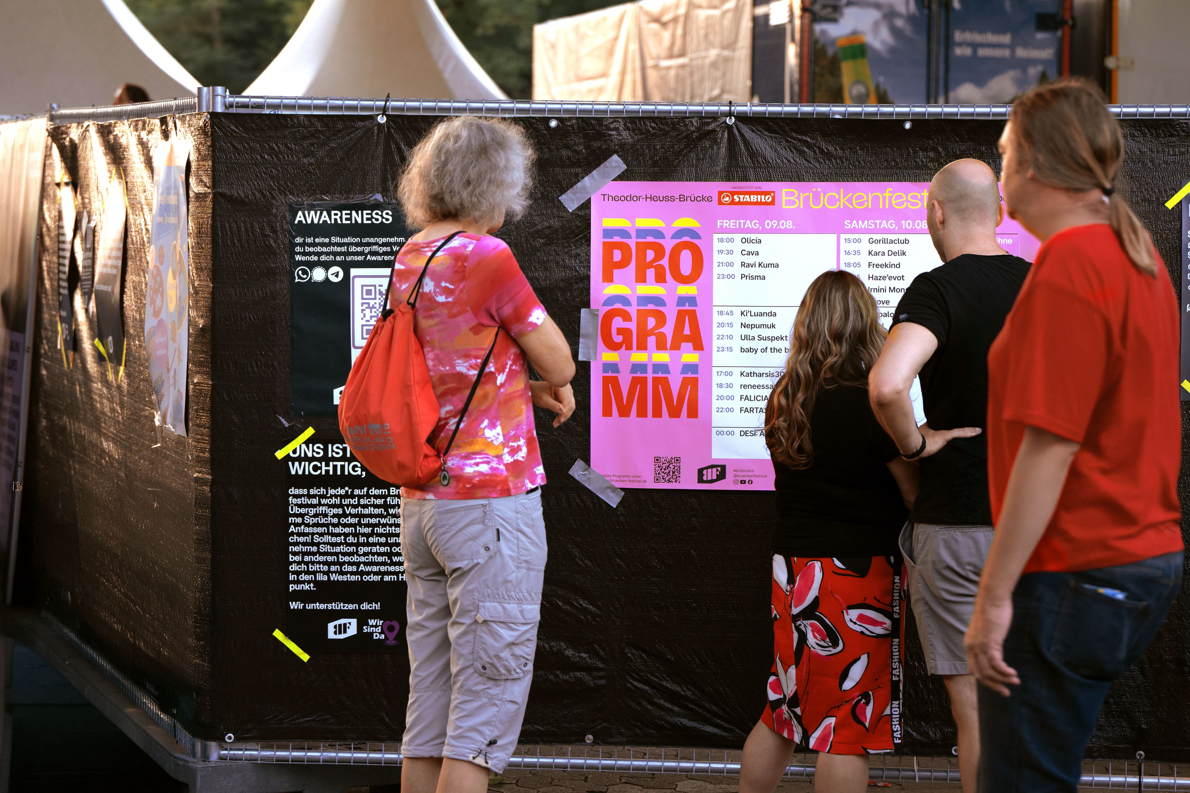
See you next year!
Next Project