cin cin
Client
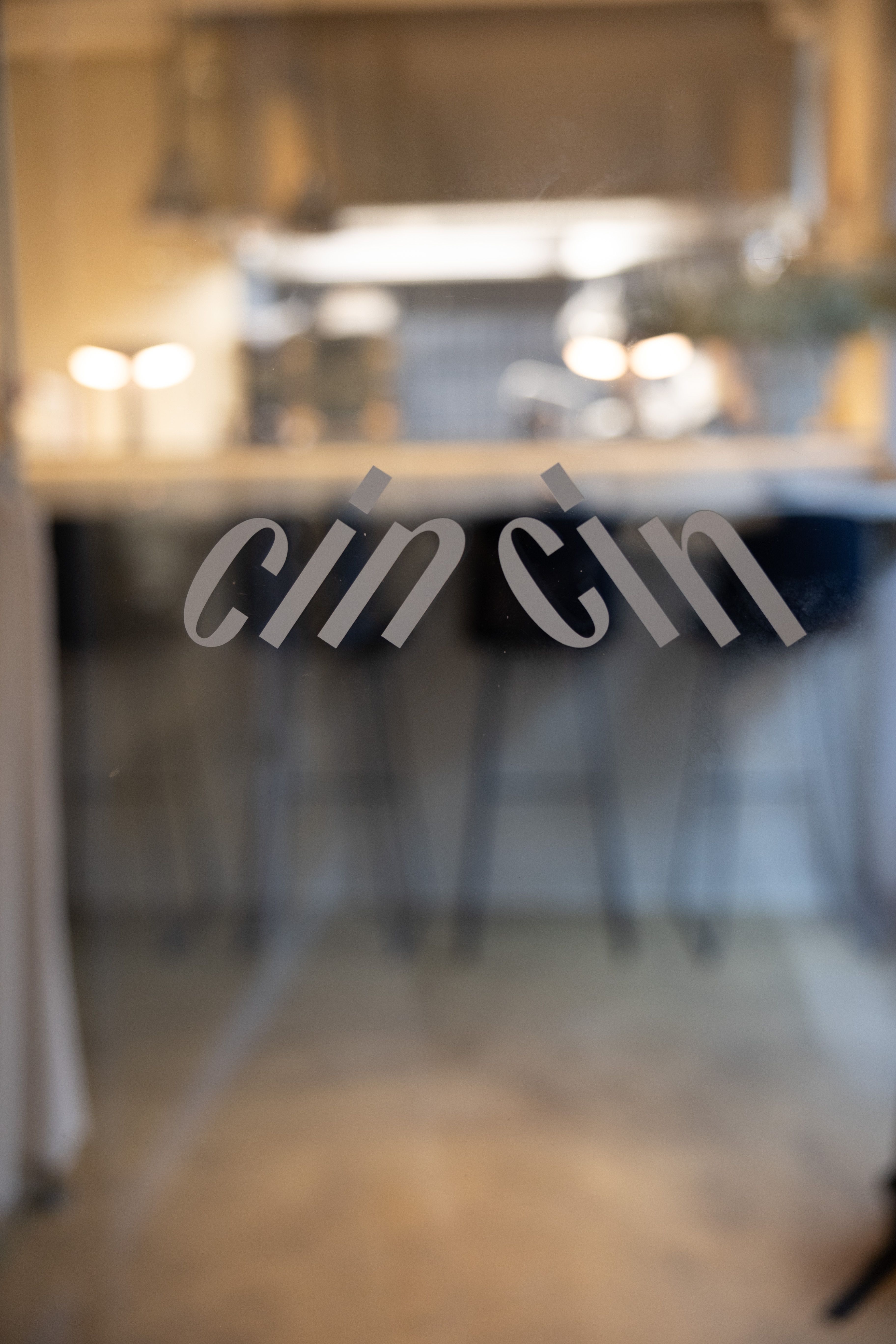
cin cin
CATEGORY
Branding Concept, Logo Design, Typography, Colors, Menu Cards
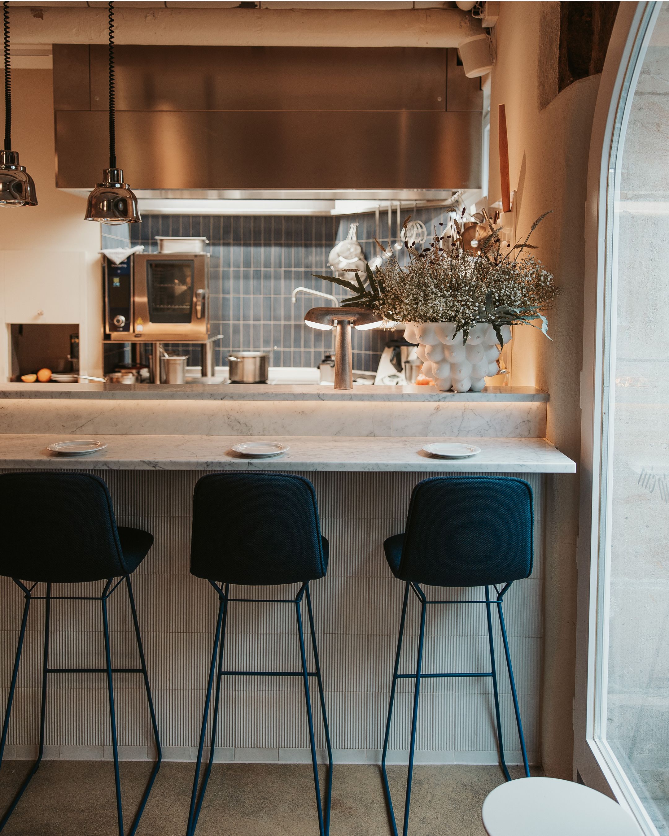
BRANCH
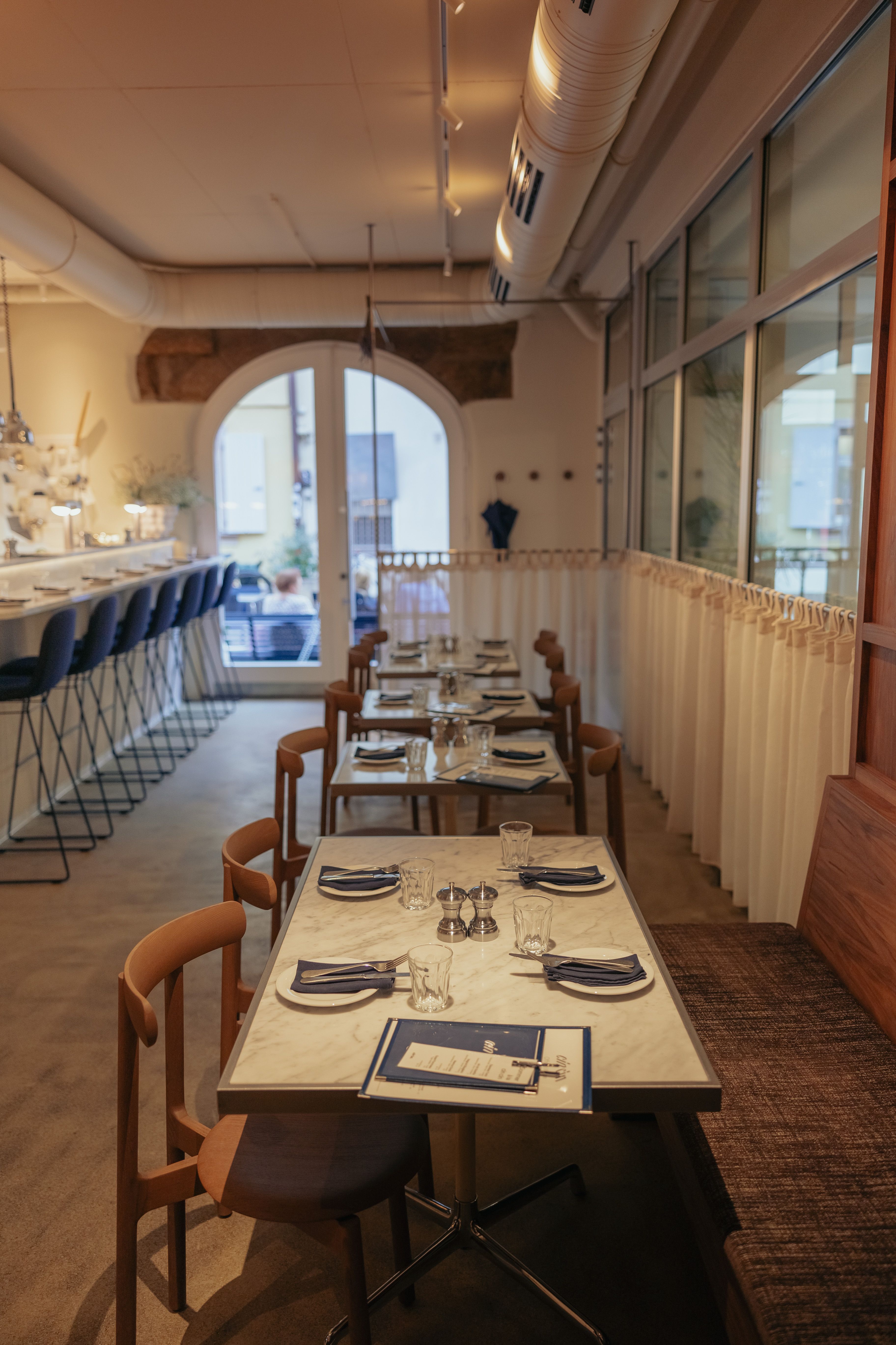
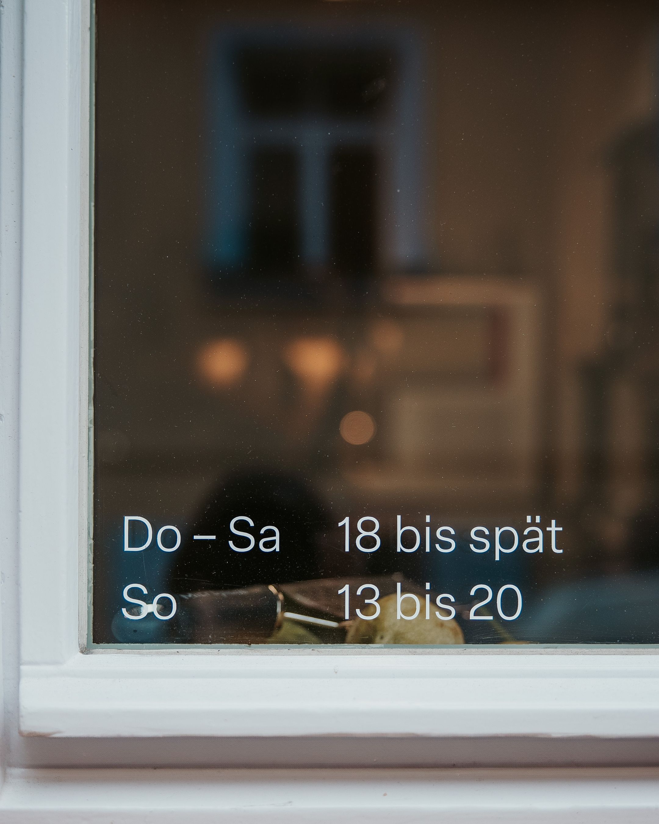
Bistro & Bar
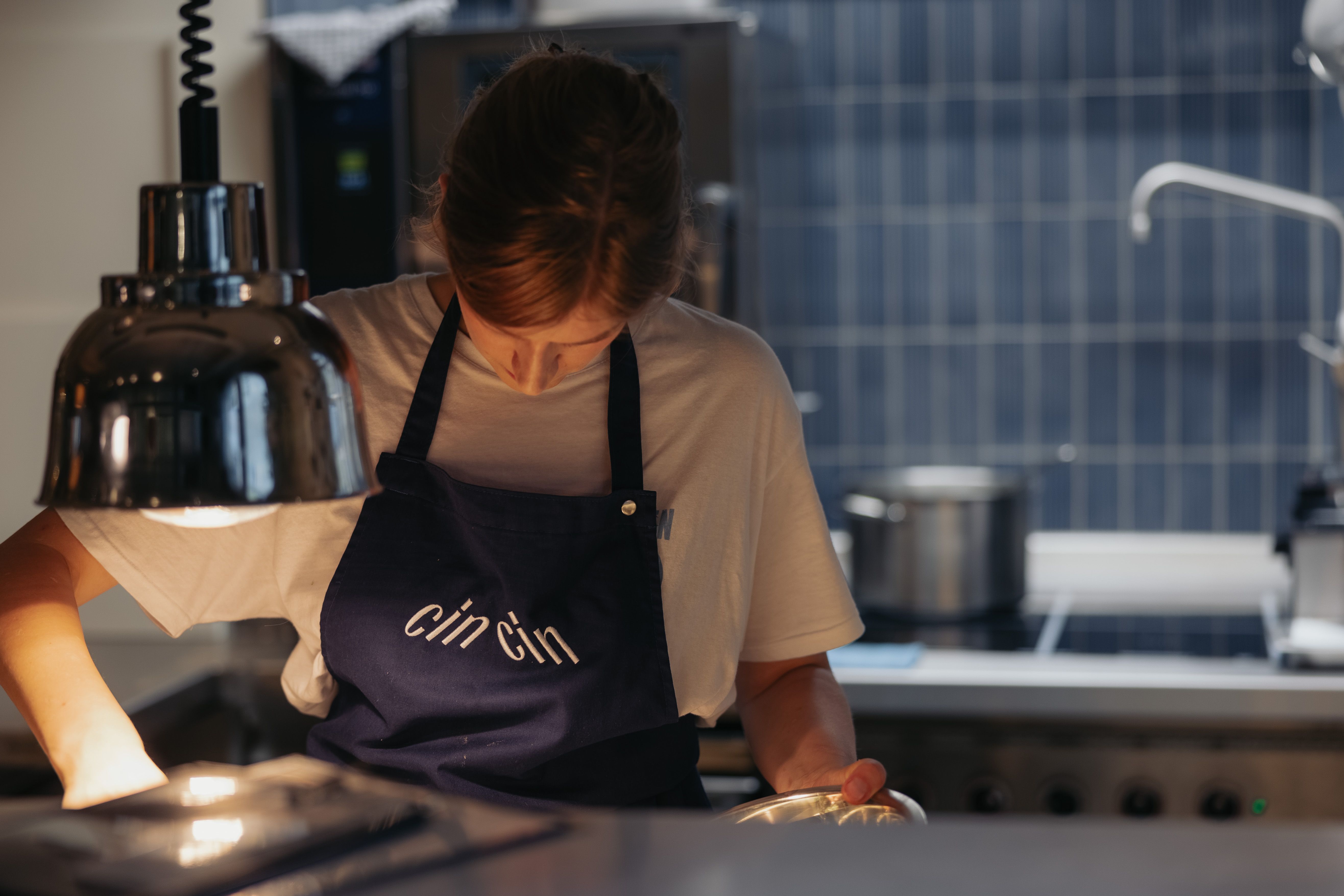
Photos
cin cin employees & Sebastian
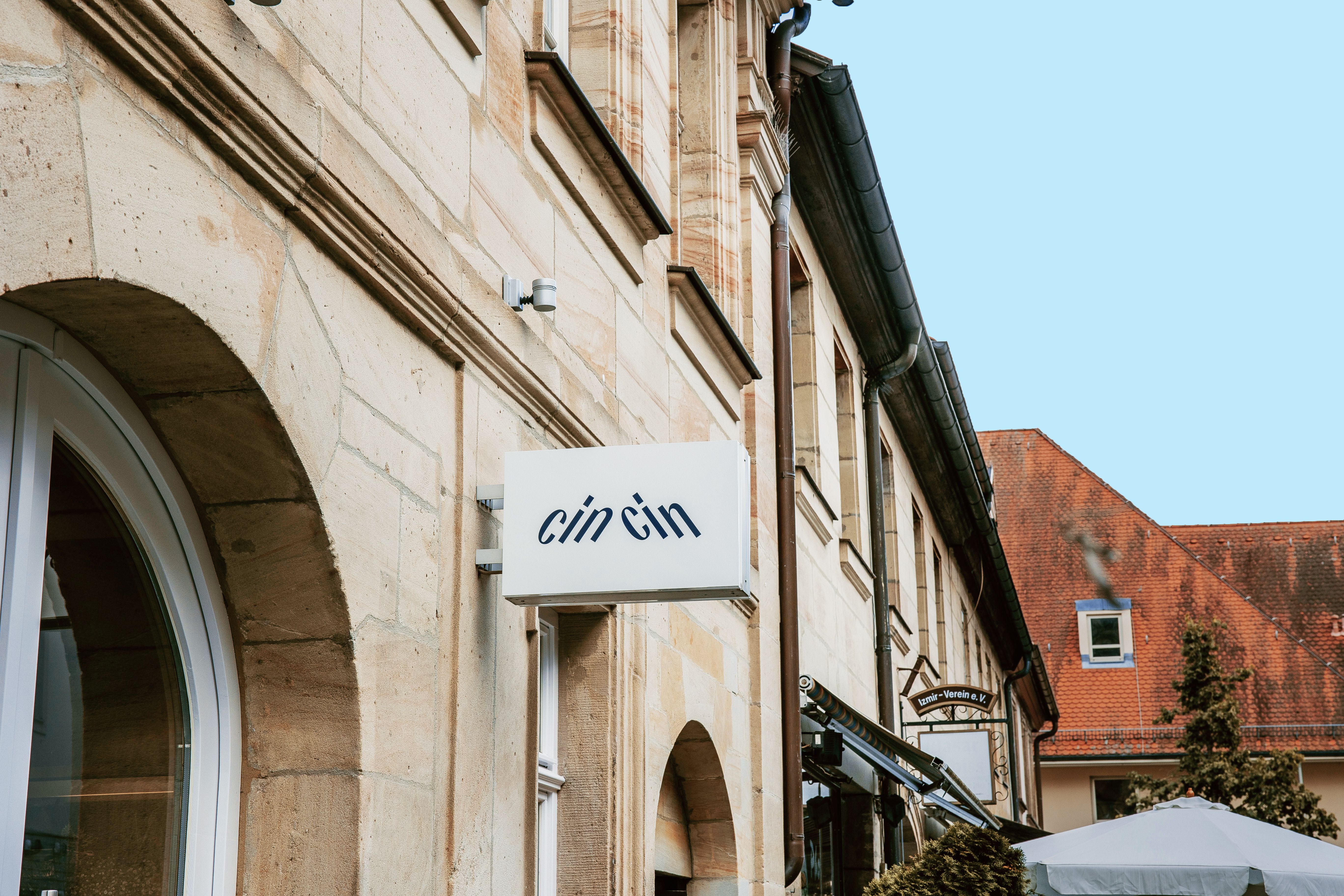
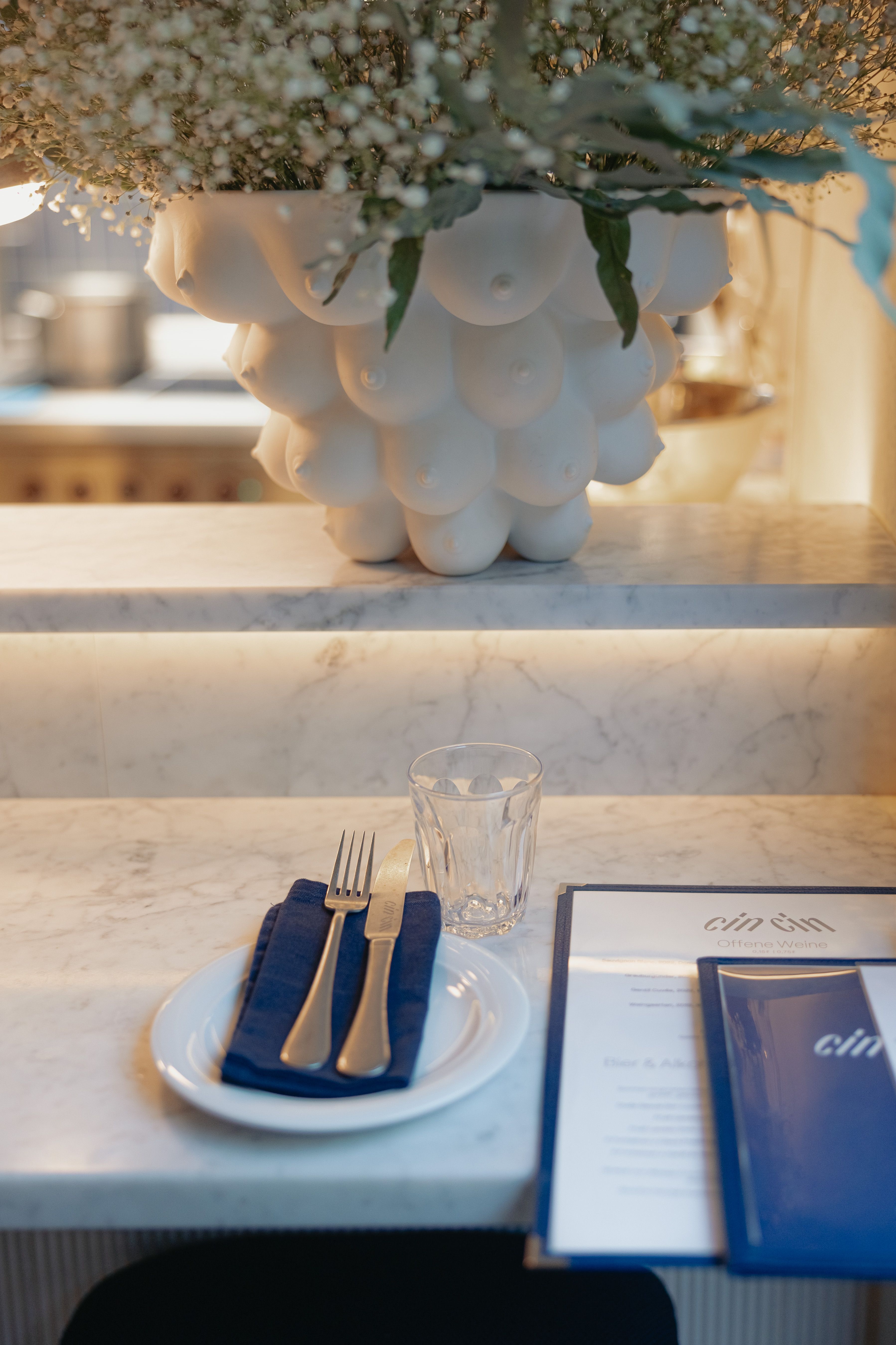
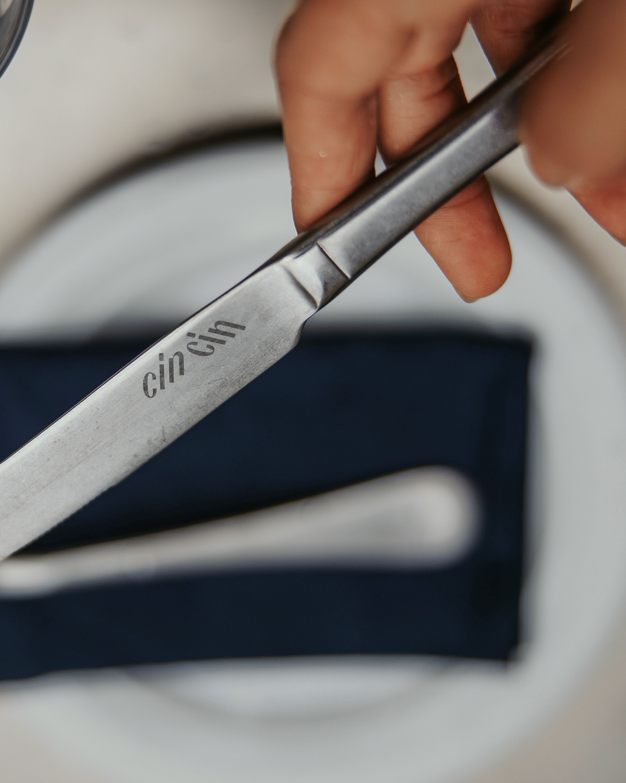
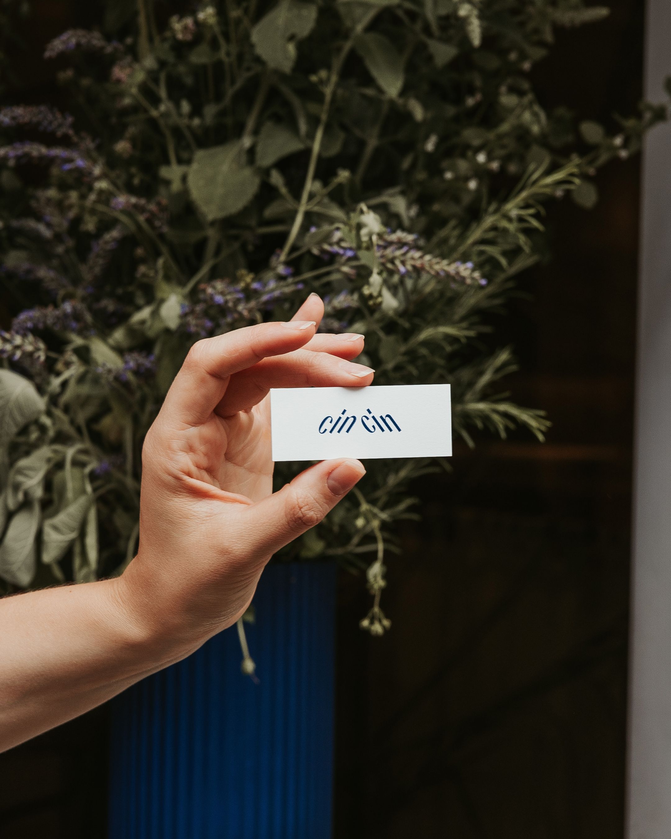
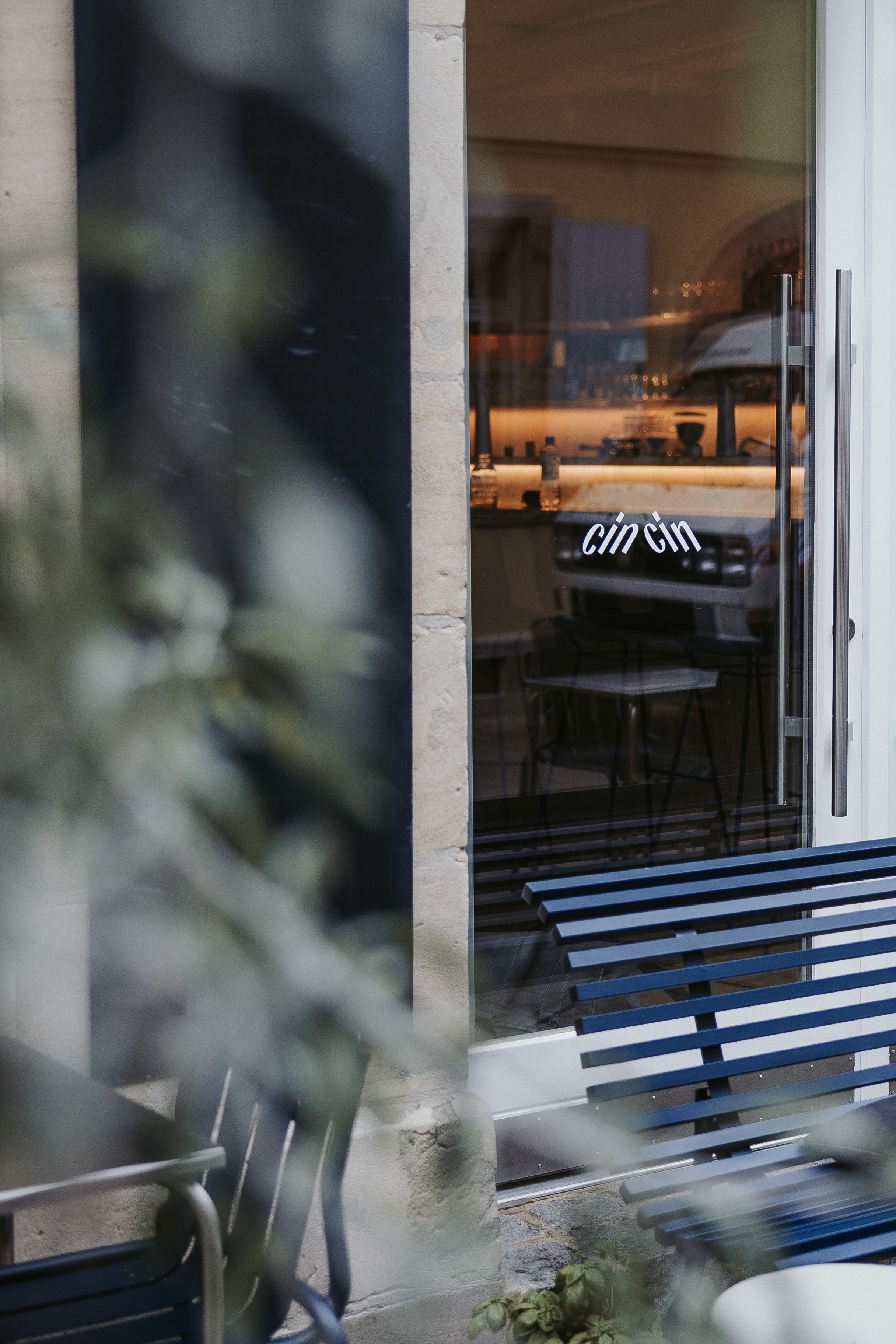
Waiting for the sound of two glasses clinking before they meet at a 30-degree angle: cin cin – a sound you'll hear often in Erlangen. For the fanciest Bistro & Bar in Franconia, we designed a typographic logo that symbolizes this moment with a Rotalic forward and backward. Hannah Gericke, a renowned chef, has created a space filled with taste and magic, from the small street to the finely picked napkins.
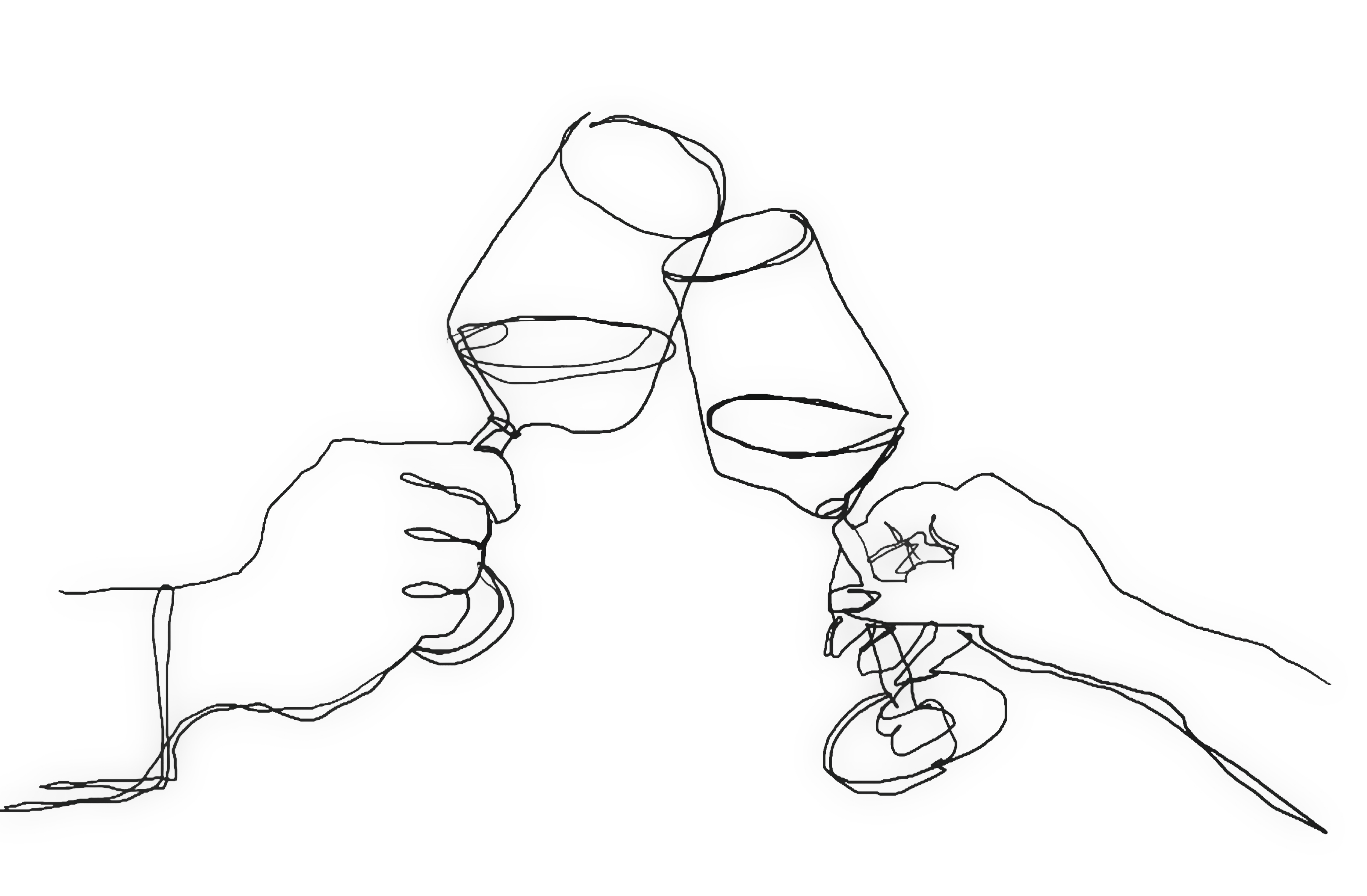
Monoline sketch by Mona
Typographic logo
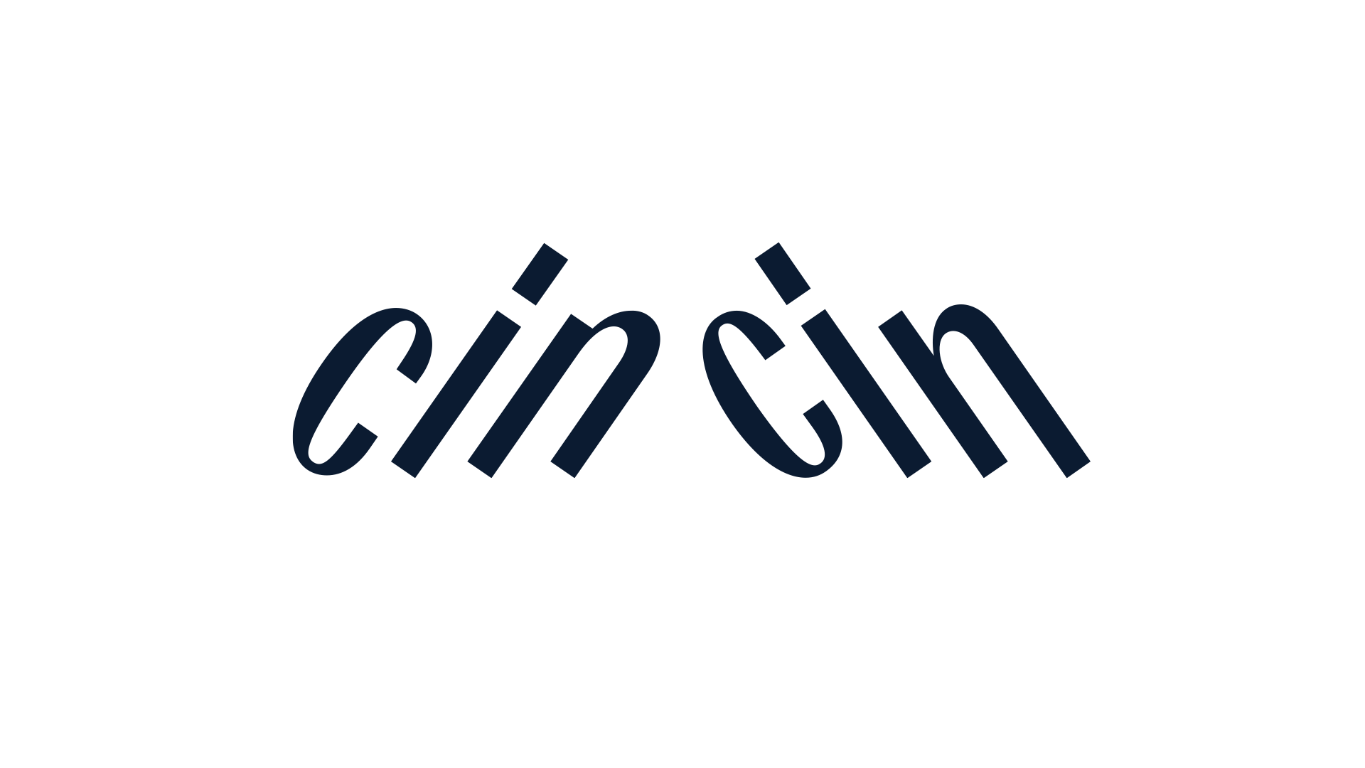
The chosen logo idea was sketched very quickly, but finding the right typeface to fit the purpose proved to be a challenging task. So-called rotalics are rare. We almost found one to suggest to Hannah: a stunning condensed sans named Bourrasque 45 Est and Ouest. However, we ultimately had to reconsider and draw the logo from a new angle: we needed something that conveyed 30° Franconian fine dining rather than 45° Bavarian beer hall. 😉
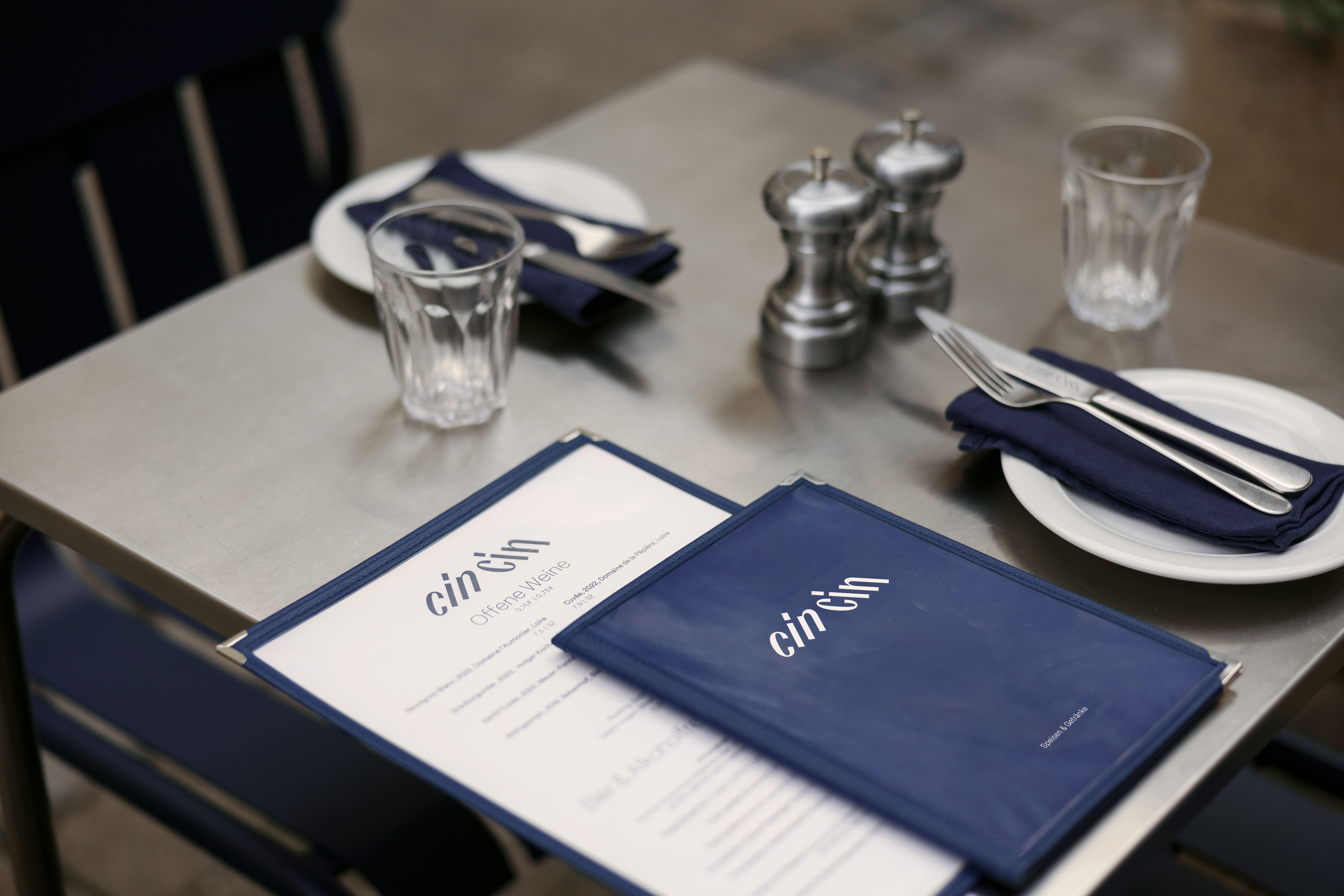
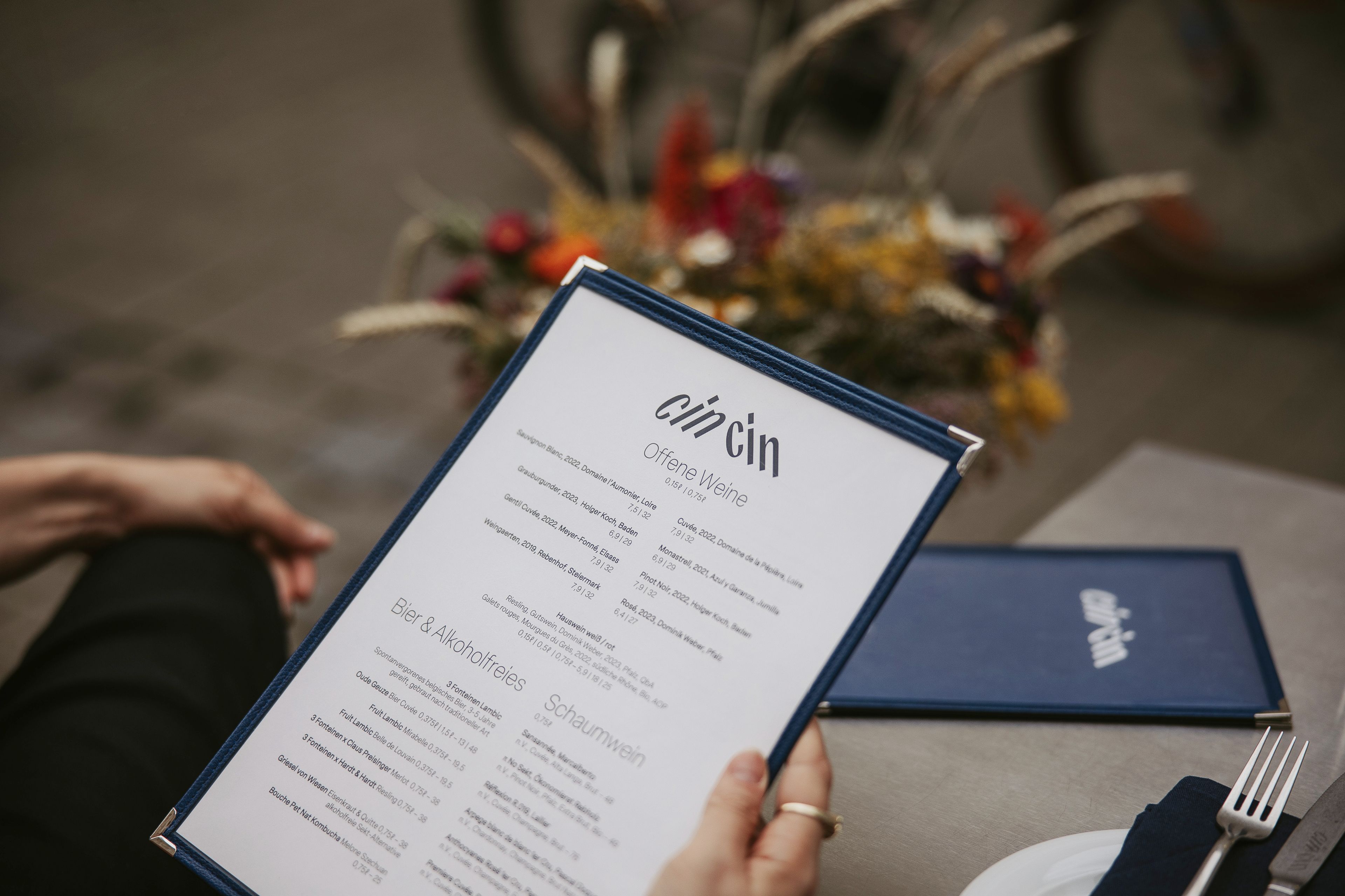
Weekly menu meets selected wine card
To achieve an exquisite look, the design should remain subtle. Since the logo already conveys elegance with a condensed and contrasting sans serif, we chose a matching typeface for the layouts: Elza by Blackletra Foundry in a very thin style. This brings in a fine, linear tone that complements the similar i-strokes.
The Layout idea is very much fitting the logo idea through its alignments towards each other. I bet you would have done the same.
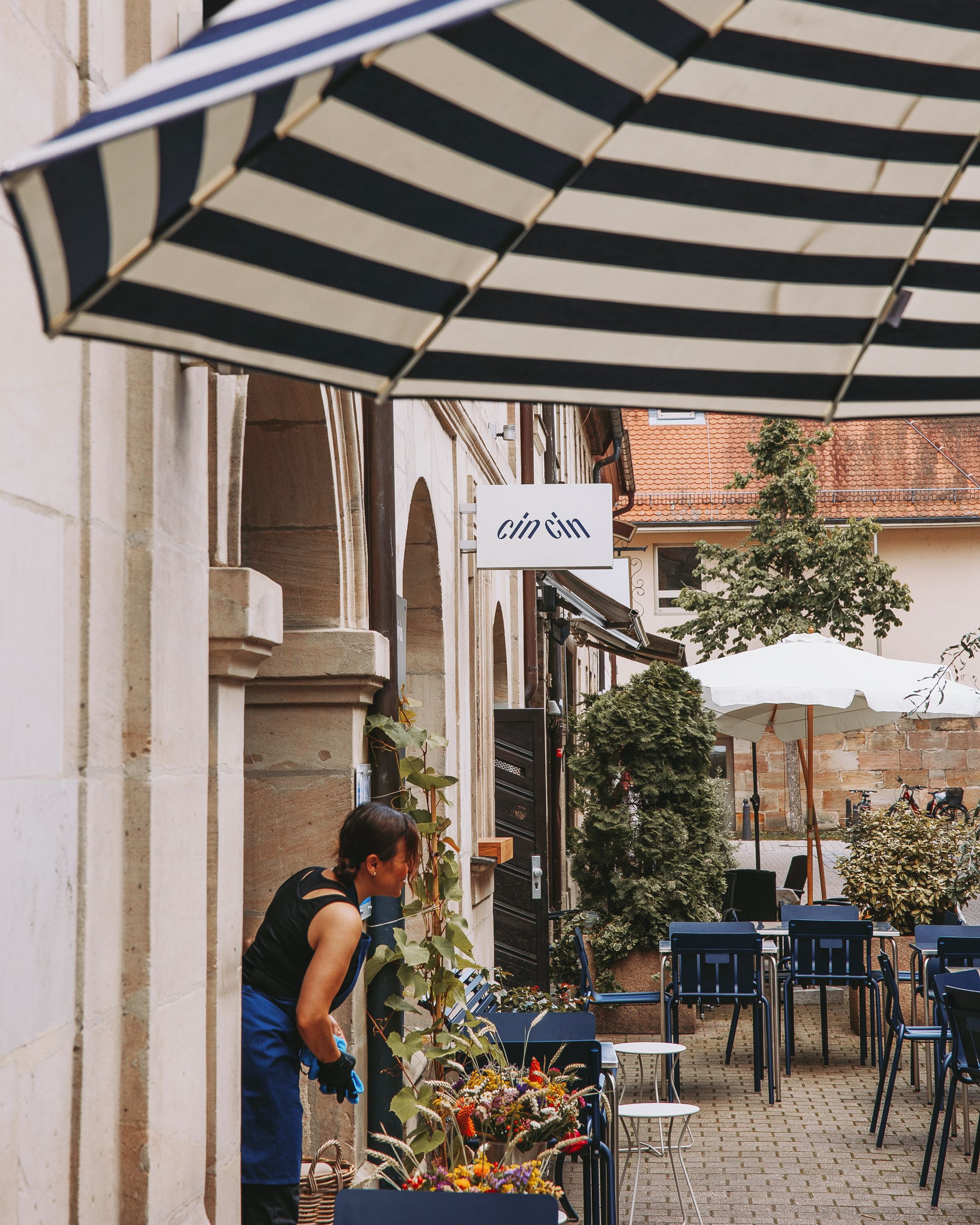
Warm recommendation: Visit Hannah!
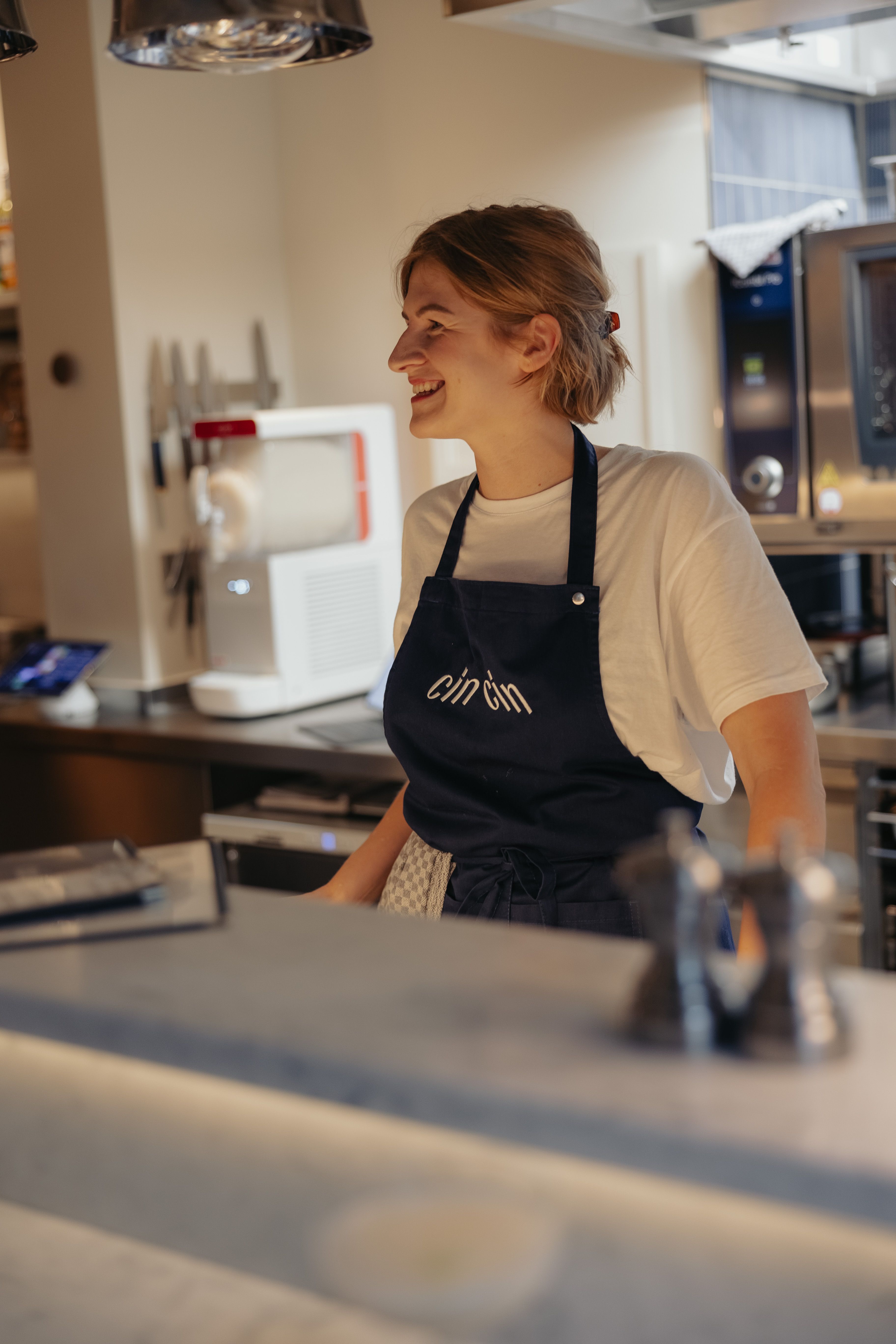
As her name, H-A-N-N-A-H, suggests, she thinks everything through from backwards to forwards. Thank you for your trust and for welcoming us. We really enjoyed refining the details and helping you find the right font that conveys high-class products, with a blue tone defined for all necessary color systems. Seeing the logo on every corner of your beautiful restaurant was truly rewarding – cin cin!
Next Project