OLA
CLIENT
OLA – Office for Landscape and Architecture
category
Branding and Webdesign
PHOTOGRAPHY
Maria Bayer
Square. Practical. Good.
The three young aspiring architects from Nuremberg wanted a suitable corporate design for their newly established business that could be easily applied across various media. A clear and straightforward design is intended to provide a fitting stage, especially for the commissioned web design of their portfolio.
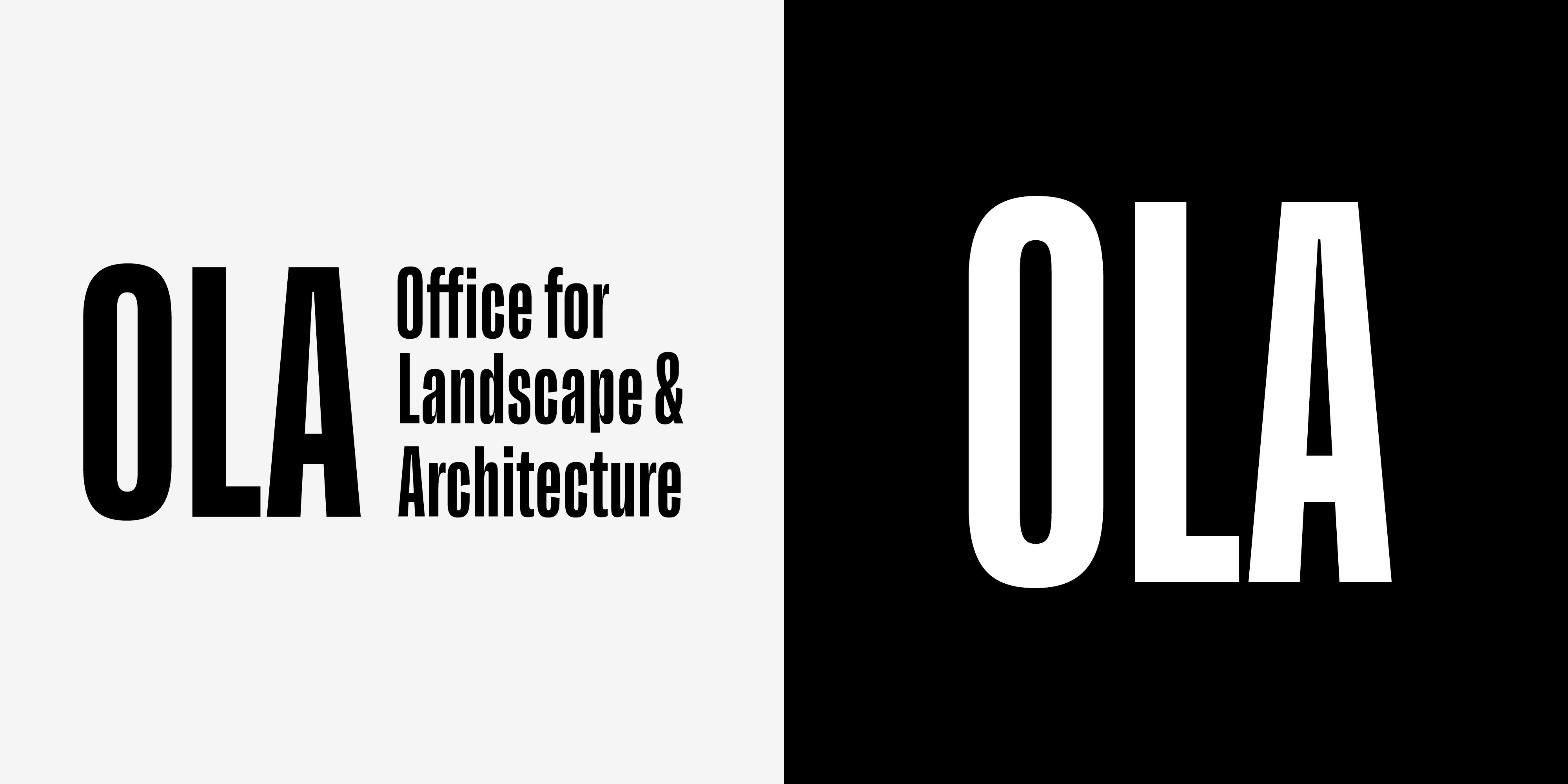
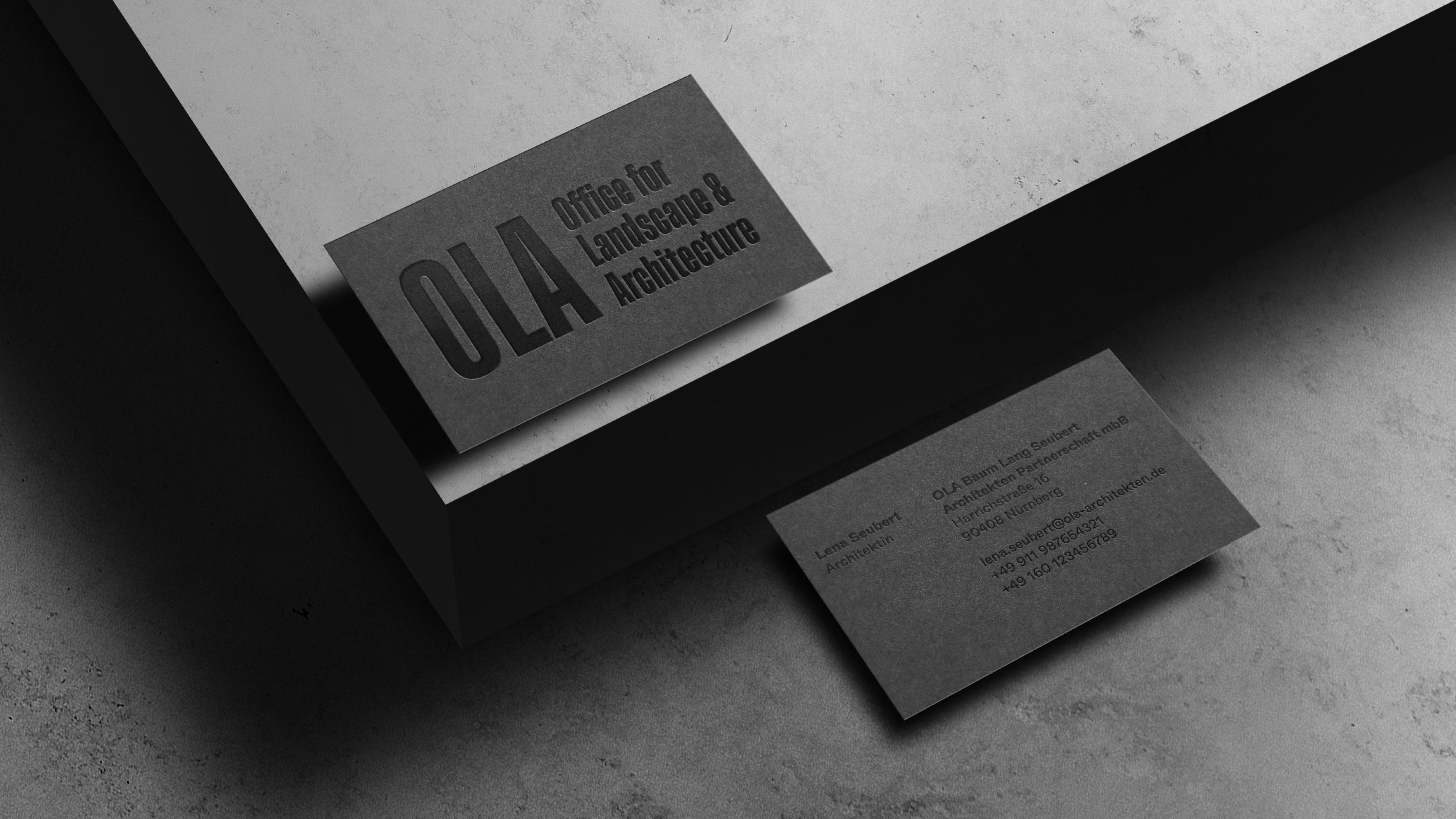
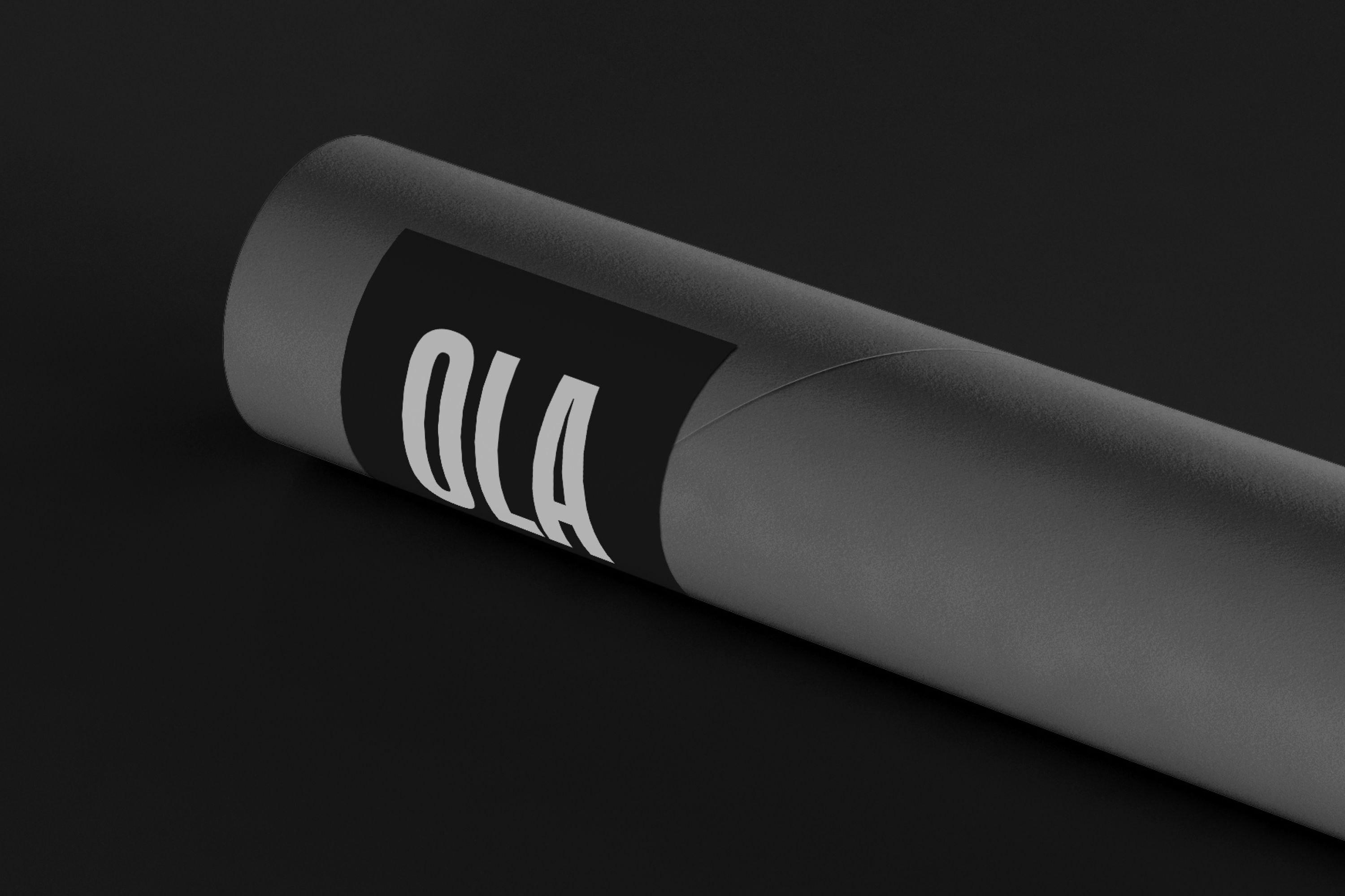
To start, we created a compelling condensed wordmark – a purely typographic logo composed of narrow letter shapes that evoke the imagery of city buildings lined up in rows. The abbreviated version consists of the initials »OLA,« forming a square that stands out on its own or seamlessly integrates into social media formats like Instagram.
Logo process
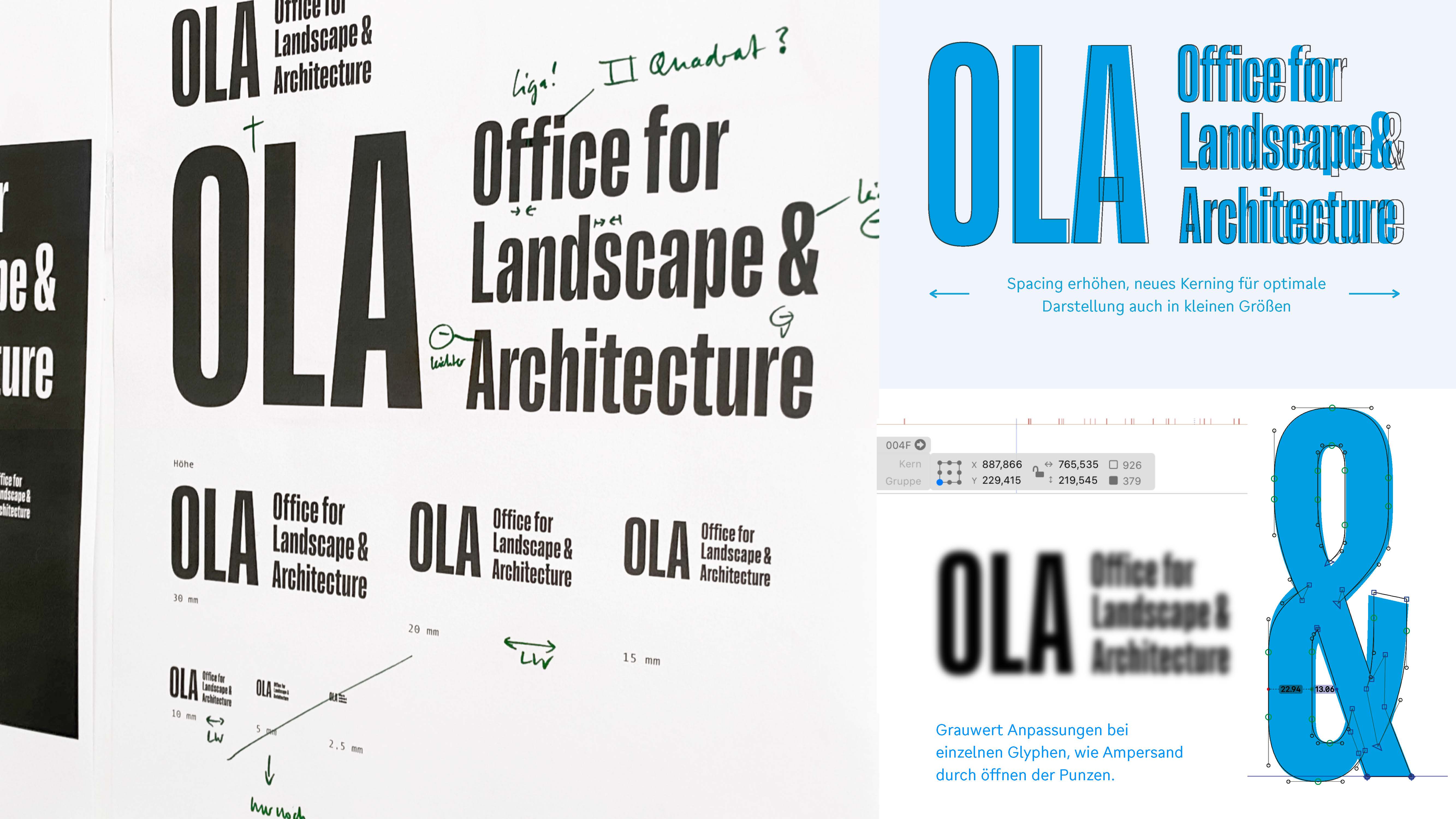
Our typographic logo concept found its ideal foundation in the Lektorat typeface, masterfully crafted by Florian Fecher. With its exquisite design tailored for headlines, we made minor adjustments to seamlessly adapt it into a versatile logo across various sizes and mediums. Furthermore, we fine-tuned the weight of the ampersand adjoining lowercase letters to harmoniously align with the grayscale.
From logo to layout system
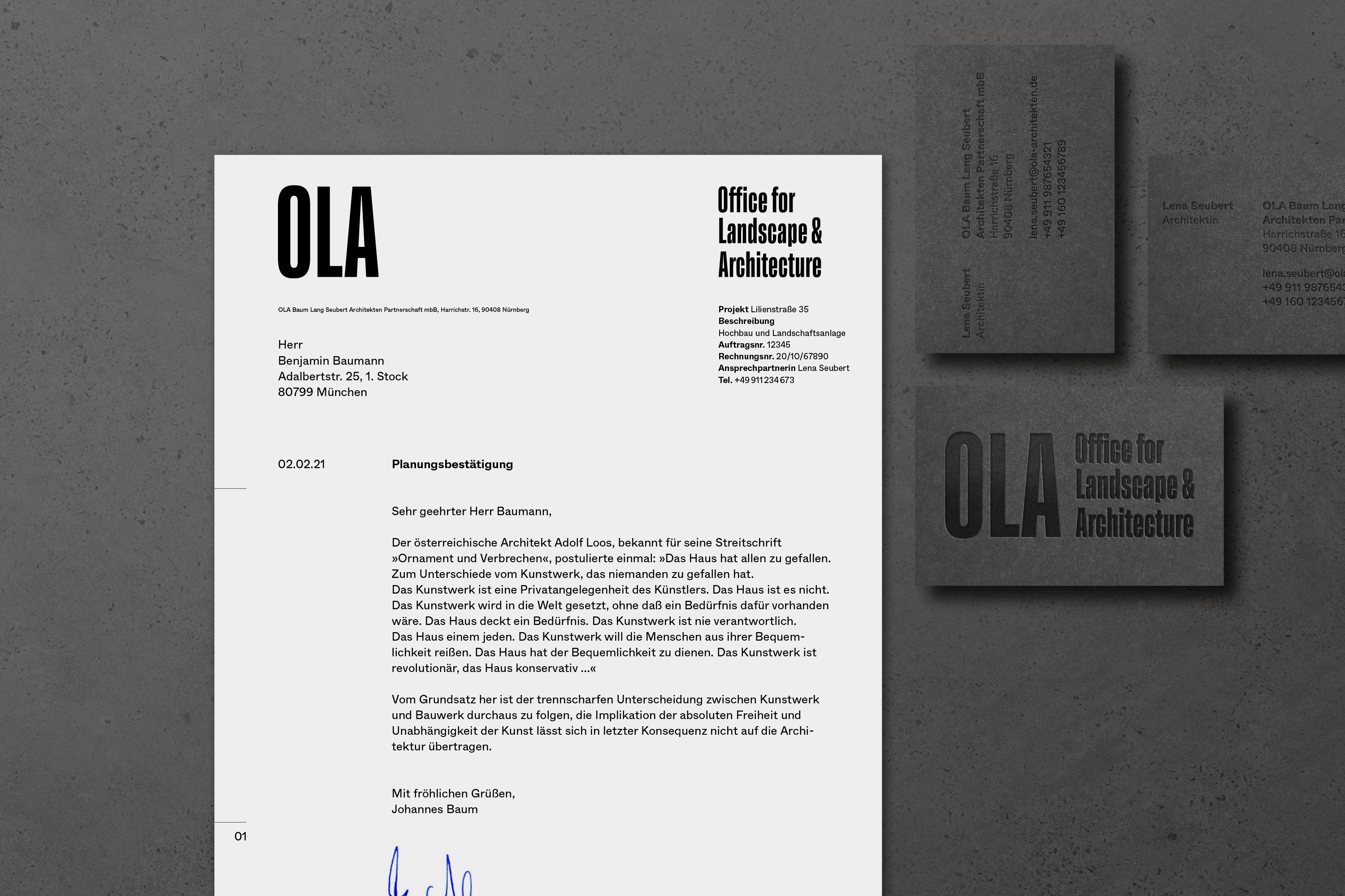
A chic and unembellished aesthetic, accentuated by generous whitespace, embodies a straightforward attitude. Drawing inspiration from the logo’s binary elements, we have created a simplistic layout principle that aligns text within the second column to create additional whitespace.
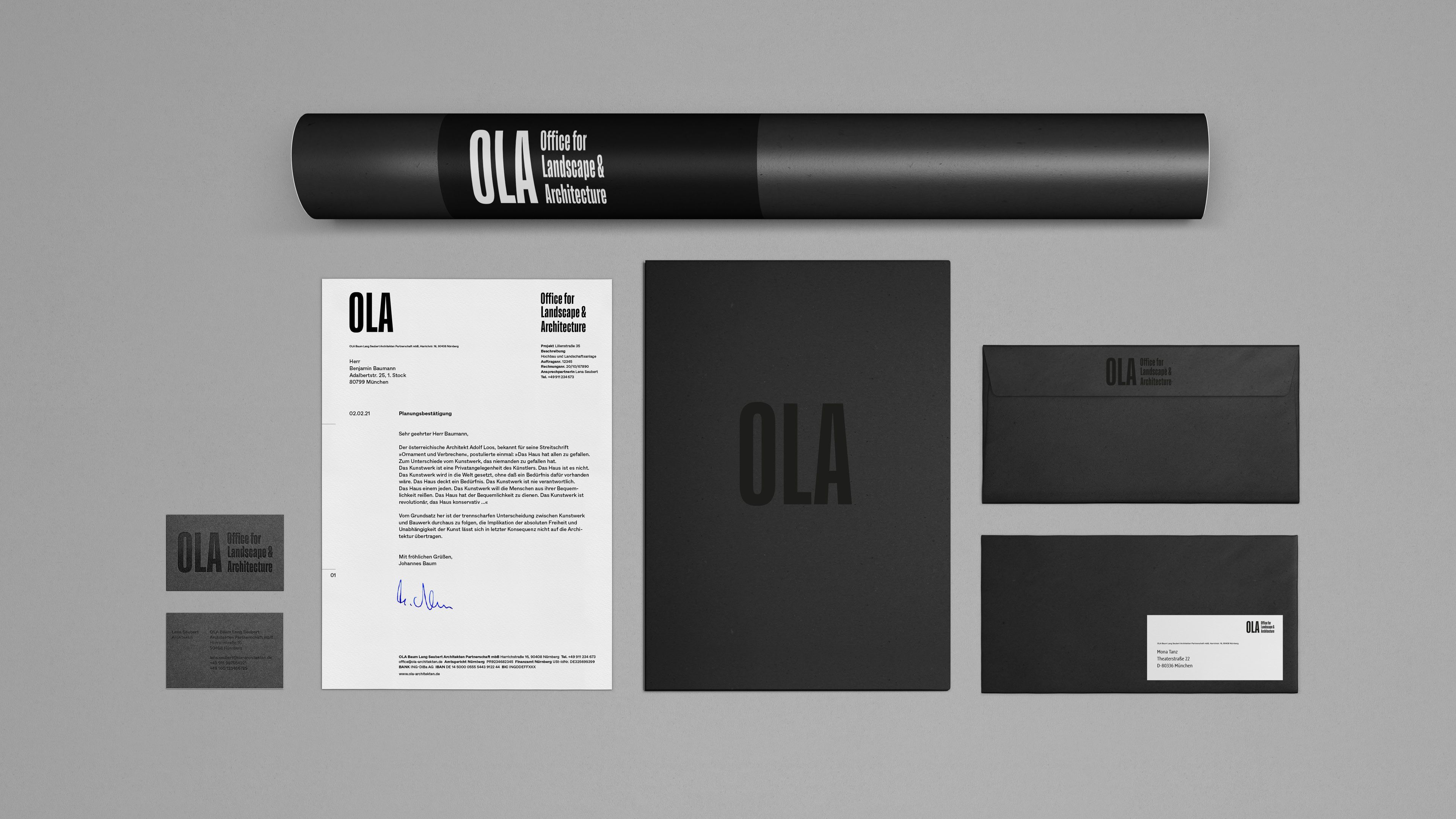
The use of the boldly rectangular logo forms combined with clear, small typography set in Whyte by DINAMO gives a legible and crisp appearance. The combination of the logo and a well-chosen typeface is not only a handy toolset for business cards and invoices but also serves as a strong foundation for corporate design elements that will maintain visual consistency across all touchpoints.
Webdesign
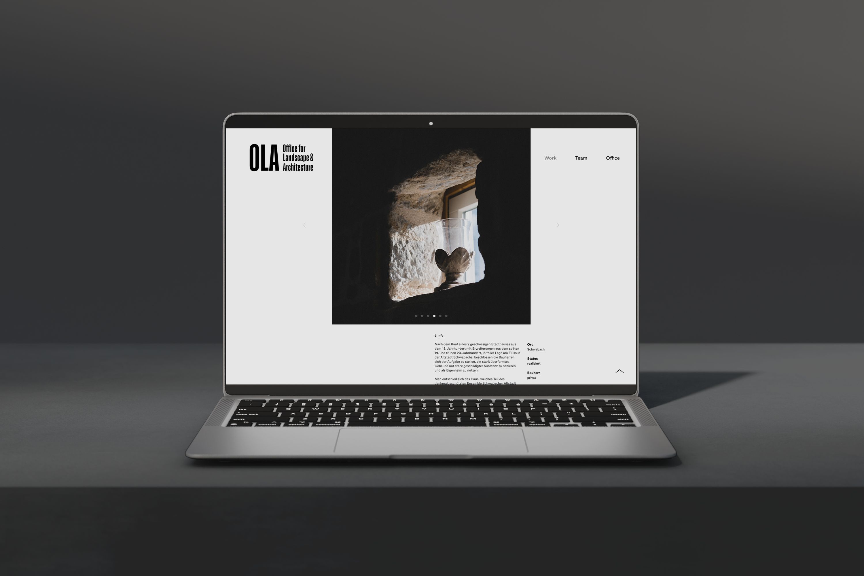
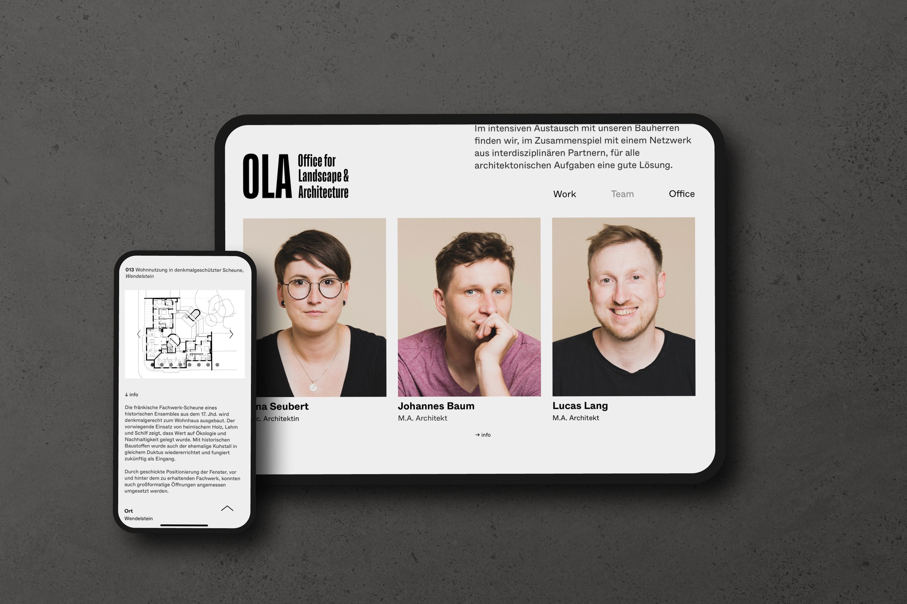
To start their business, OLA architects required the development of a user-friendly website. The UI design incorporates a sleek black-and-white aesthetic, providing the ideal platform to showcase their broad portfolio. To infuse a sense of intimacy into the clean, straight-lined design, Maria Bayer brings us up close through her portraiture and documentary-style photographs of OLA’s work.
Alongside this, we provided a workshop to familiarize them with the WordPress-based CMS tool, empowering them to autonomously manage and consistently update their portfolio — we love to see you grow!
Next Project