Schauspielhaus Graz
Short facts
CLIENT
Schauspielhaus Graz
CATEGORY
Corporate Typeface
COLLOBORATION
Layouts and CD by Colourborative
Fotos by Schauspielhaus Graz, Johanna Lamprecht, Sascha Rybas
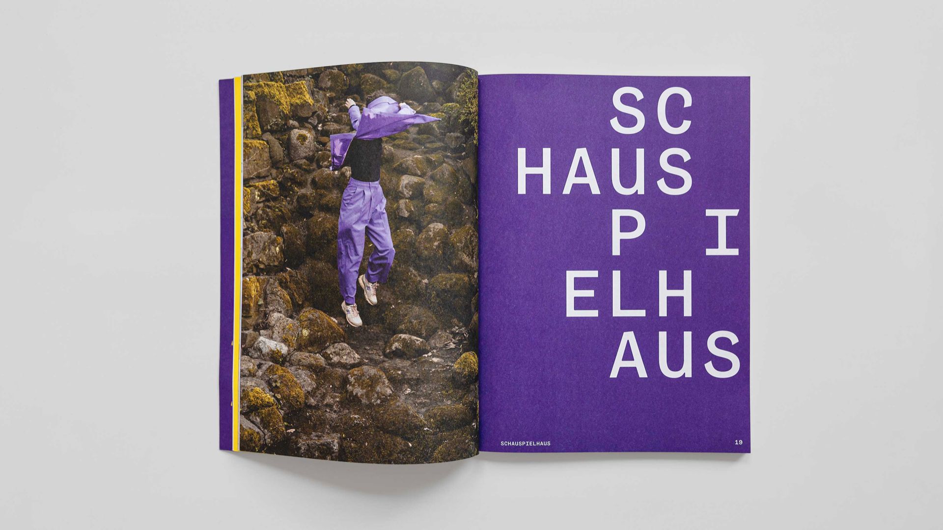
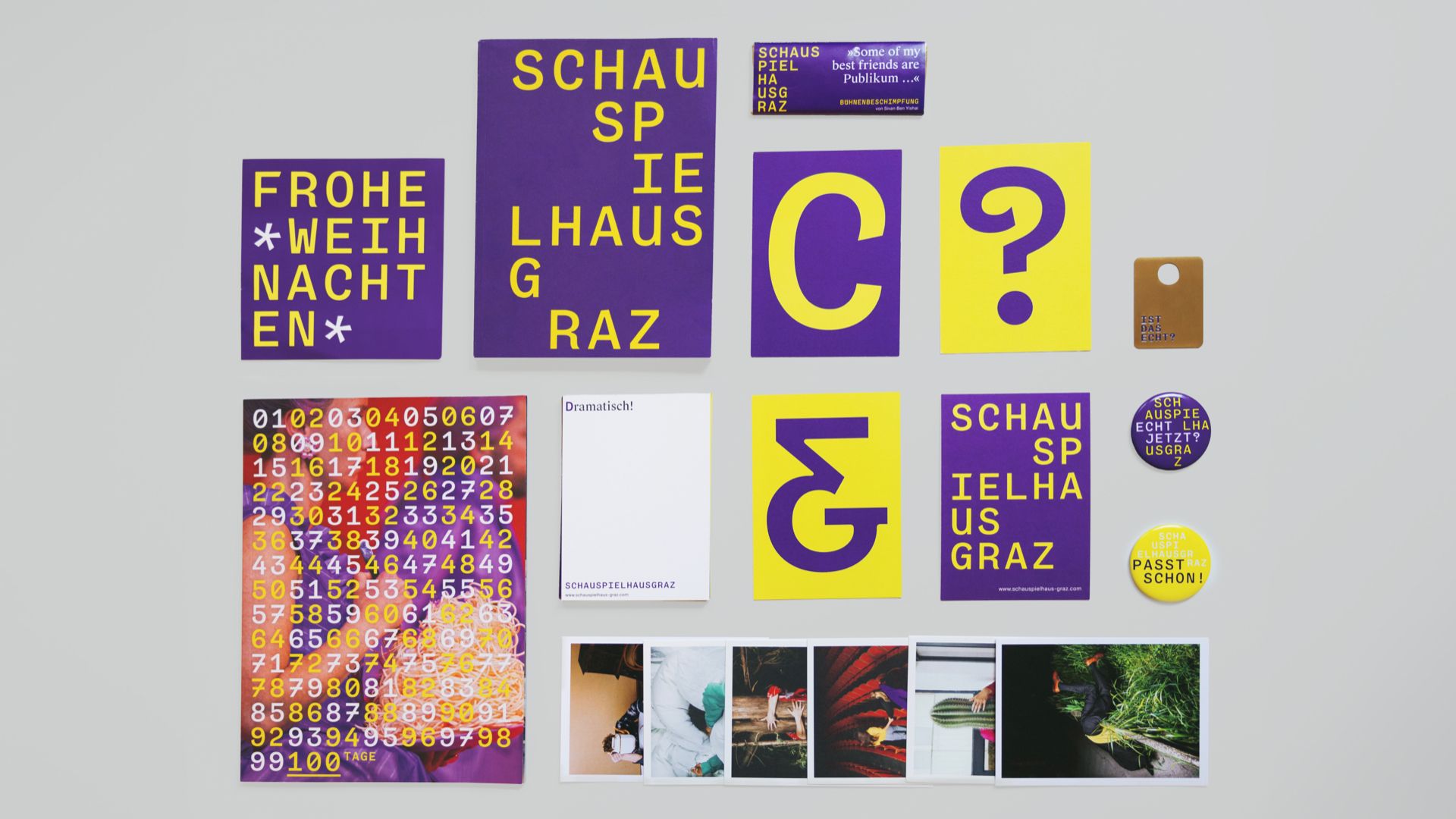
The grand stage for new a visual voice!
The grand stage for new a visual voice!
For the new season of 2023/24, the Schauspielhaus in Graz is not only getting a new artistic direction but also a custom brand typeface. The creative agency Colourborative quickly realized that the theatre needed a new visual language with a distinctive unique appearance in the form of its own typeface. This typeface is meant to make the Schauspielhaus itself, as well as the upcoming season with its cultural offerings, stand out.
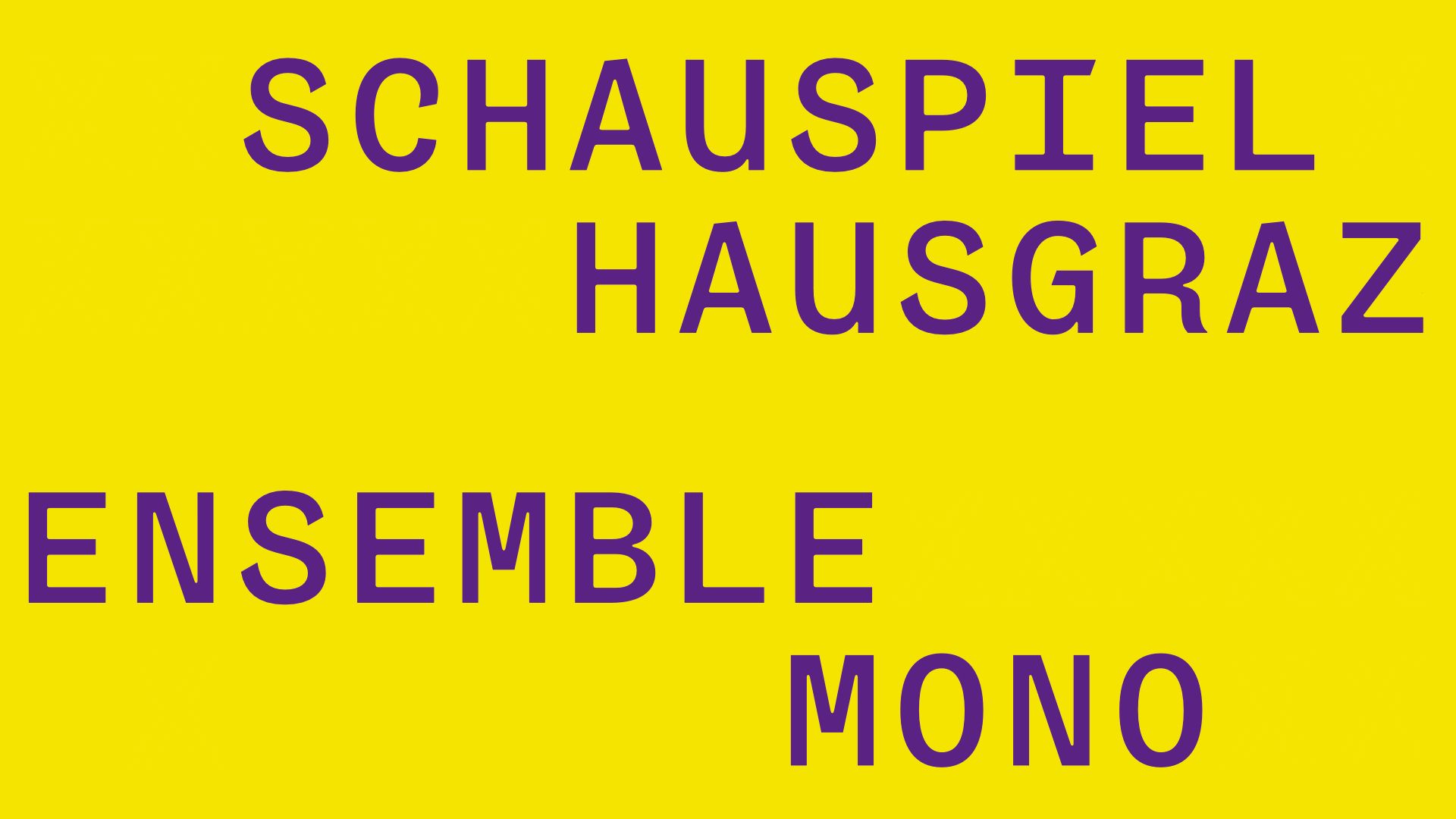
The specifications called for a mono-spaced font in uppercase letters. The long search for the right formal language was a success. We have decided to incorporate a touch of the old spirit and to make the independent, quirky character of the many voices in the house tangible. Our custom typeface Ensemble Mono has rocked the Schaupielhaus Graz since last summer 2023. Thanks for the colourborative colourboration and congrats to an outstanding branding!
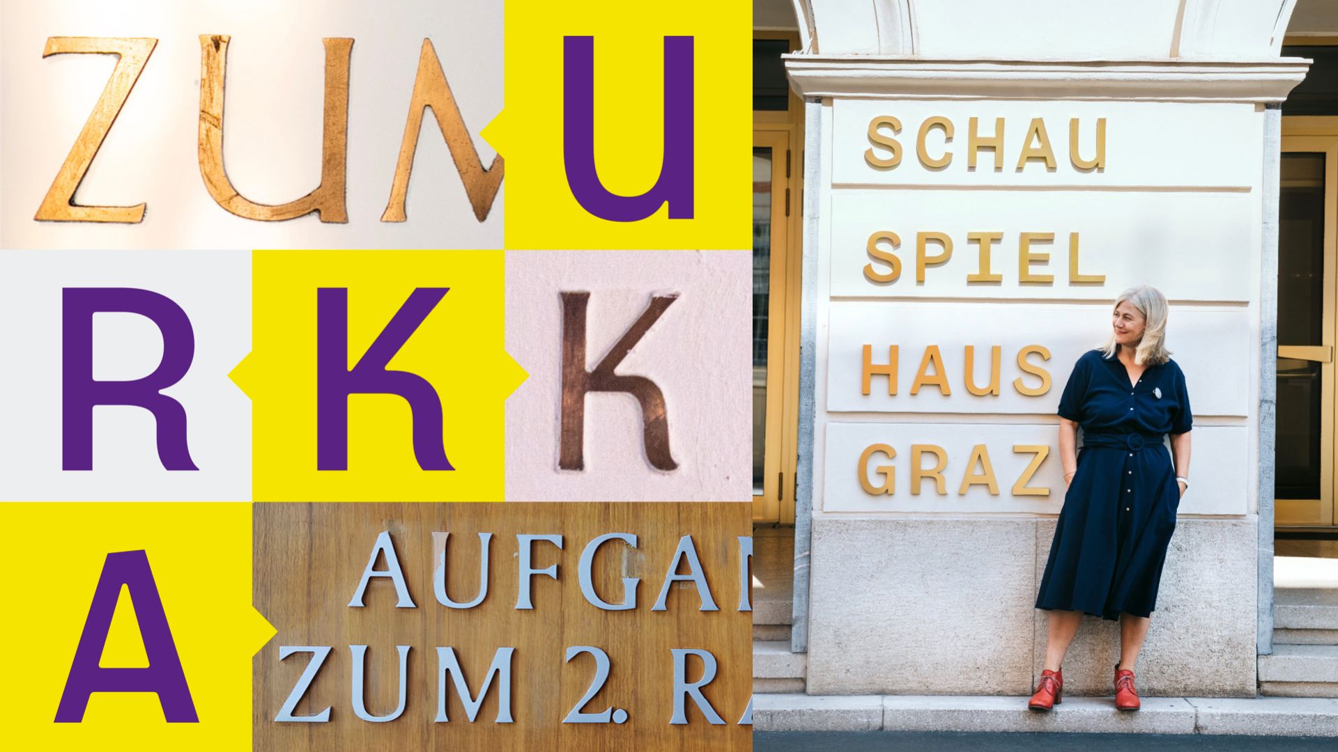
Luckily, Johanna rescued some physical letters from the Grazer Schauspielhaus installed around the ’60s. These inspired us to design a rocking R and kicking K. Moreover we recycled a few strong details that give a historical feeling like an additional terminal of the Uppercase U or the sloped roof A that has a distinct shape. With this Ensemble Mono manages to stand out and, with just one cut, to play across the house with all its media representing different voices. The new typeface with the subtle reference to the former signage with old copper letters is now reborn and welcomes visitors at the entry of the theatre.
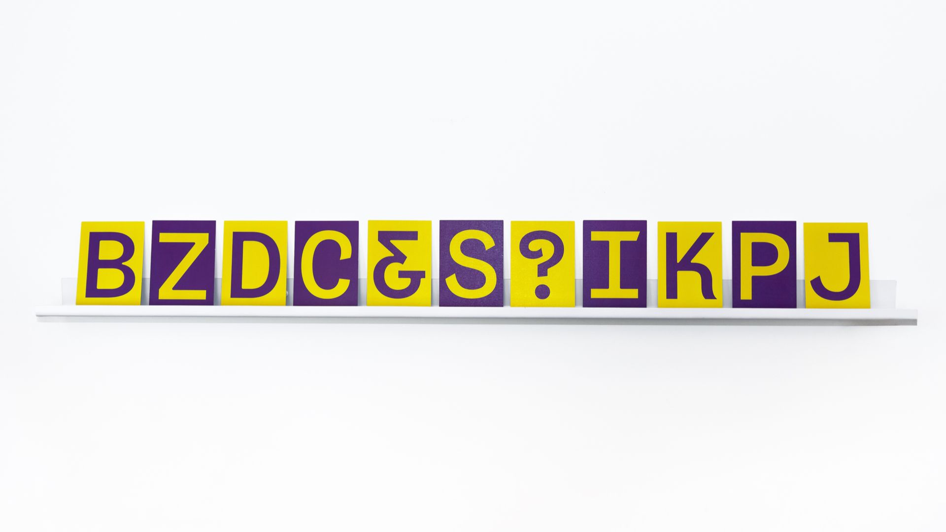
Monospaced not monoline!
Monospaced not monoline!
Sculpting the past into the present? The truth is, this was not the brief;) We were asked to make an uppercase mono typeface. The designers from Colourborative started to design some shapes of their own with more straight lines than you can imagine. Actually, it would have been easy to just fill the first brief and paste some straights in the glyphs set and call it a font. BUT obviously, we started a dialogue followed by many. We found out that there is a history on which we could build. To fit the layouts, we still ended up with an uppercase Mono that has a lot of funky characters between all the natural straights. Moreover we were happy to be asked for more warmth that we added through roundings inside the letterforms captured from the physical letters.
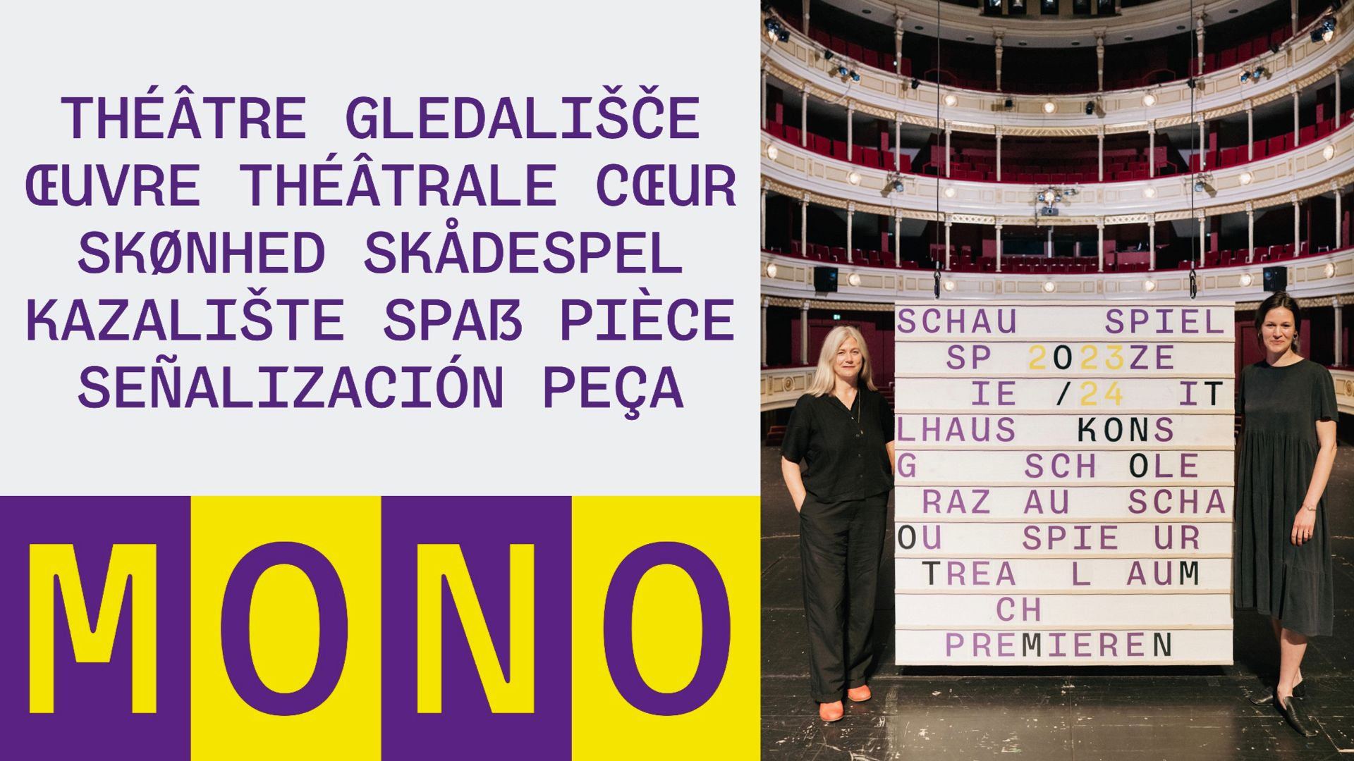
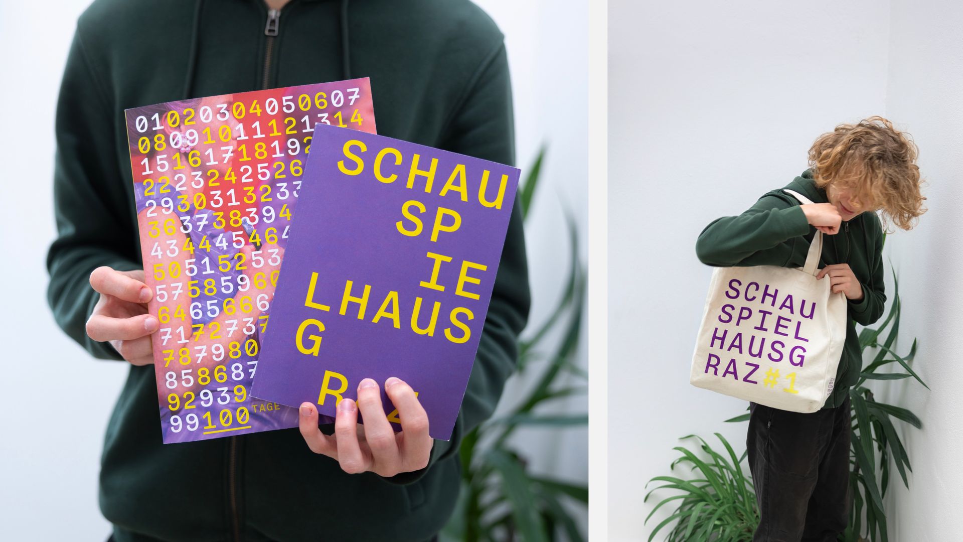
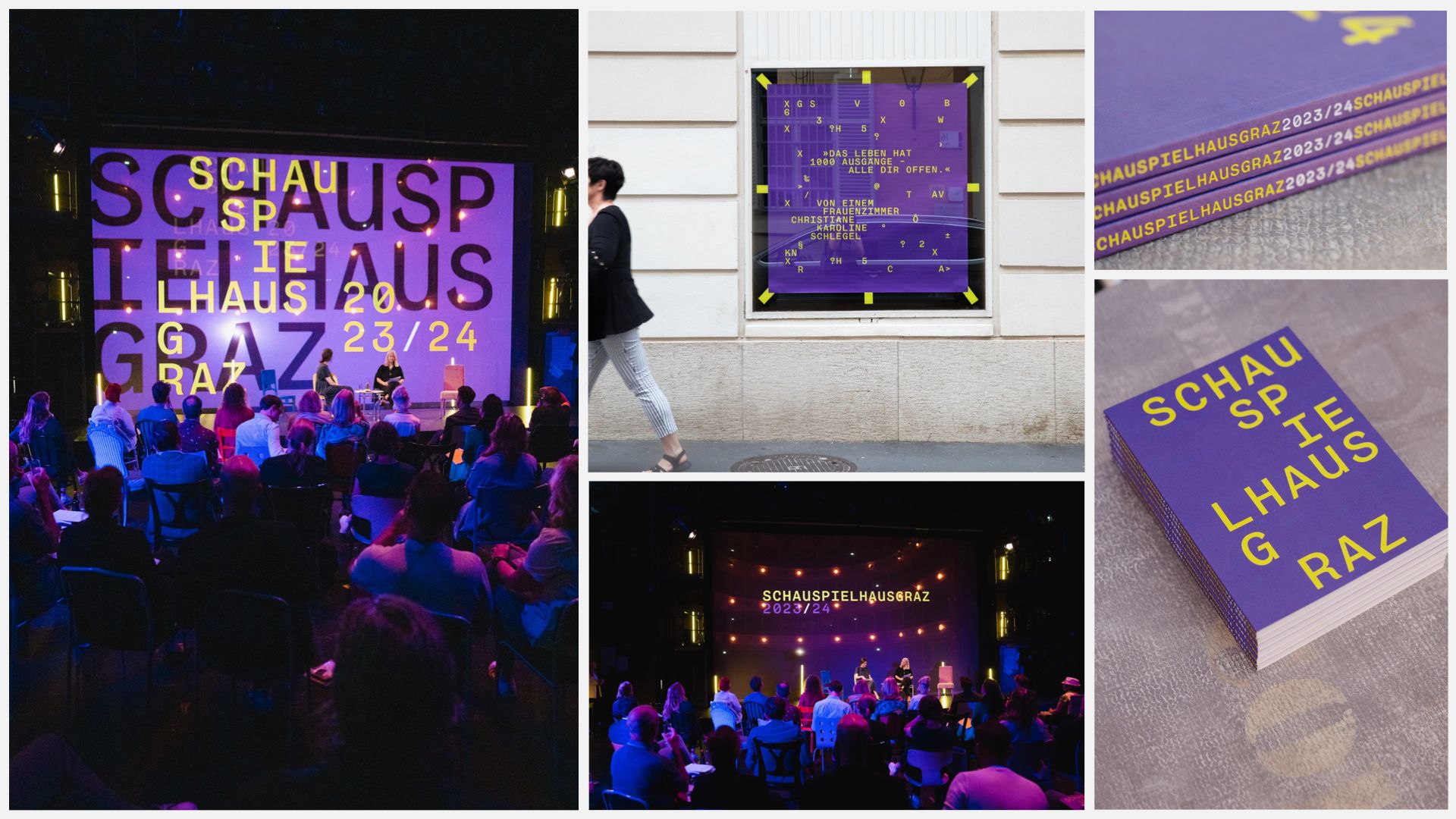
Ensemble in action!
Ensemble in action!
Check out this extensive font-in-use! Our individually cast Ensemble Mono appears everywhere throughout Graz. Who has spotted it already in the wild?
We are amazed how just one style can bring so much diversity in appearance. More fonts-in-use after our long-overdue revisit in Graz.
The Ensemble of Schauspielhaus Graz starts to play …
Spacing
Next Project