Fonts
Retail Fonts
Retail Fonts
We are experts in type design without being a type foundry. In addition to our custom typefaces for brands, Mona has been creating retail fonts since her very first typeface, Franz Sans. After completing her Master’s degree at TypeMedia, she has been selling her type families mostly through the well-known German foundry TypeMates.
You can find most of her retail typefaces, such as Gratimo and Bridge at TypeMates.com.
Pssst pssst and her next retail release is already in the works :)
Bridge Head & Text
Design
Mona Franz
Specs
Head: 10 styles, 5 weights, 3 width, 830 glyphs
Text: 16 styles, 8 weights, 830 glyphs
Formats
Variable Font Format, otf and ttf for desktop and apps, woff and woff2 for web
Released by
TypeMates
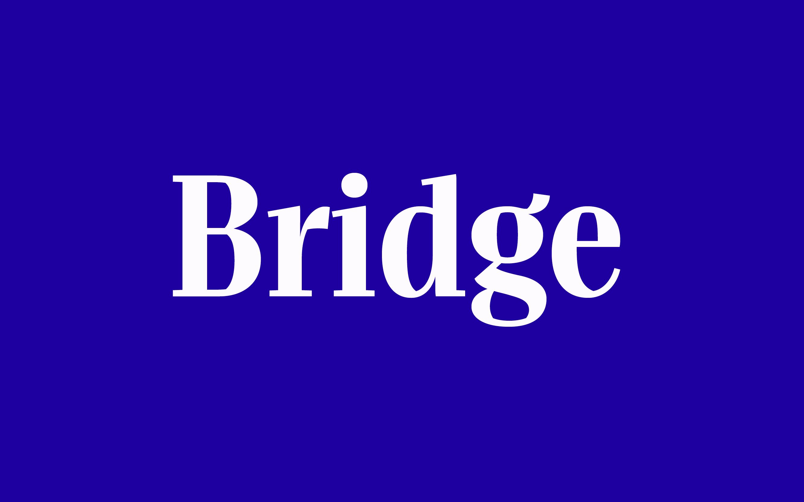
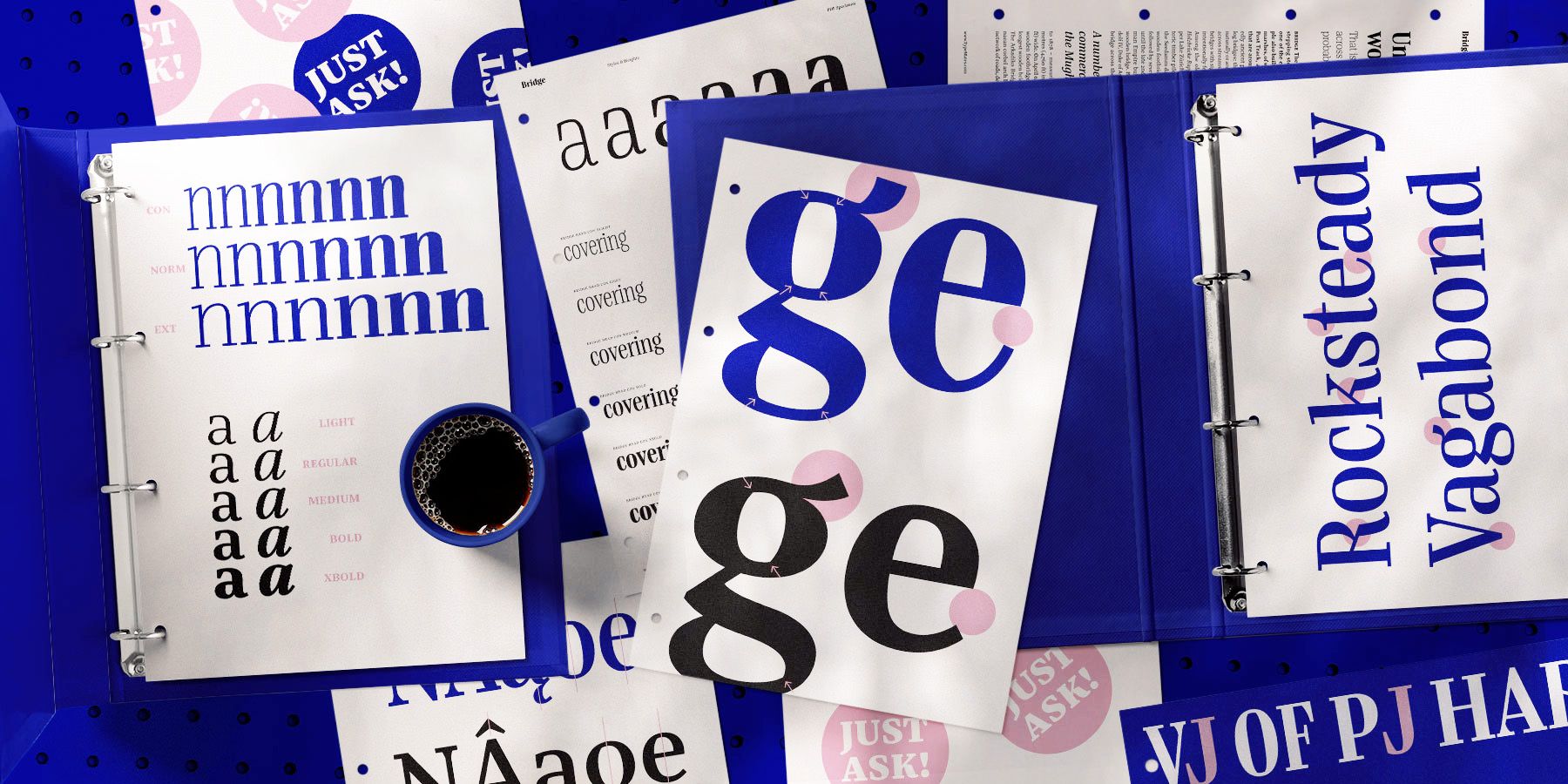
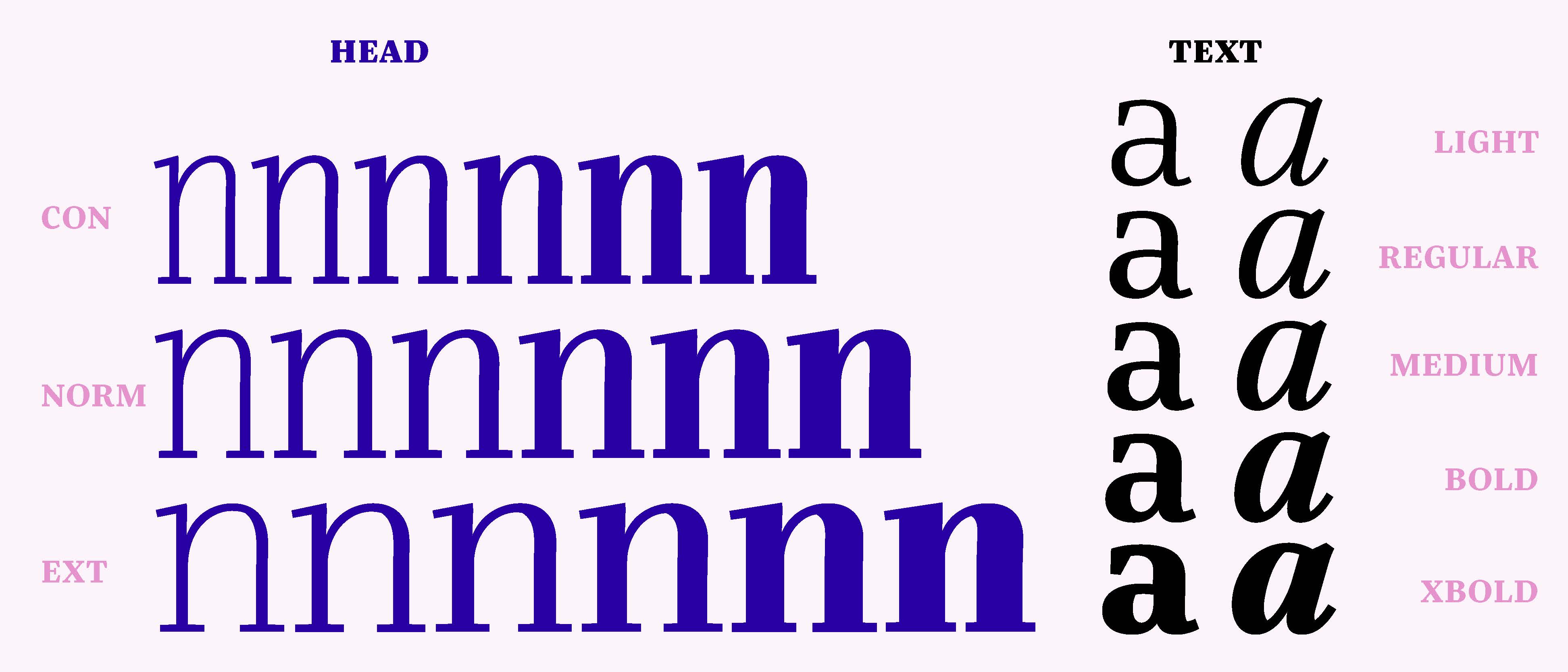
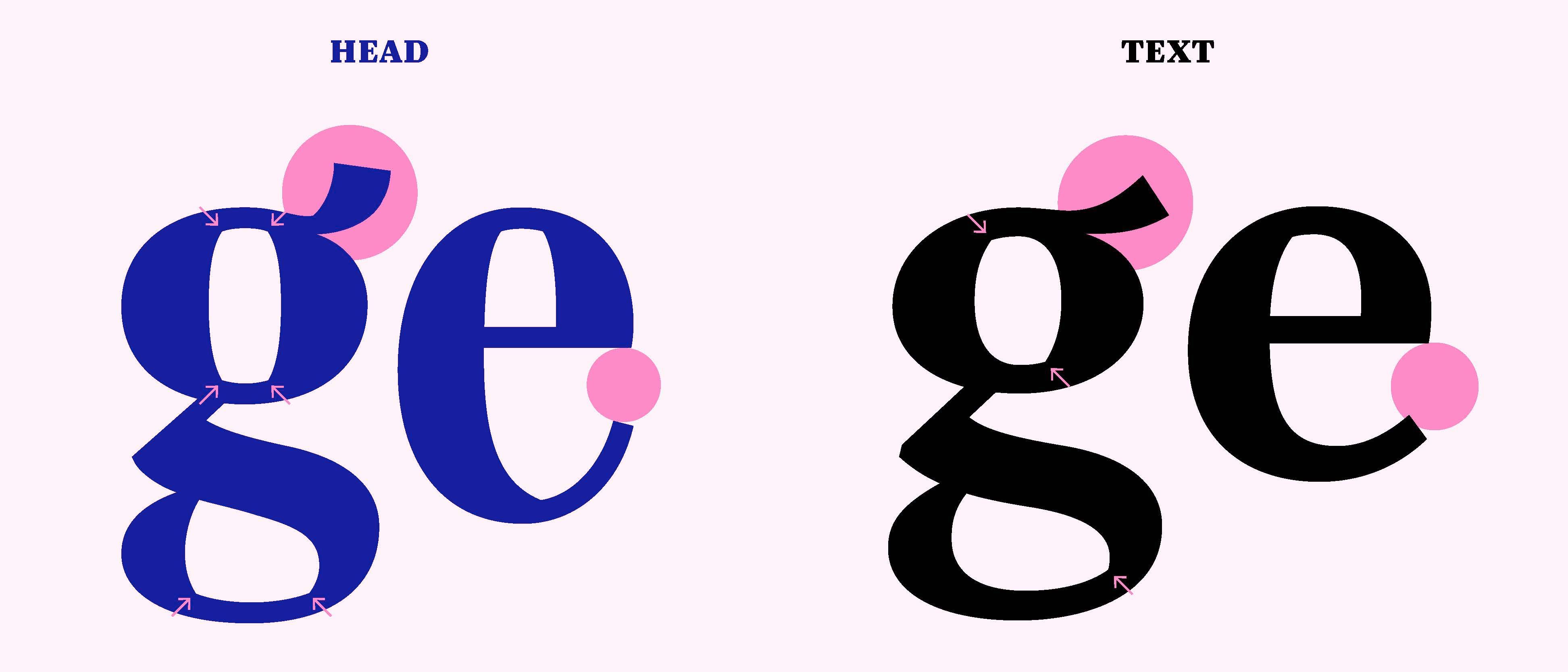
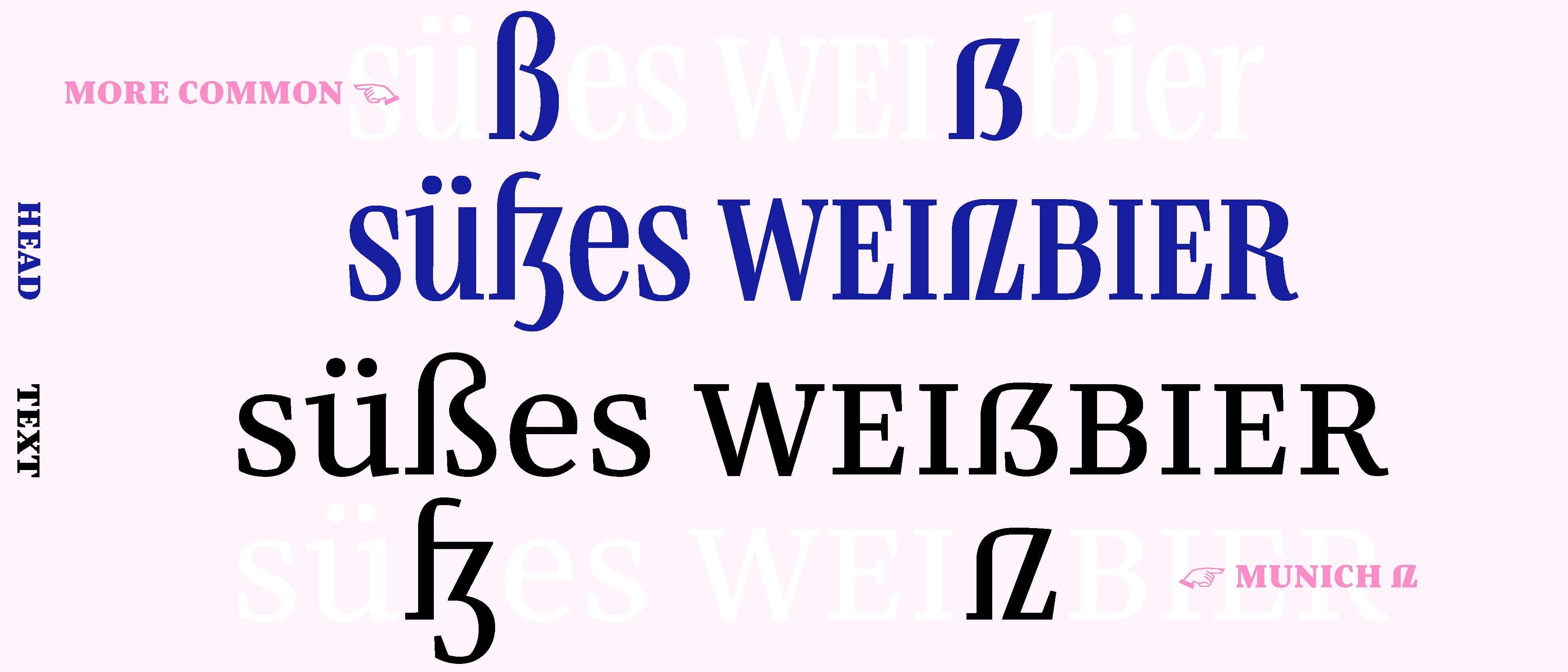
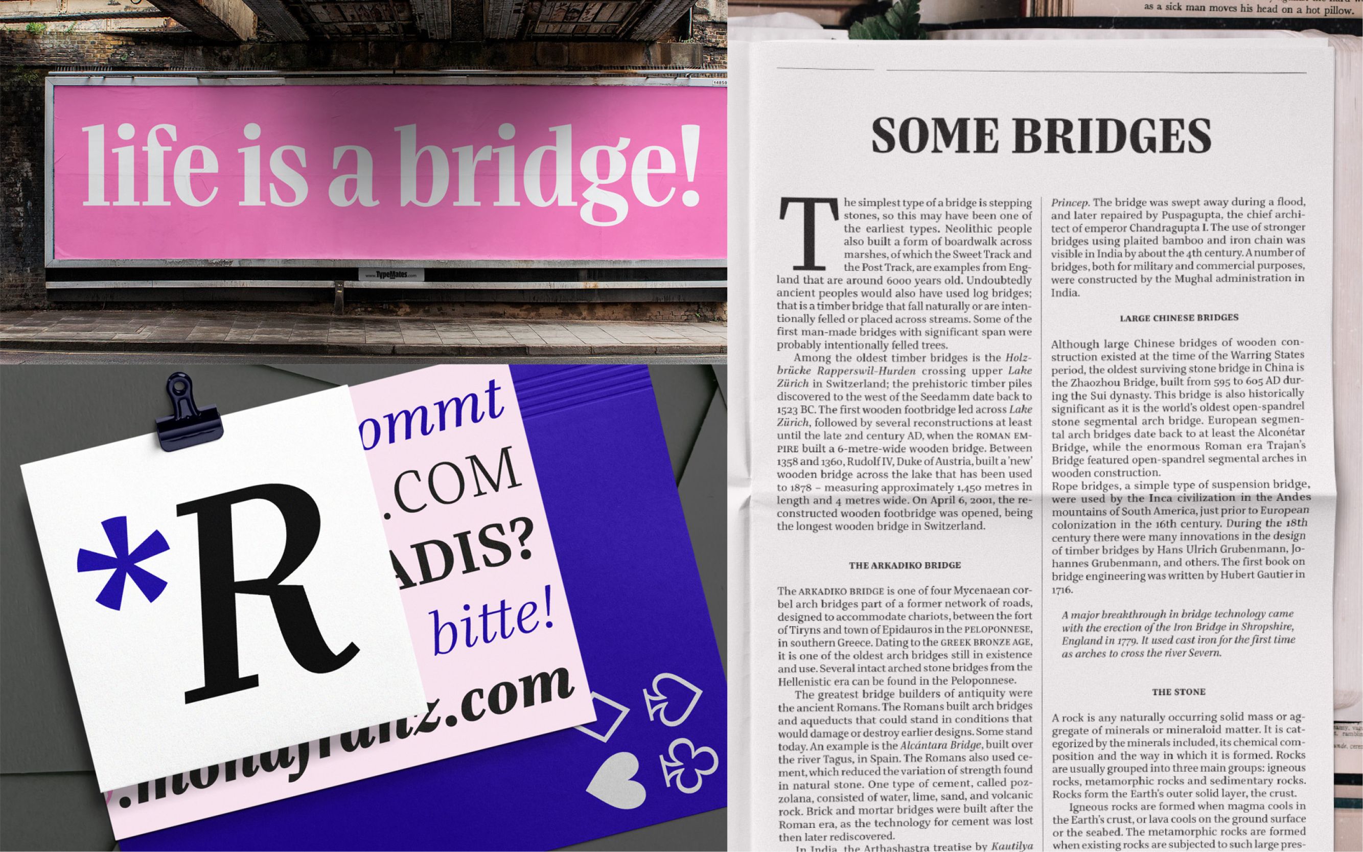
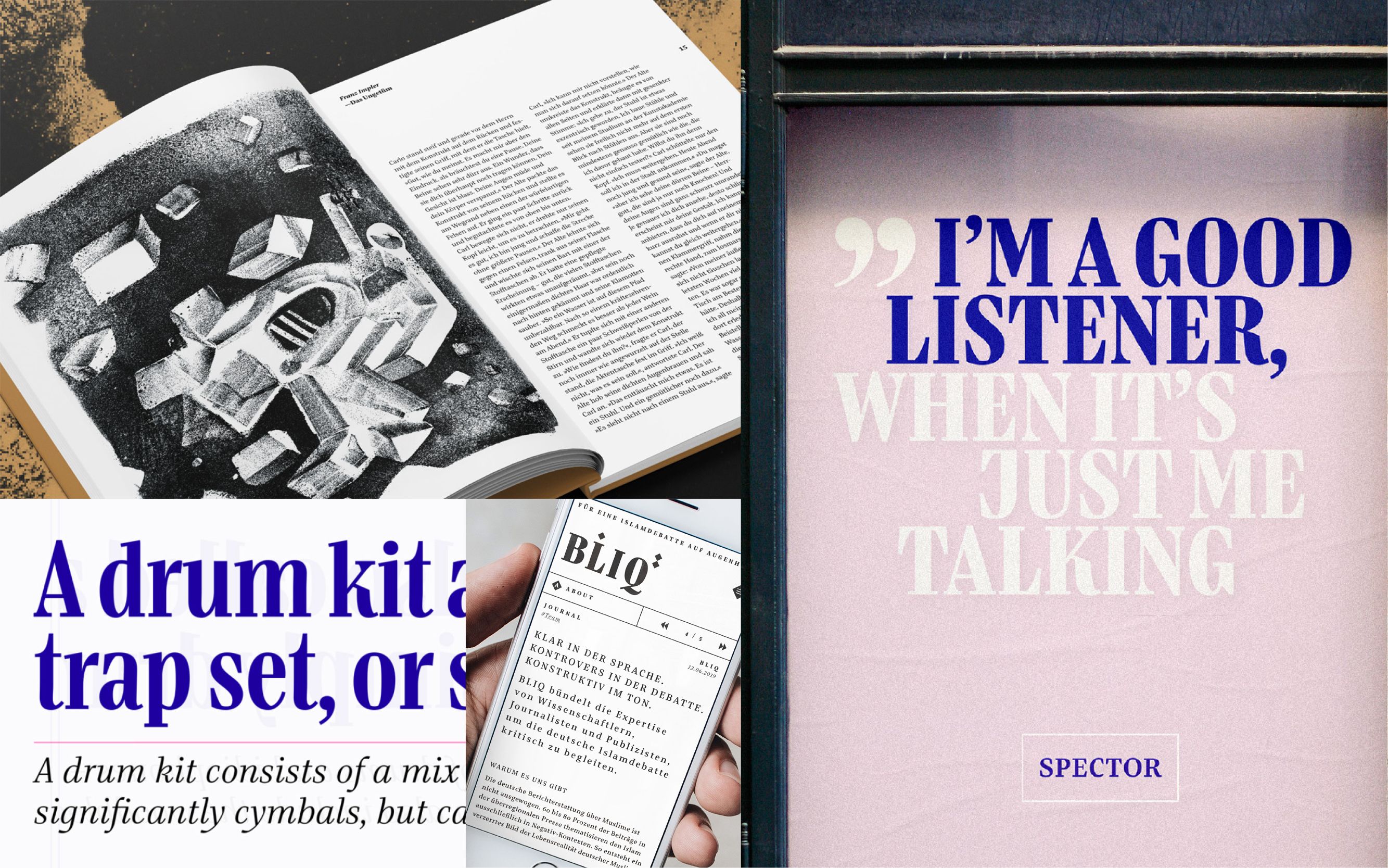
With three different widths and six weights, Bridge Head hits the perfect notes for expressive headlines. Alongside a solo career on posters, banners, and logos, Bridge Head also strikes the right chord as a duo: each of the 18 display styles is carefully matched with Bridge Text, allowing them to work together to tell stories and create complex typographic layouts for editorial and corporate design.
Bridge Text is the drummer in a band of confident, edgy editorial typefaces, bringing rhythm and clarity to extensive text layouts. With its distinctive character, highly legible forms, and asymmetrical counters, Bridge Text translates the graphic qualities of Bridge Head into readable text at smaller sizes.
The ideas and foundations for Bridge emerged during TypeMedia 2018 in The Hague as a master’s project under the guidance of Erik van Blokland, Paul van der Laan, and Peter Verheul.
After extention and refinement it was released at TypeMates.com in 2019. Find more about the idea of Bridge Head & Bridge Text.
Franz Sans
Design
Mona Franz
Specs
8 weights, 628 glyphs per style
Release & update
franzsans.de in 2014/2016
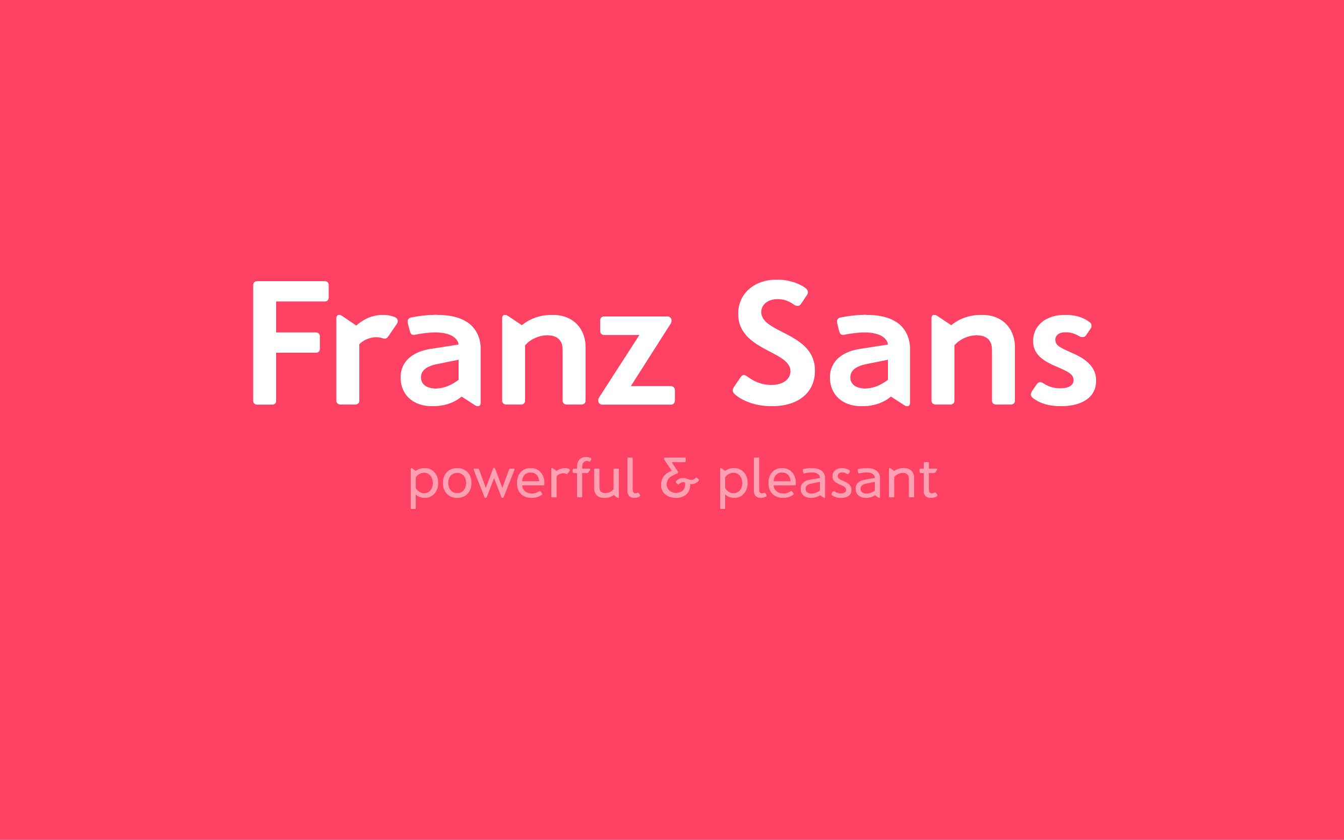
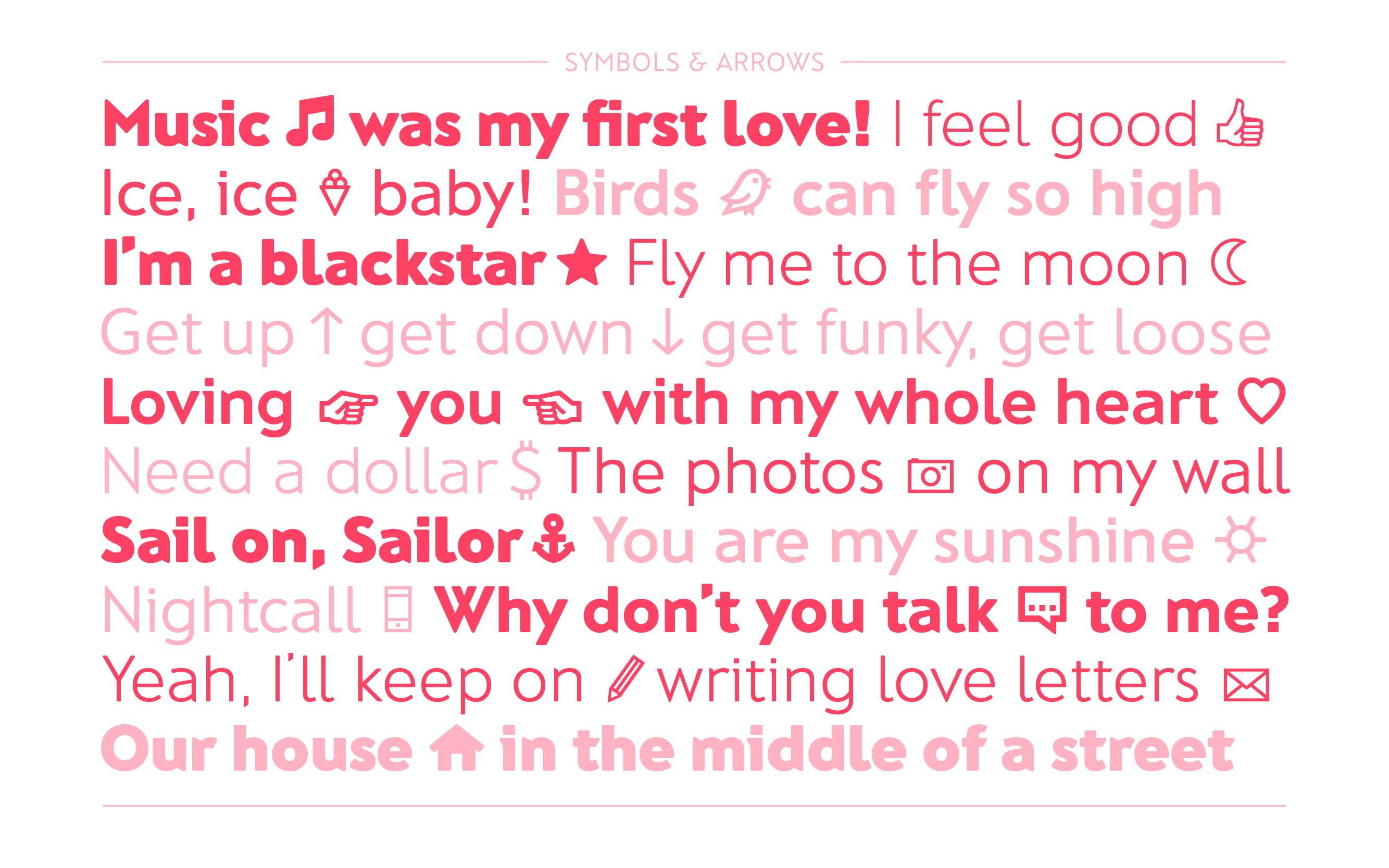
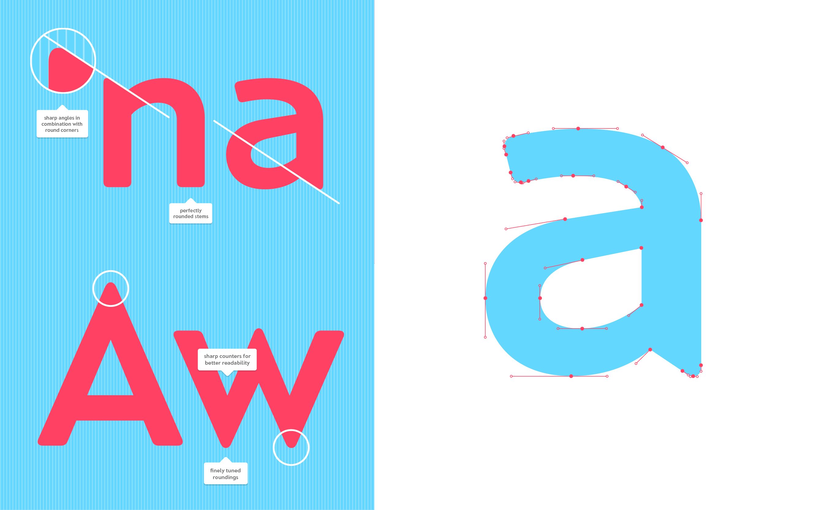
Sharp angles meet softly rounded corners. Franz Sans is both powerful and friendly. The typeface family comprises eight weights, ranging from ExtraLight to Heavy.
Especially at large sizes, the distinctive details of this optical mono-linear sans serif become apparent. Precise angles create a recognizable character, while the rounded forms lend the typeface a soft and approachable appearance. OpenType features allow individual letters to respond to one another and combine into harmonious type images. This makes Franz Sans particularly well suited as a brand-defining typeface for striking headlines, logos or web presence.
The family comprises a total of 628 glyphs and supports more than 30 languages. In addition to alternative letterforms and various numeral styles, it includes a wide range of symbols designed to complement the typeface.
Franz Sans Bold was born at TH Nuremberg for Mona’s Bachelor project under the guidance of Prof. Peter Krüll. Later on, Mona expanded the styles and the character set to sell it at Franzsans.de.
Gratimo Classic & Gratimo Grotesk
Design
Jakob Runge & Mona Franz
Consulting & Help
Irene Vlachou, Ilya Ruderman, Yury Ostromentsky, Donny Truong, Christoph Koeberlin, Igino Marini
Awards
Shortlist Modern Cyrillic Award 2021
Granshan Award 2022: Special Mention for Greek
Specs
2 families, 12 styles, 6 weights, > 1100 glyphs per style
Formats
Variable Font, Formats for web, app and desktop (otf, ttf, woff, woff2)
Grafikdesign
Paul Eslage
Released by
TypeMates
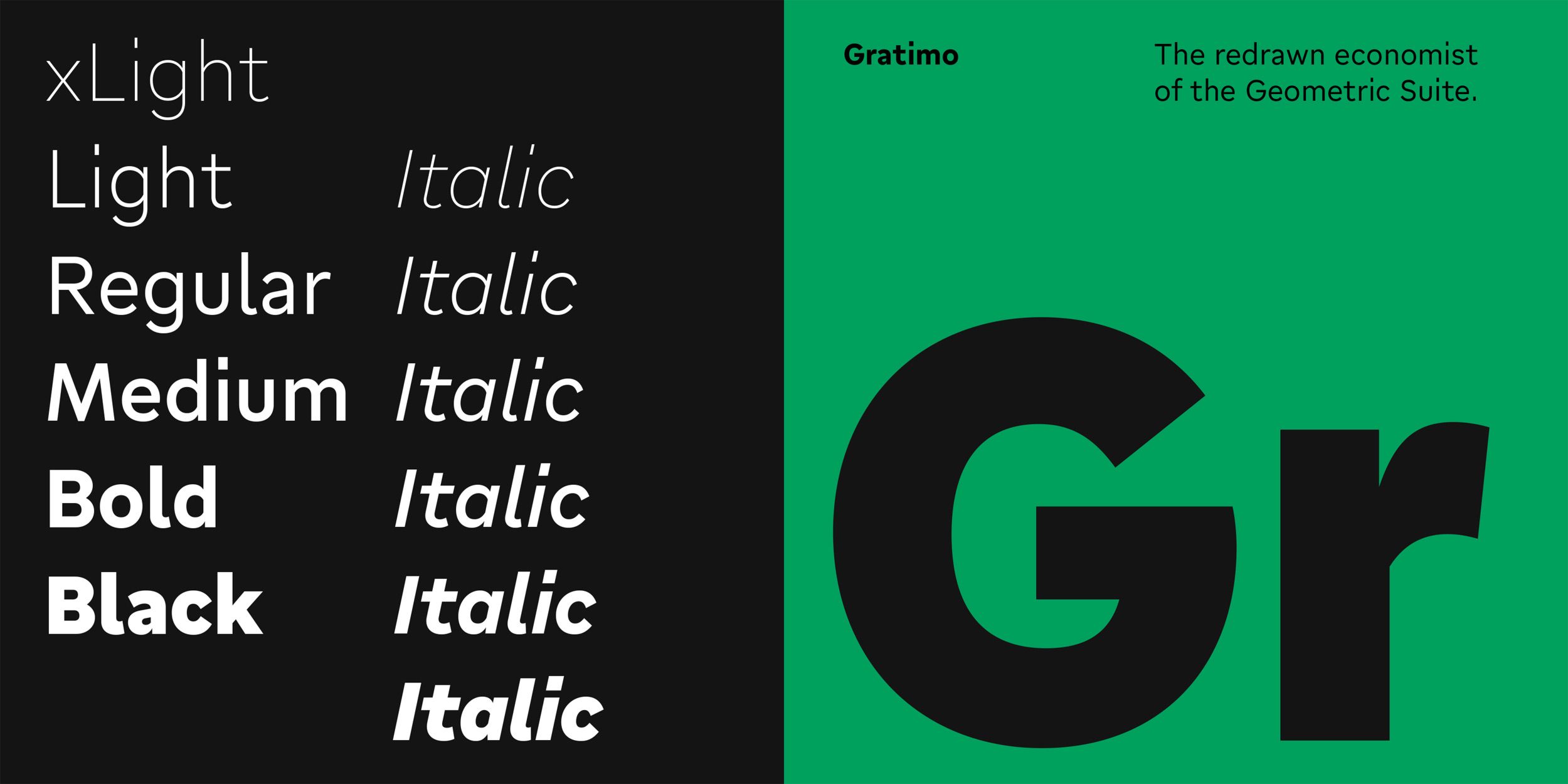
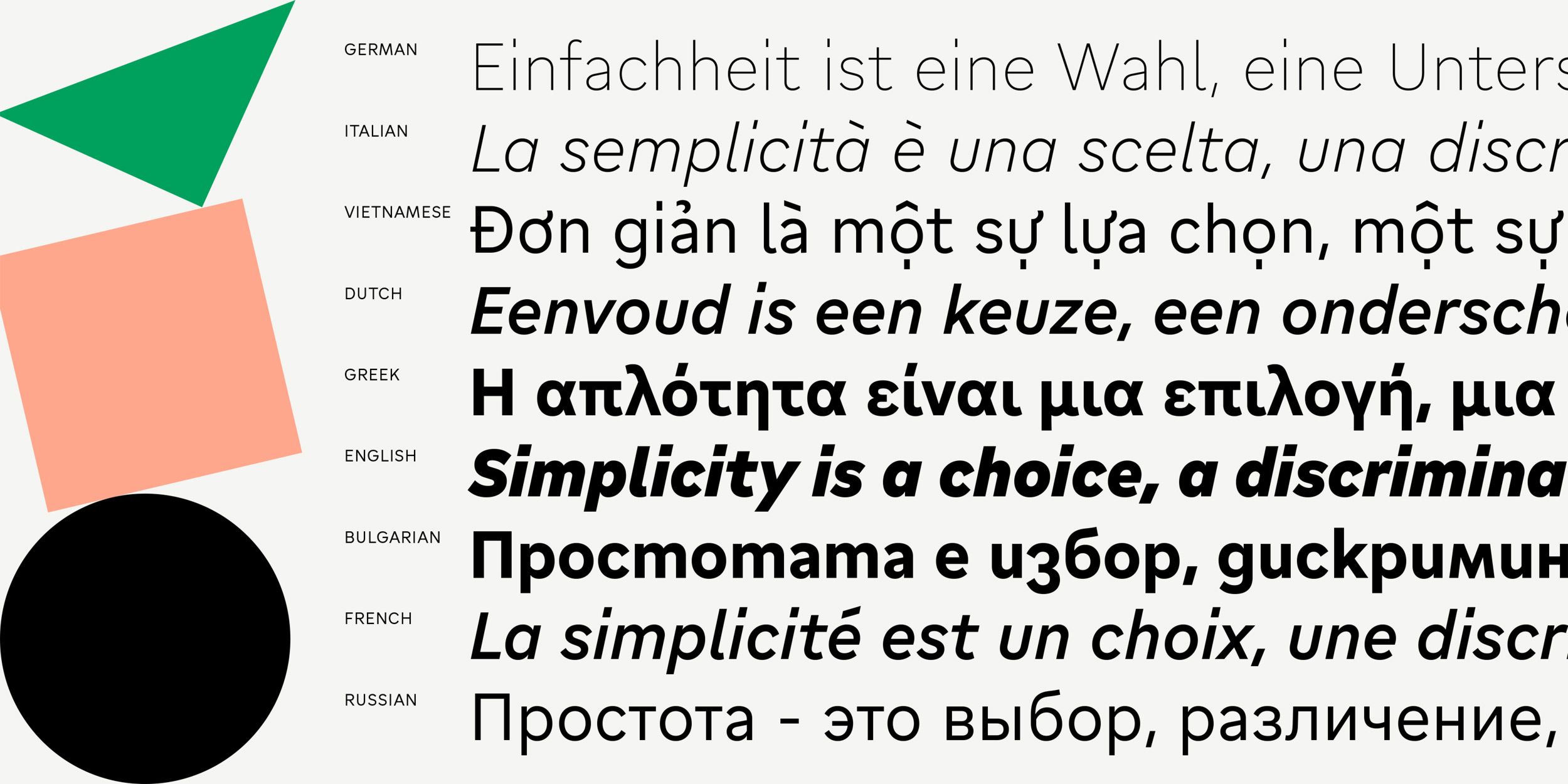
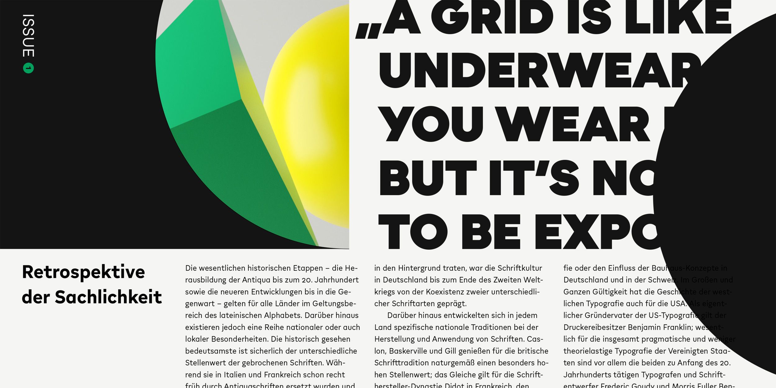
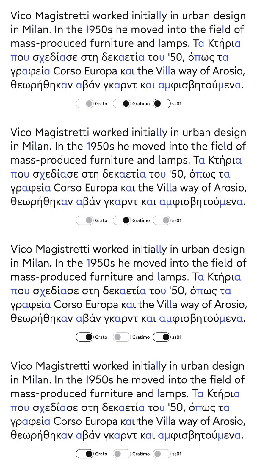
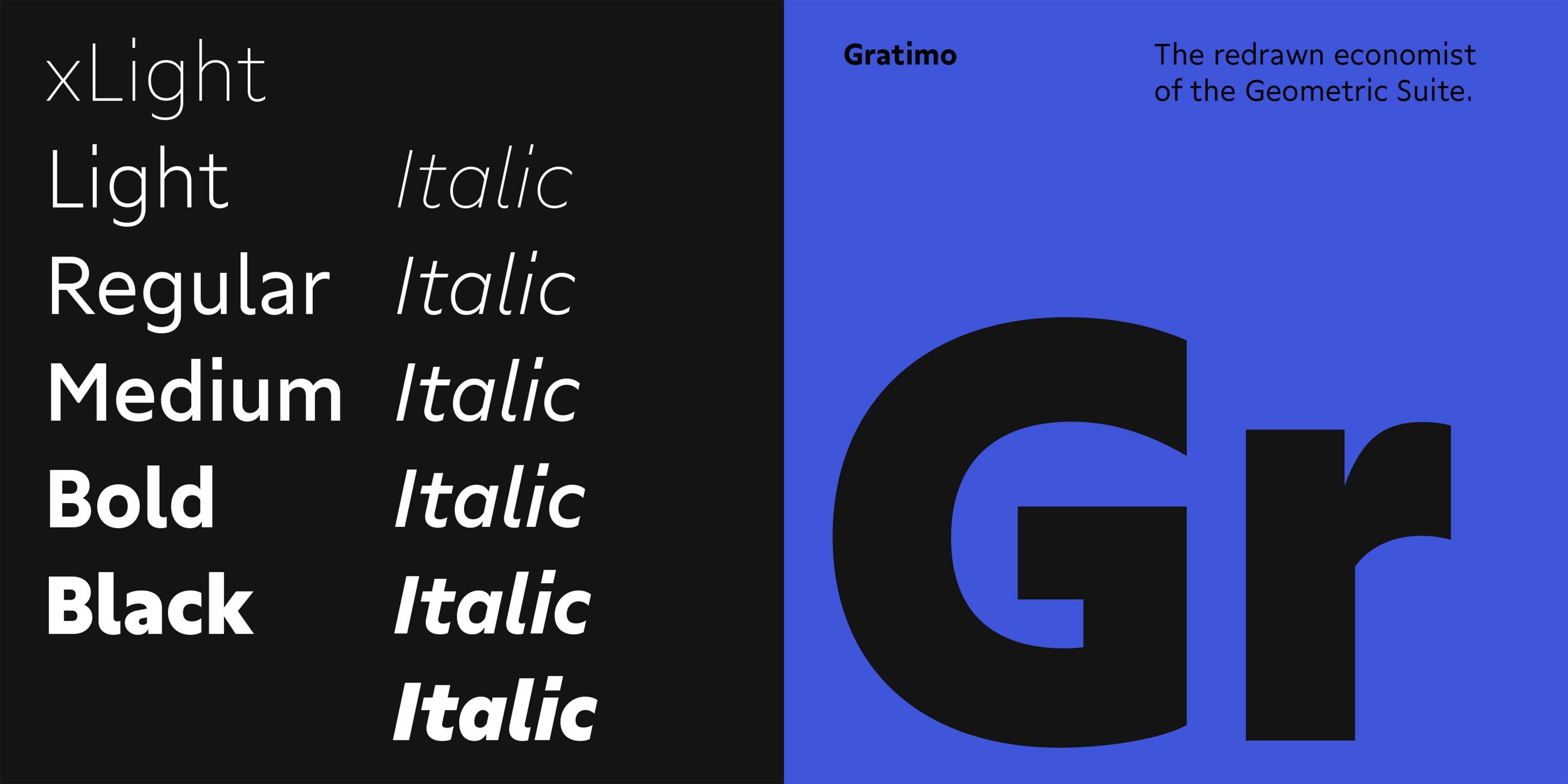
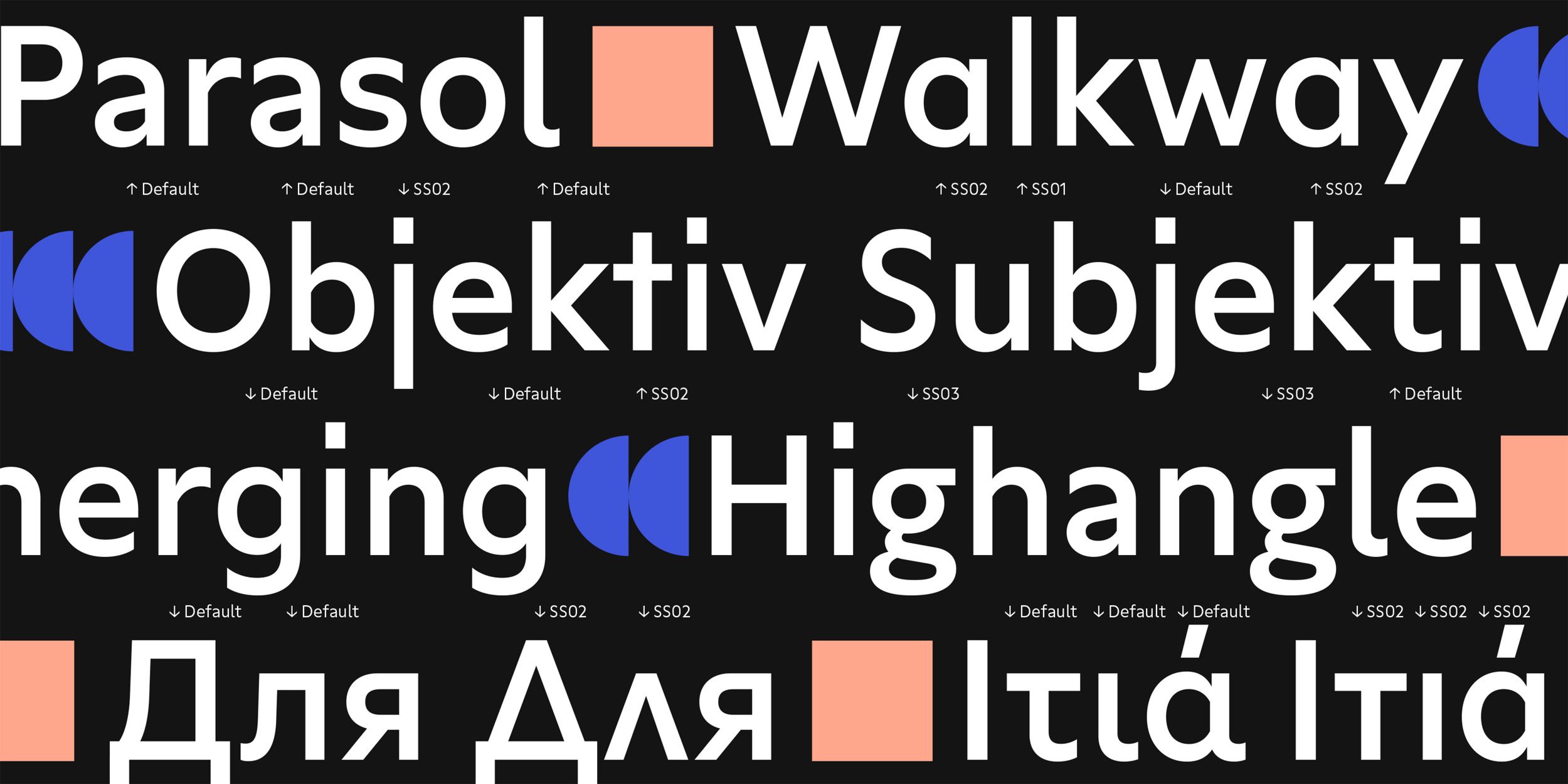
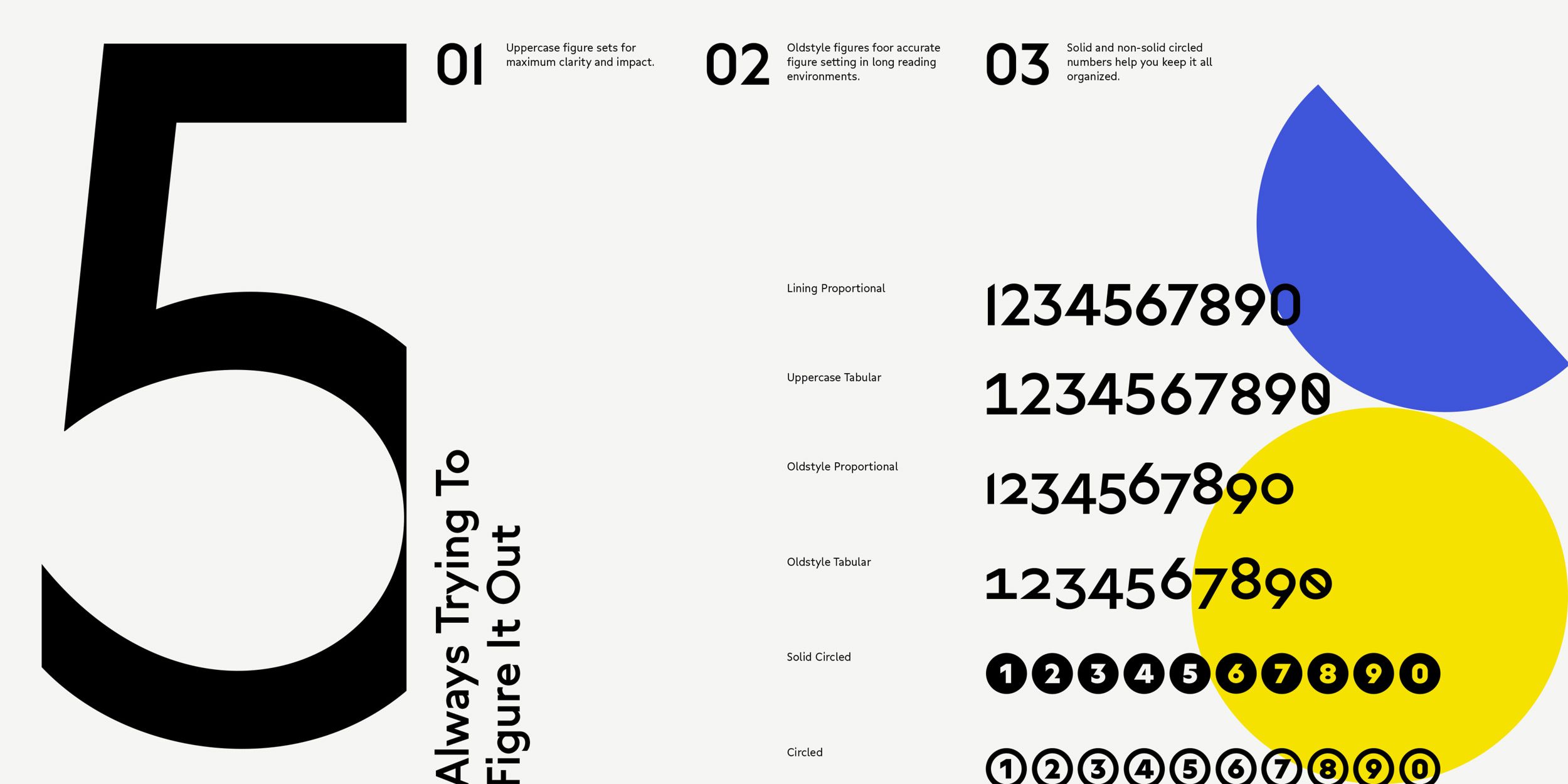
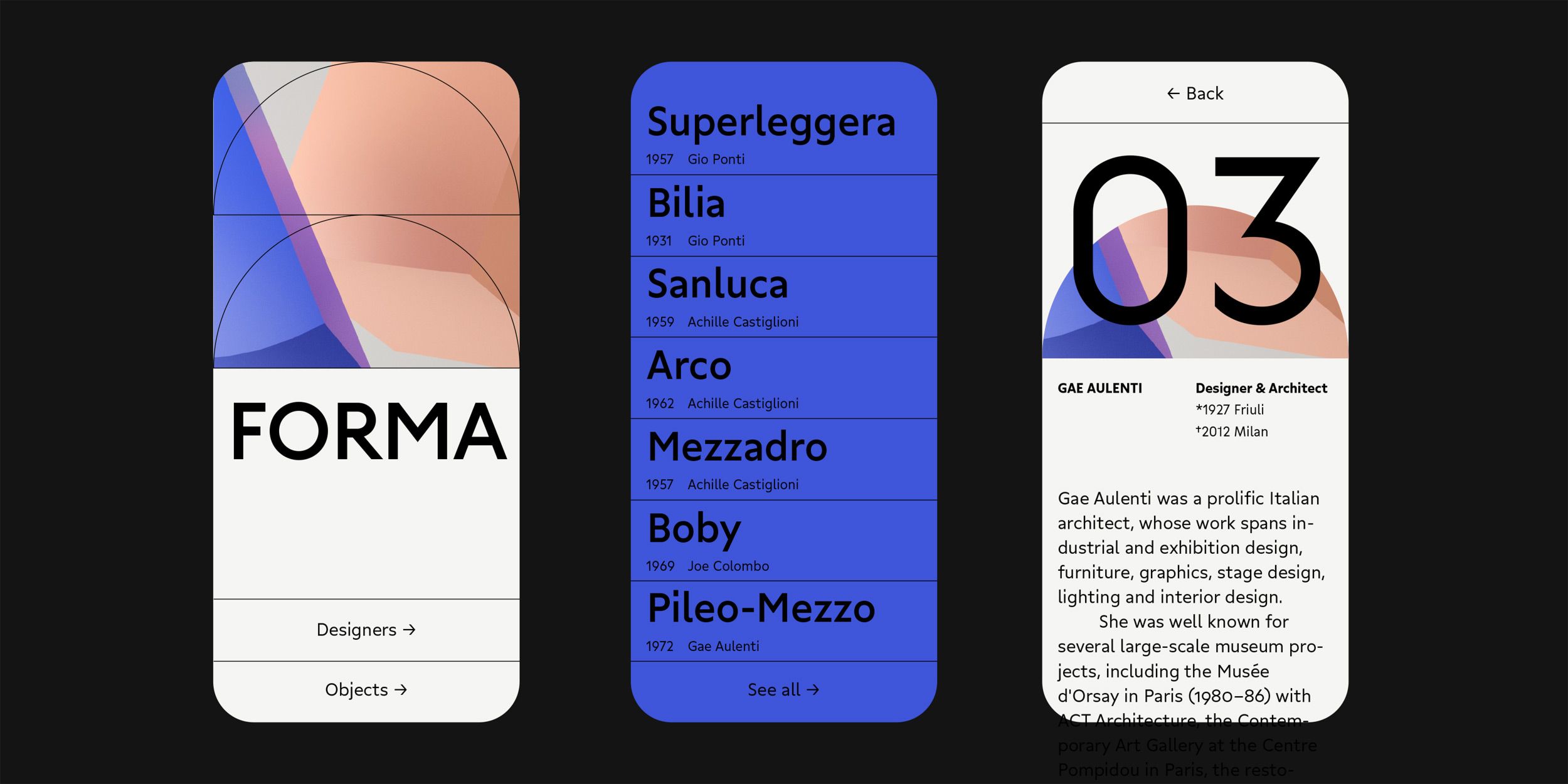
Gratimo is part of a superfamily comprising two styles: Classic and Grotesk – which differ primarily in their stroke endings and the proportions of their capitals. Gratimo is the restrained sibling of the hyper-geometric Grato by Jakob Runge. With its robust x-height, open stroke endings, and generous spacing, Gratimo is designed for excellent readability across both digital and analogue media.
While Gratimo Grotesk is shaped by the clarity and directness of early 20th-century American grotesques, Gratimo Classic draws on humanist-geometric type models.
The family offers extensive language support, including Greek, Cyrillic, and Vietnamese.
Download trial fonts and learn more about Gratimo Classic or Gratimo Grotesk at the TypeMates website or find out all about the huge Grato Collection.